A single stem with one bloom fits a narrow space like the wrist or the back of the hand, while a full bouquet needs the forearm or thigh to spread without cramping.
1. Single Rose Tattoo
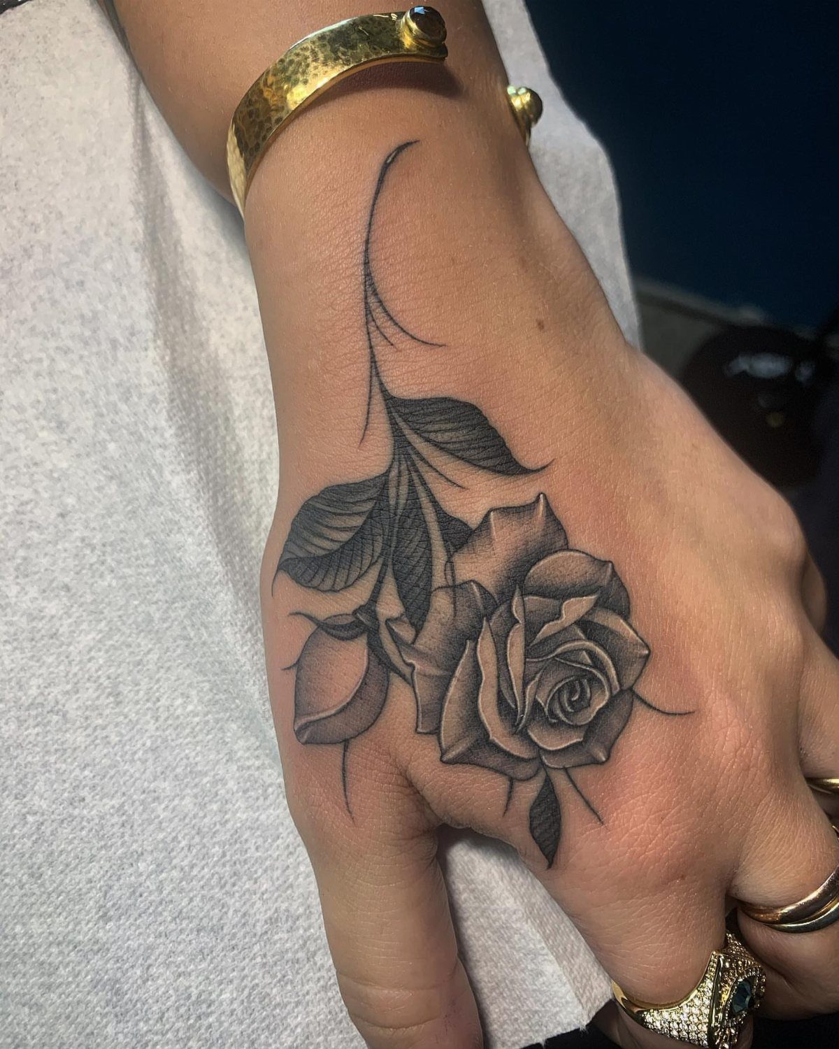
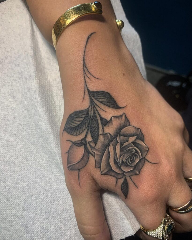
A single rose with its stem and leaves gives you the full form, not just the bloom.
The stem adds length, which makes it work better on narrow spots like the back of the hand, the side of the wrist, or running down the forearm.
I like how contained this feels.
One rose reads clearly at almost any size, and it doesn’t need other elements to feel complete. For something recognizable but not crowded, this is where I’d start.
2. Rose Bouquet Tattoo
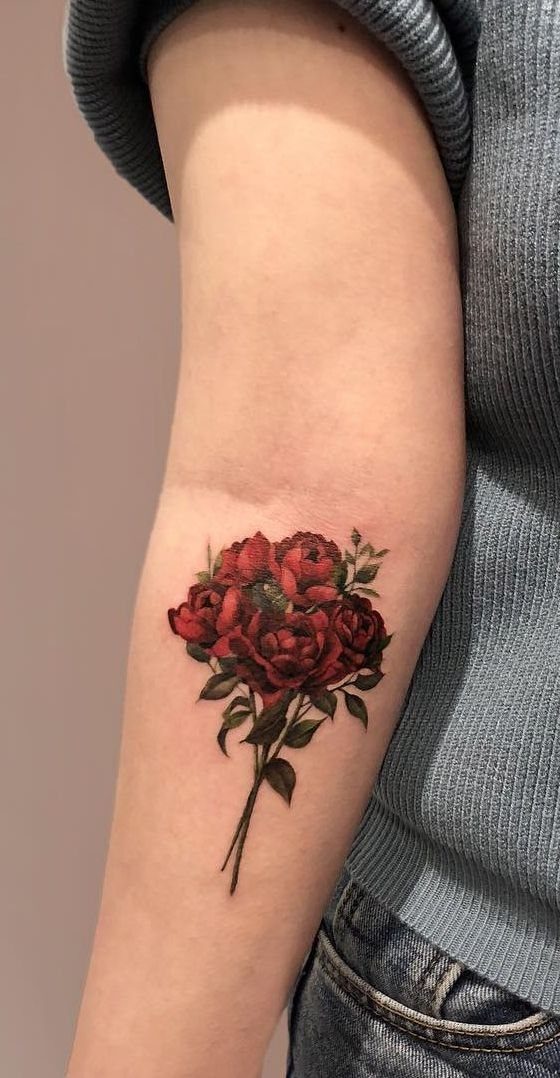
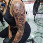
Instead of one bloom, a bouquet gives you three or more roses clustered together with their stems bundled. The arrangement fills space faster, so it suits larger areas like the forearm, the thigh, or the upper arm.
Red roses with green leaves read as traditional and bold. For color that stays clear and readable, this is one of the most straightforward ways to use it without the design feeling abstract.
The fuller the bouquet, the more sitting time you’ll need.
3. Black Rose Tattoo
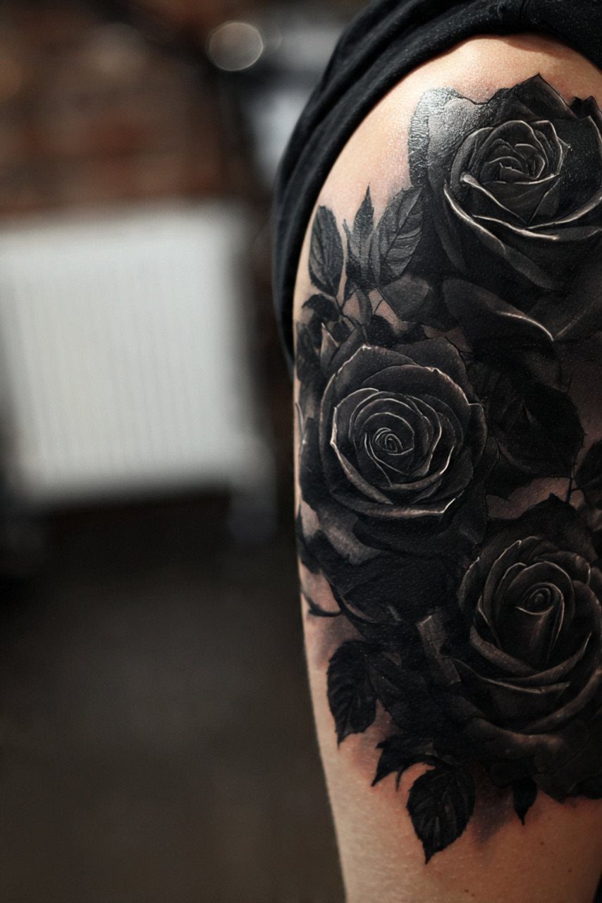
Black roses use heavy shading instead of outlines alone, and the petals look darker than a typical line drawing. The result feels more serious, less decorative.
People choose black roses to mark the end of something: a relationship, a chapter, a version of themselves they’re leaving behind. The design still reads as a rose, but the tone shifts completely.
Shading this dense holds up well over time if the artist packs enough ink into the petals. On an upper arm, you have room for detail without the design feeling cramped.
4. Watercolor Rose Tattoo
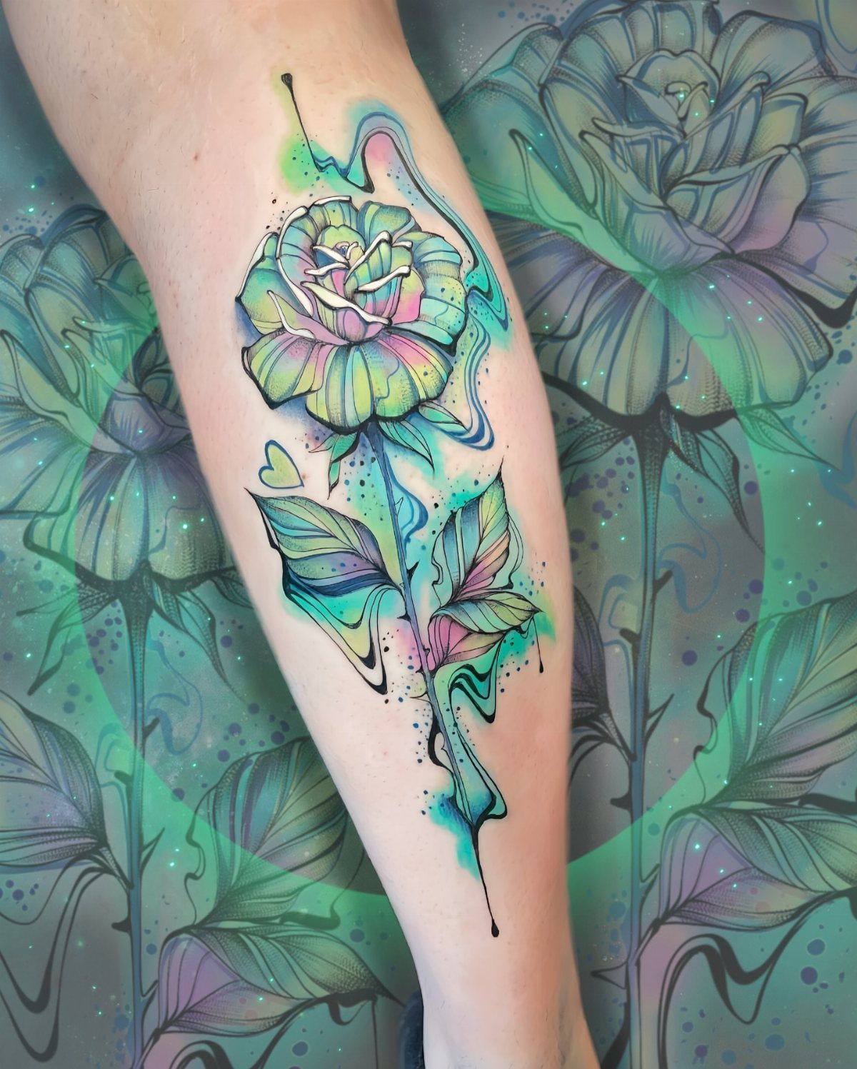
Watercolor roses use color that bleeds outside the linework, like brushstrokes on paper. You’ll see splashes of green, blue, and purple dripping past the petals, and the effect is softer and more painterly than a solid fill.
This style loses intensity sooner than traditional color because the washes are lighter and less saturated. Touch-ups every few years keep it looking fresh.
The leg works well for this because the design can spread vertically without running into other tattoos. For something vivid that doesn’t look like every other rose, this is the move.
5. Rose and Skull Tattoo
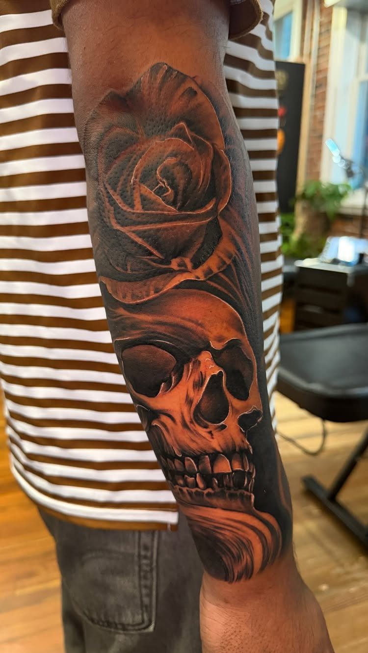
The rose stays delicate, the skull stays stark, and the contrast is what makes it work.
This pairing has been around for decades, and it still reads clearly because the symbols are so different from each other. For something that feels finished without adding more elements, this combination does it on its own.
Black and gray keep the focus on form instead of color. The forearm gives you enough length to stack the 2 pieces without cramming them together.
6. Compass Surrounded by Roses
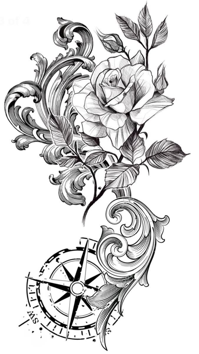
A compass centered below a rose with ornamental leaves ties the 2 symbols together without overlapping them. The rose sits at the top, the compass anchors the bottom, and the space between stays open.
Navigation and growth in one piece. If you’ve moved through something and come out with direction, this is one way to say it.
Line art like this works well as a stencil for fine line or blackwork.
7. Sword Piercing Through Roses
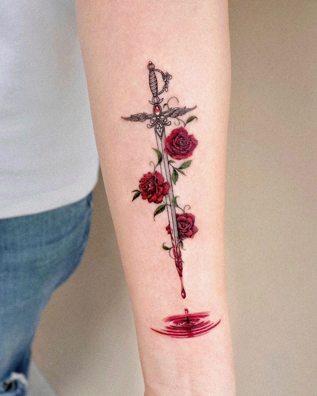
The sword runs vertically, with roses pierced along the blade, and a drop of blood falling below.
This reads as sacrifice or survival, and the blood makes it literal. On the forearm, the vertical layout follows the muscle and gives the sword room to stay clear.
For something more charged than a rose on its own, this is one way to shift the tone.
8. Fine Line Rose Tattoo
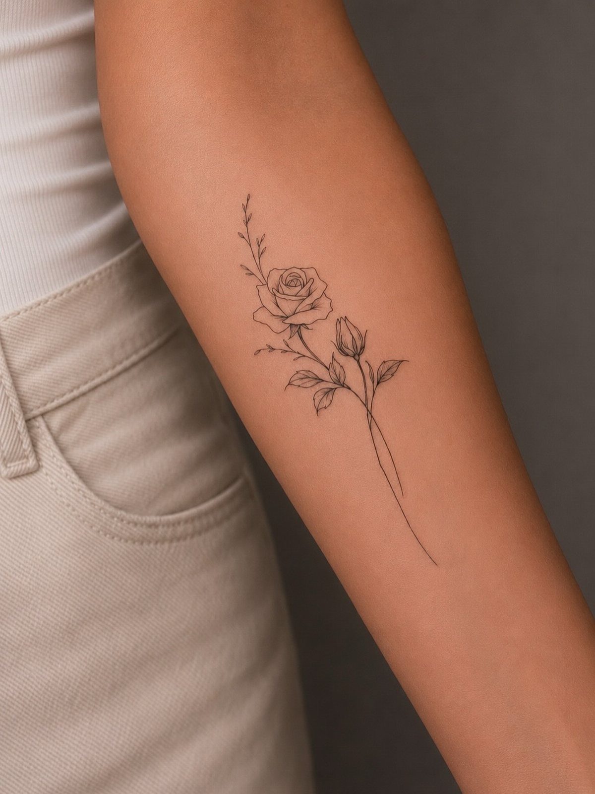
Fine line roses use thin, consistent outlines without heavy shading or color fill. The petals stay light, and the design reads as delicate instead of bold.
This approach scales down easily, so you can fit a rose and bud on a narrow spot like the inner forearm or wrist without the design feeling cramped.
Fine lines fade faster than thicker work, so touch-ups down the line keep it sharp.
For something recognizable that doesn’t take over the space, this is the cleanest option.
9. Traditional Rose Tattoo
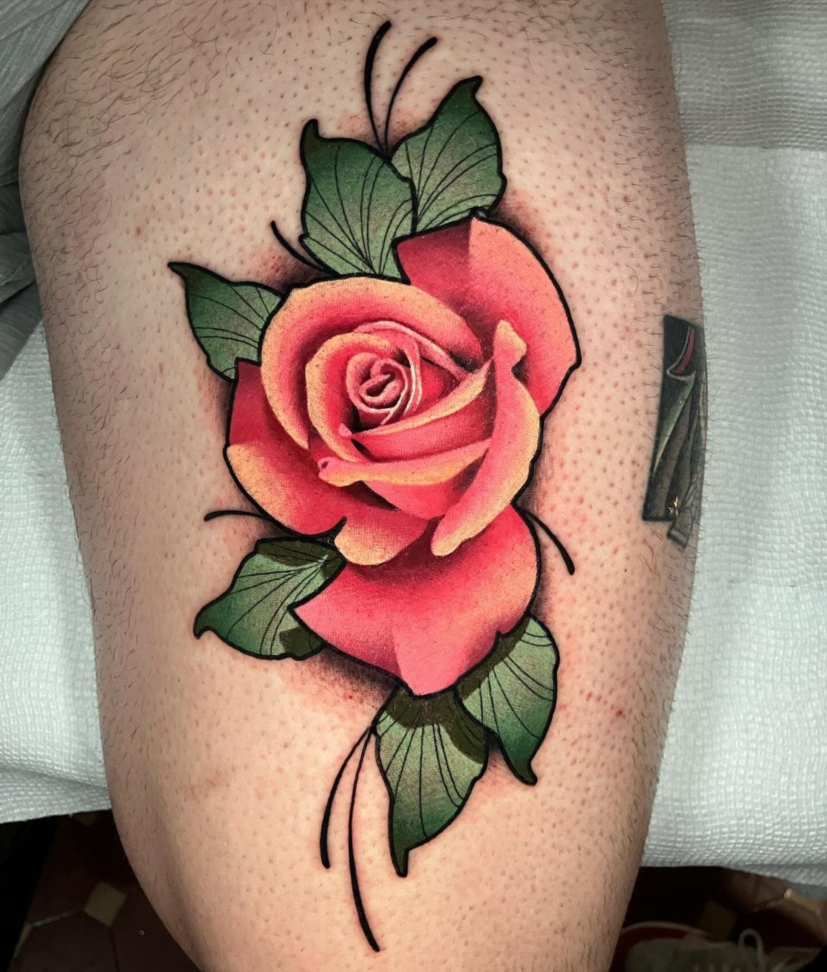
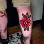
Traditional roses use thick black outlines, solid color fills, and high contrast between the petals and leaves.
Red and yellow roses with deep green leaves are the most common palette, and the style has been around long enough that it reads as classic rather than trendy.
The bold lines hold up well over time because there’s more ink packed into the skin. The leg gives you room for the full bloom and leaves without crowding the composition into something illegible.
This is the style if you want something that stays readable for decades.
10. Rose with Cursive Text
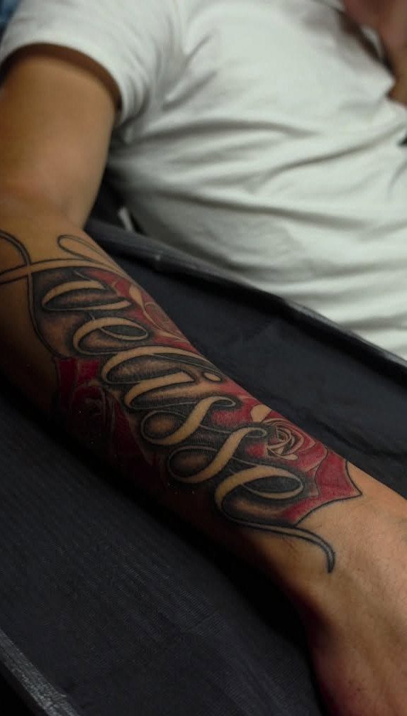
A rose with text layered over it combines two elements in one piece. The cursive runs across the petals, and the rose fills the background.
The text becomes the focus, so the rose stays secondary. This works when the words matter more than the flower itself, and you want both without splitting them into separate tattoos.
For something personal that still includes a recognizable image, this is the setup.
Symbolism of Rose Tattoos
Roses carry love and beauty first, but they also hold grief, loss, and the cost of getting through something. The color and the way you draw it shift which meaning lands.
A rose with thorns visible says you paid for what you earned.
The bloom stays soft, but the stem tells the other half. Pain and beauty in the same plant, and once it’s inked, both sit together.
Men get roses as often as women do now. The design doesn’t read as feminine when the style is bold or the pairing is harder: a skull, a sword, something that changes the tone.
The flower itself is neutral. What surrounds it and how you draw it decide how it feels.
If the rose marks someone specific, the name can sit along the stem in cursive. That turns the symbol into something personal without changing the image itself.
Placement Ideas for Rose Tattoos
Arms and forearms take roses easily because the length matches the stem, and the curve of the muscle follows the shape of the bloom.
Shoulders give you width for a fuller composition, and the rounded surface works for roses that sit flat rather than stretch. The upper arm handles color better than areas that see more sun or friction.
Ankles suit smaller roses, usually fine line or a single bloom without much surrounding detail. The space is narrow, so anything wider than a few inches starts to wrap and distort when you move.
For visibility, the forearm and hand stay exposed most of the year. The ribs, back, and thigh keep the tattoo private unless you choose otherwise.
Color Meanings in Rose Tattoos
Red roses read as romantic love or passion, the most recognized meaning and the one that has held for centuries. If the rose is for someone you love or lost, red is still the most direct choice.
The shading is heavier, and the tone is somber instead of celebratory.
Blue roses don’t grow naturally, so they read as rare or impossible.
Yellow, pink, and white roses each carry their own associations, but none land as clearly as red or black. If the color matters to you personally, that’s reason enough.