A rose tattoo can appear as a single bloom, a line-drawn stem paired with script or a dagger, or a cluster stacked vertically across the forearm, and the idea you choose depends on the symbolism you want and how much skin you’re ready to commit.
1. Three Black Ink Roses
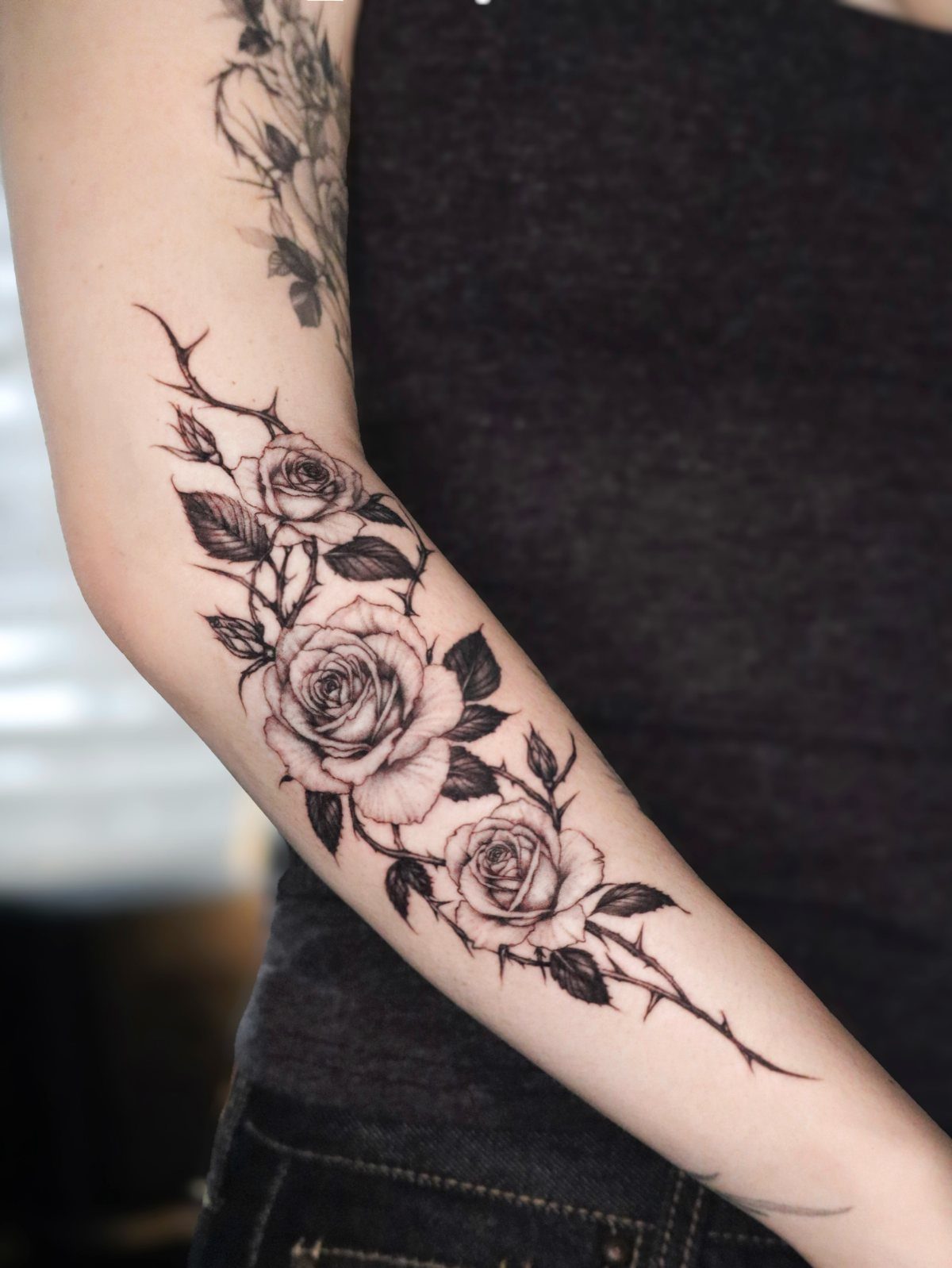
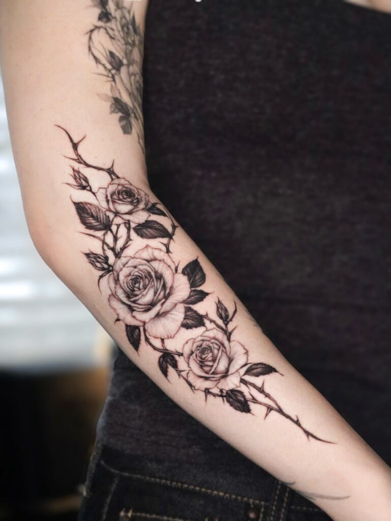
3 roses stacked along the length of a forearm give you a design that fills the space without crowding it. The vertical arrangement mirrors the line of the arm, and spacing the blooms evenly keeps the composition balanced.
Black ink alone keeps the focus on form. Thorns and leaves between the blooms add texture without softening the design, and the contrast between solid petals and fine stems makes each rose readable from a distance.
This size works well for a forearm or outer calf, anywhere the tattoo runs along a limb rather than sitting in one spot.
2. Single Rose Bloom
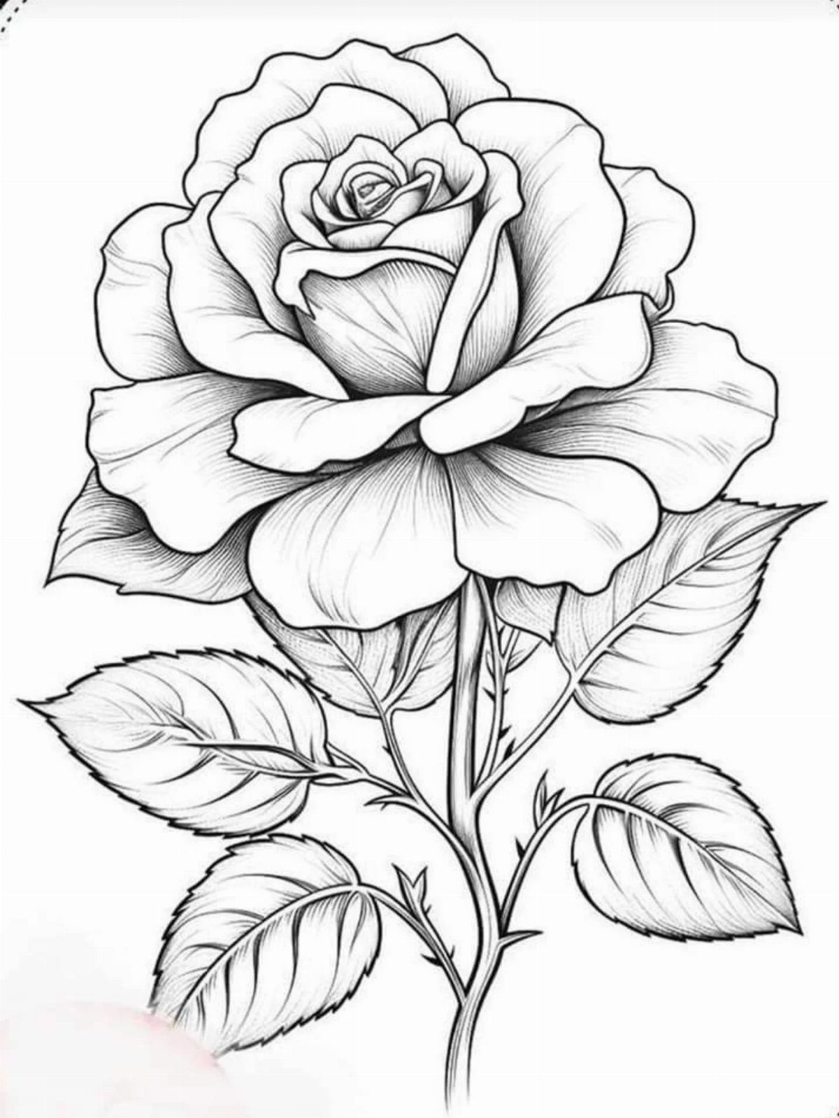
A single rose in full bloom gives you a design that fits almost anywhere, from the inside of a wrist to the back of a shoulder.
The detail in the petals and leaves makes it work at a smaller size, and black line work keeps it crisp as it heals.
This version skips shading, so the tattoo reads clearly even years later. The open petals and visible stem make the design feel complete without needing other elements around it.
For a rose tattoo that stands alone, this is the most straightforward option.
3. Rose with Cursive Script
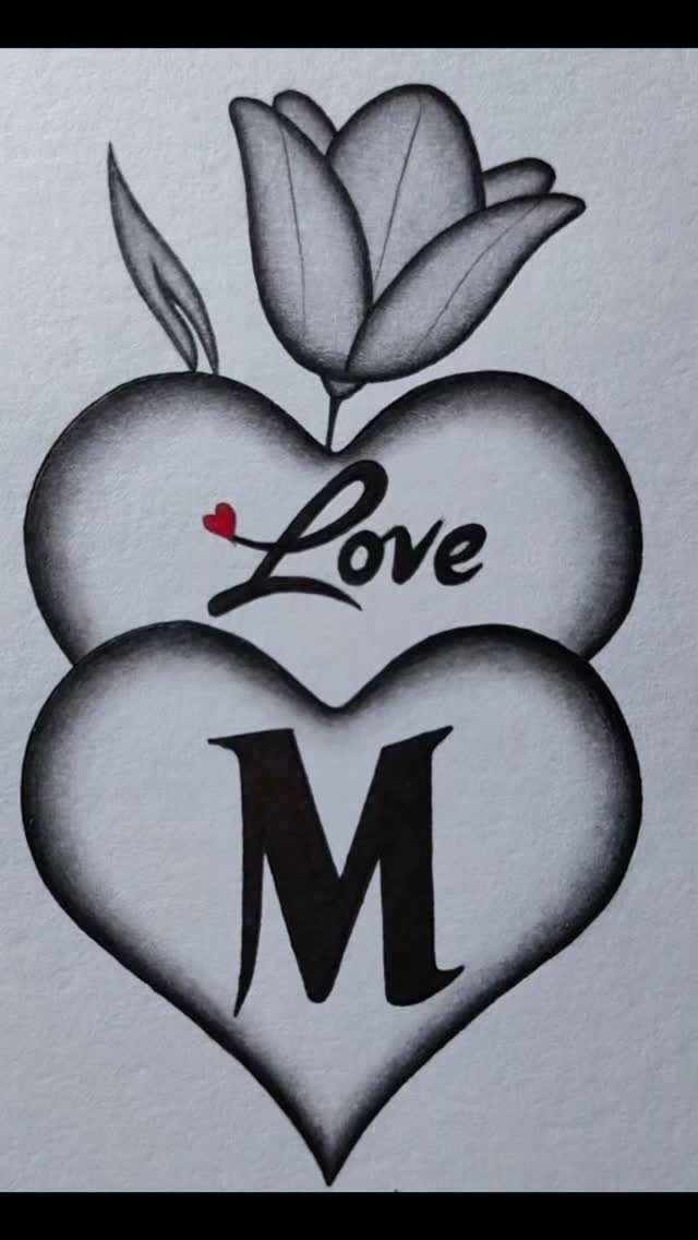
A rose sitting on top of 2 stacked hearts, with cursive text inside, gives you a design that holds personal meaning without requiring explanation.
The rose acts as the visual anchor, and the hearts below it add weight to the bottom of the design so it doesn’t feel top-heavy.
Black and grey ink keeps the text legible, and limiting the red to one small detail prevents a traditional valentine look.
This layout works well on the upper arm or chest, anywhere a compact design with clear vertical structure fits.
4. Rose and Dagger
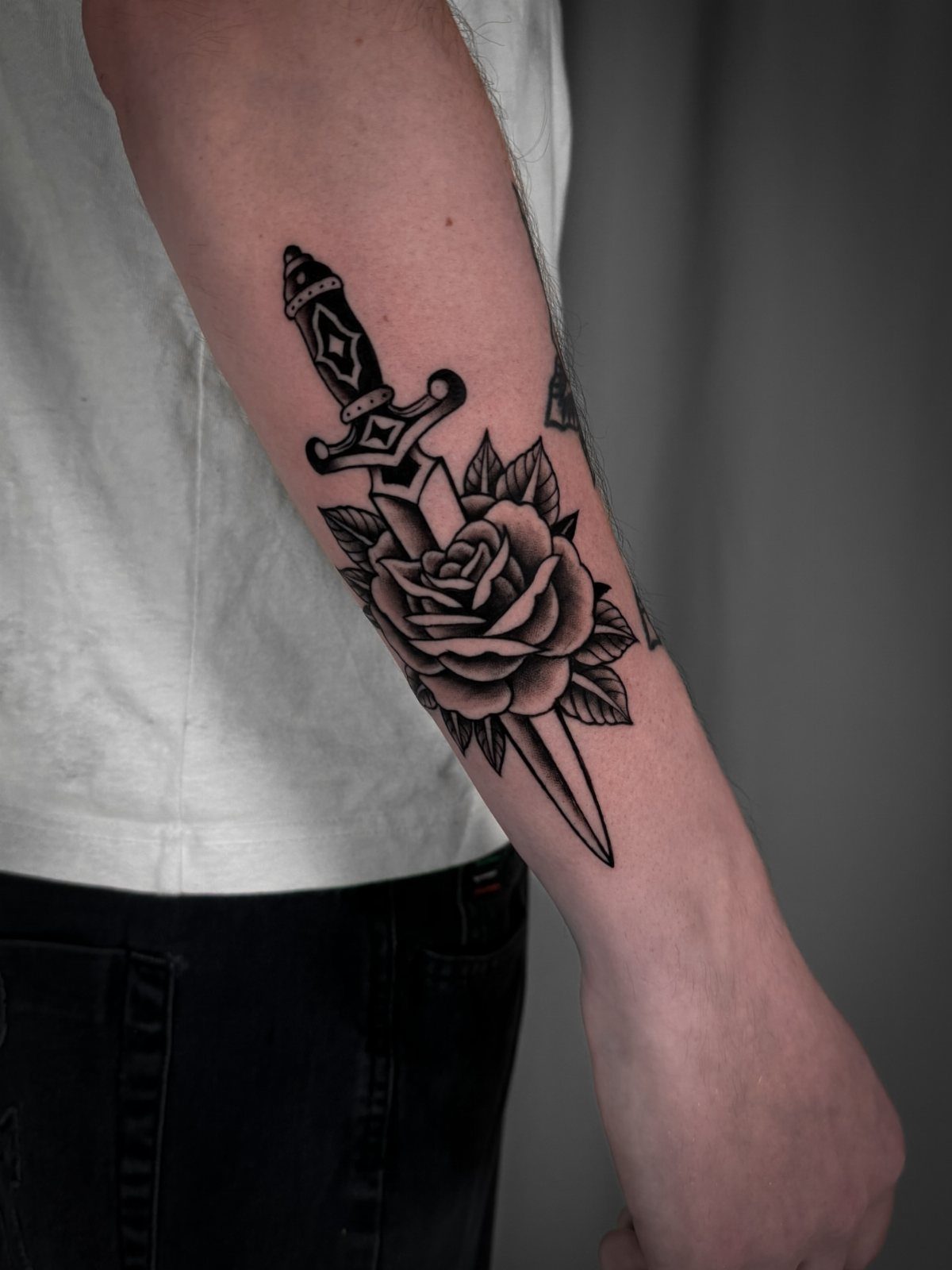
A rose wrapped around a dagger gives you a design that balances beauty and edge. The stem coils around the blade, and the contrast between soft petals and hard metal makes the image hold tension even when it sits still.
Black ink keeps both elements readable, and placing the rose at the top of the dagger lets the composition taper naturally toward the point.
This design fits well on a forearm, where the vertical shape follows the line of the arm and the detail stays visible.
The dagger adds weight to the symbolism without requiring extra decoration, and the rose softens the blade without making it disappear.
5. Rose with Butterflies
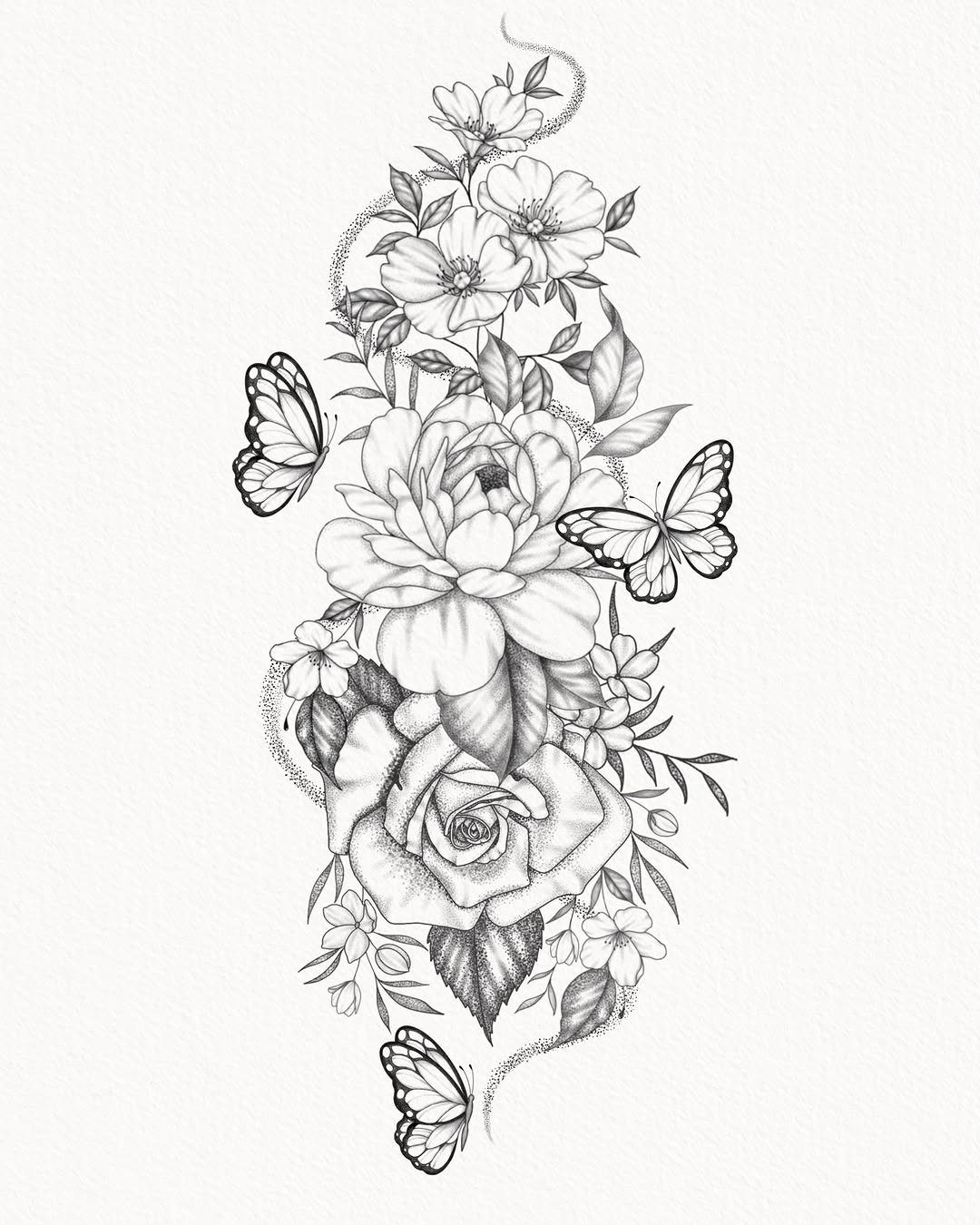
Roses grouped with butterflies give you a design that adds movement to a floral piece.
The butterflies break up the symmetry and keep the eye traveling across the composition, and the contrast between grounded blooms and hovering wings makes the tattoo feel less static.
Black and white line work keeps the design readable at a distance, and spacing the butterflies around the roses rather than clustering them in one spot keeps the layout balanced.
This version works well on the thigh, ribs or upper back, anywhere you have room for a larger design that can spread horizontally.
The pencil sketch look softens the edges and gives the tattoo a hand-drawn quality that holds up as the ink settles.
6. Rose with Pocket Watch
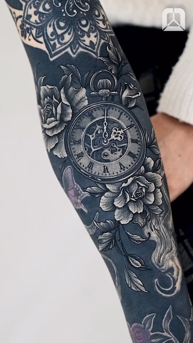
A pocket watch surrounded by roses gives you a design that layers time with growth.
The watch face sits in the center, and the roses frame it without covering the detail on the dial. Black and grey shading adds depth, and fine texture control keeps the piece readable even over existing ink.
The watch and roses use contrast to stand out, the shading giving the piece depth against the skin. If you’re covering old work, this approach lets you build a detailed piece without removing the base layer first.
A mandala above the watch adds structure and balances the composition vertically, keeping the design from feeling bottom-heavy.
Tattoo Styles
Line art gives you a rose that stays readable as the ink settles. Black outlines alone, no fill, keep the design crisp and prevent the petals from bleeding together over time.
Swirling leaves and ornate flourishes around the bloom add detail without requiring shading, and the vertical stem makes the composition easy to place along a forearm or ribcage.
Shaded designs add depth by layering black and grey tones across the petals.
This approach works well for realistic roses where the bloom needs to look dimensional, but it requires more time under the needle and a larger surface area to show the gradation clearly.
Minimalist versions strip the rose down to a few clean lines, no texture or decoration. The bloom and stem alone, sometimes with one or two leaves, give you a design that fits smaller placements and reads clearly from a distance.
Symbolism of Rose Tattoos
Red roses hold the most direct link to romantic love and passion. The color itself carries the association, and pairing a red rose with text or a heart makes the meaning unmistakable.
Pink softens the message. A light pink rose leans toward admiration or gratitude rather than intensity, and pairing 2 roses in different shades, deep magenta alongside pale pink, lets you layer meanings without adding other elements.
Black ink alone removes color symbolism entirely.
Without red or pink, the rose becomes a study in form rather than emotion, and the design holds weight through line work and composition instead of relying on traditional color associations to carry the meaning.
Choosing a Design
Personal significance narrows the field faster than browsing hundreds of designs. If the rose ties to a memory, a person or a specific moment, that connection shapes the choice toward a particular style or paired element.
Placement determines size and detail level.
Realistic shading or clean line art come down to what you want the tattoo to look like years from now.
Shading can soften over time, while line work holds its clarity. Pick the style that matches the placement and the level of detail you want to keep visible.