Color choices range from single-hue green butterflies to full rainbow gradients, jewel tones, galaxy-inspired purples and blues, and bold primary shades.
1. Watercolor Butterfly Tattoo
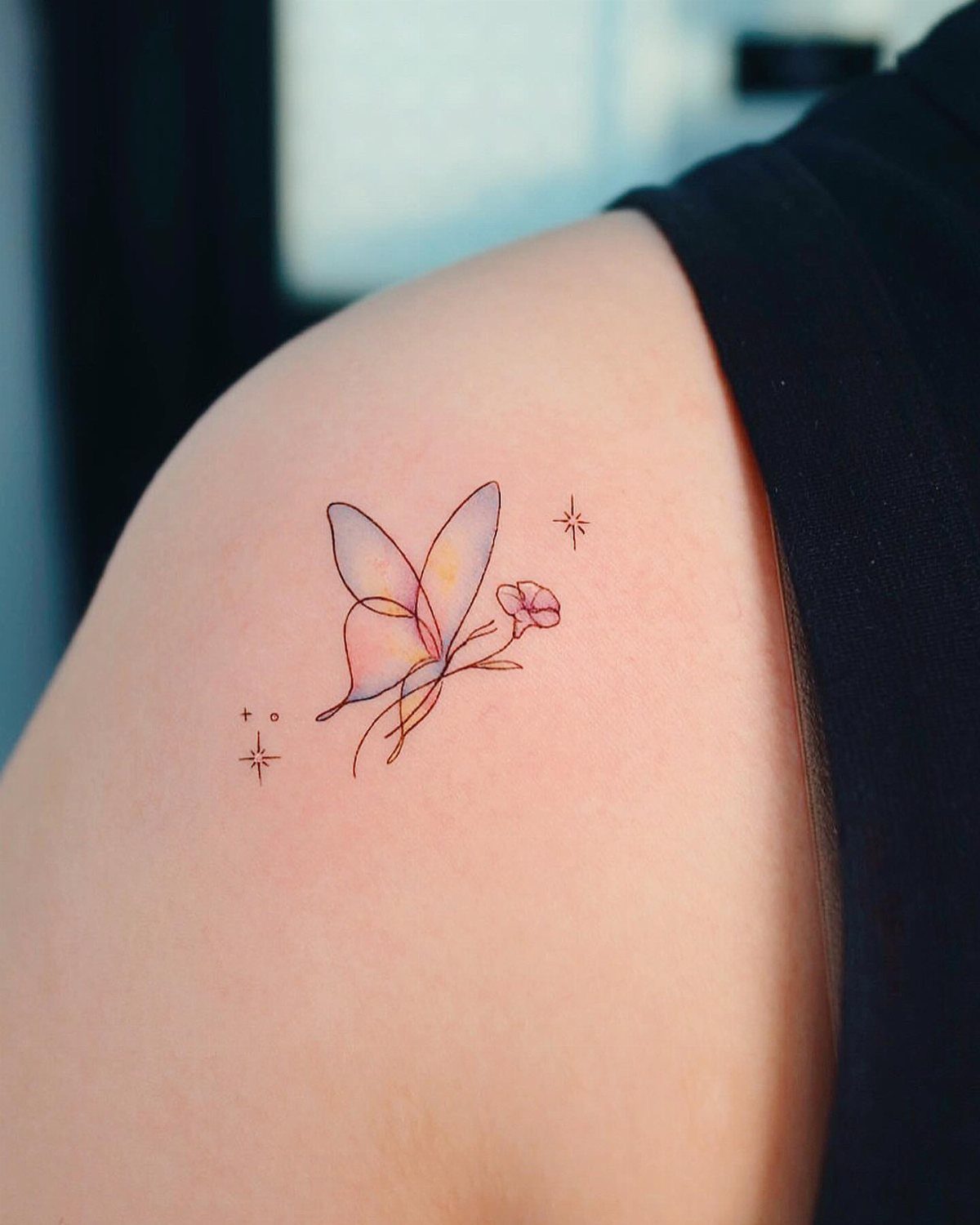
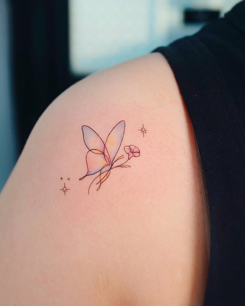
The color bleeds outward from the wings the way paint spreads on wet paper, no hard edges anywhere. That soft, diffused look gives the butterfly a sense of lightness, like it just landed and might drift away any second.
Watercolor tattoos lose their brightness sooner than solid ink because the color sits in thin layers without a black outline to hold it together. Sunscreen helps slow the fade, but expect the wash effect to soften over time.
Best on the shoulder, upper arm, or thigh where the skin stays mostly flat and the design has room to breathe.
2. Butterfly Tattoo with Vibrant Flowers
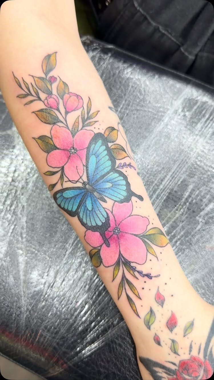
Flowers around a butterfly give the design a natural setting instead of leaving the insect floating in empty space.
The blue wings stand out against pink and yellow petals, and the green leaves fill the gaps so the layout stays clean.
This works well on the forearm because you can arrange the flowers to follow the curve of your arm, with the butterfly perched at the center or slightly off to one side.
The color contrast keeps each element readable even as the tattoo ages.
For more visual weight, add a second butterfly or expand the florals toward the wrist. A single butterfly makes the composition tighter.
3. Butterfly Tattoo with Bold Primary Colors
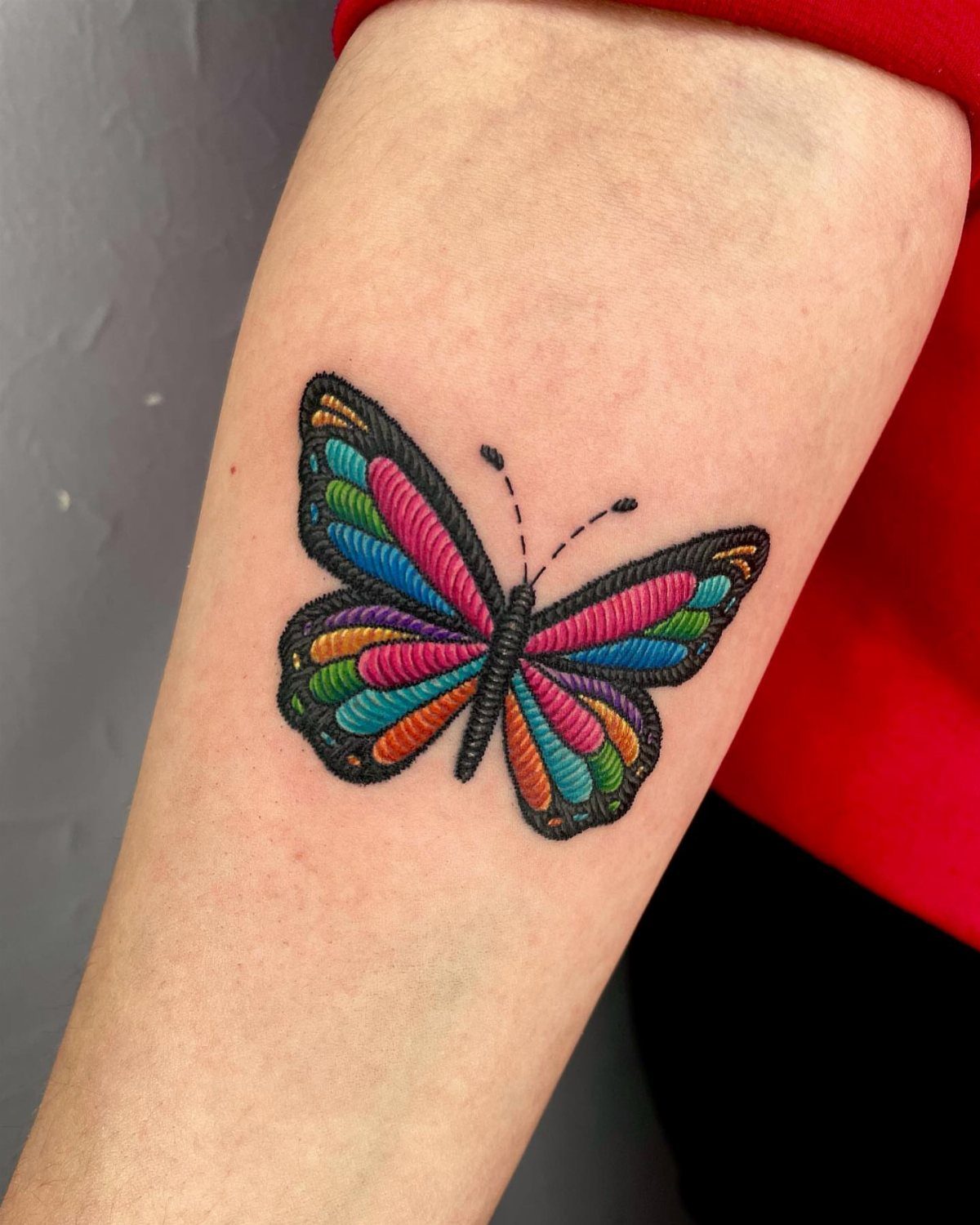
Red, blue, yellow, orange: the kind of saturation that reads at a distance. The black outline around each color section keeps the hues from bleeding into each other and adds structure even when the ink settles.
Bold color holds up better over time than delicate shading because there’s more pigment in the skin to start with. The brightness holds for years, though reds tend to lose intensity sooner than blues and yellows.
Size matters here.
Go too small and the individual color blocks start to blur together as the tattoo ages. Go bigger if your placement allows it.
4. Butterfly Tattoo with Jewel-Tone Wings
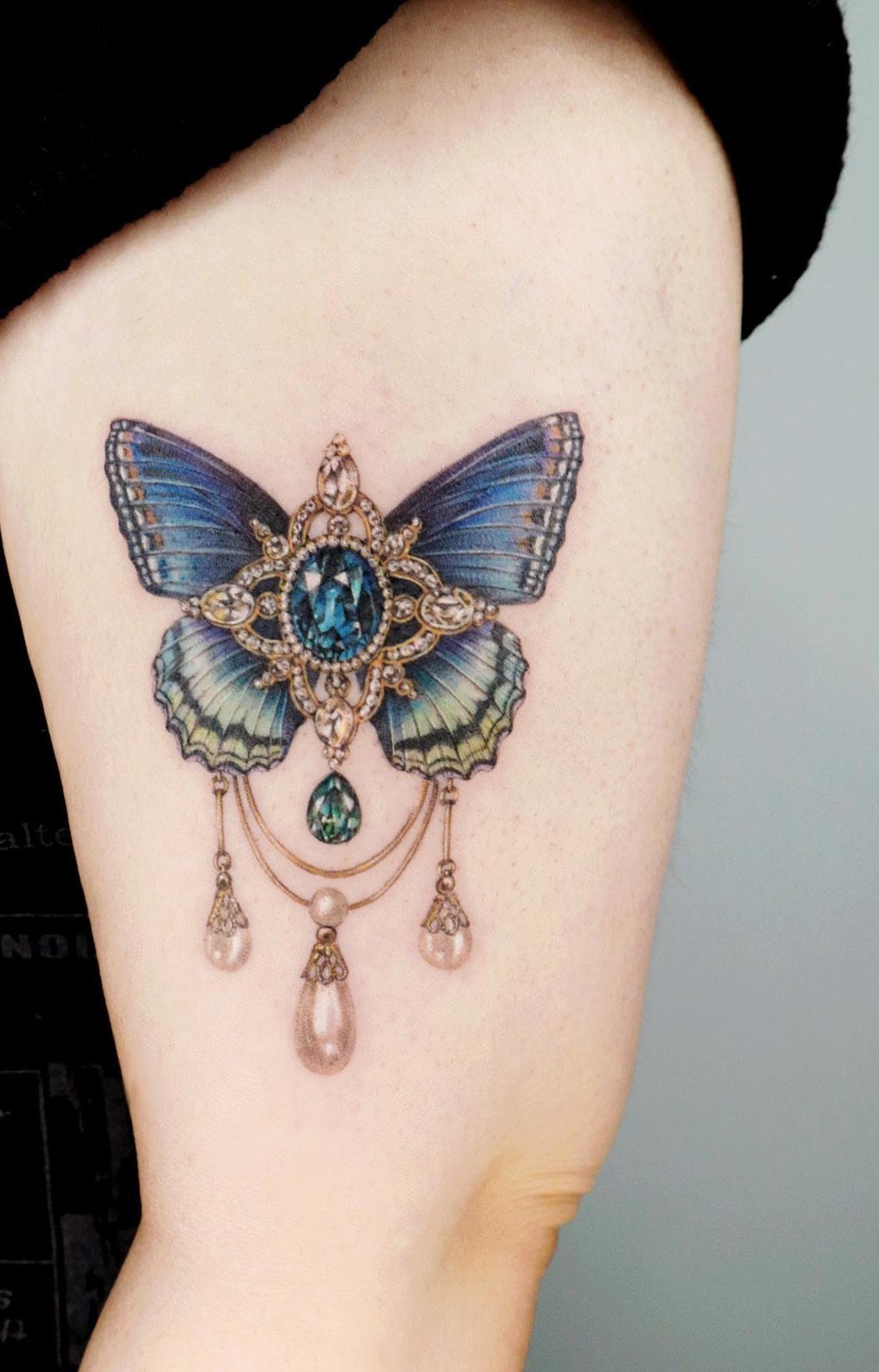
The wings carry deep blue and teal tones that mimic sapphire and emerald, and the gold jewelry detail running down the center adds an ornamental layer that lifts the design past a plain butterfly.
Jewel tones sit darker in the skin than pastel or neon shades, so this style reads well on deeper skin tones where lighter colors might not show as clearly.
The hanging pearls and gold filigree give the piece a finished, decorative quality without needing a background or additional elements.
Placement on the upper arm lets the vertical jewelry detail align with the natural line of your limb. The design stays compact but still carries enough detail to justify the color investment.
5. Small Blue and Pink Butterflies Tattoos
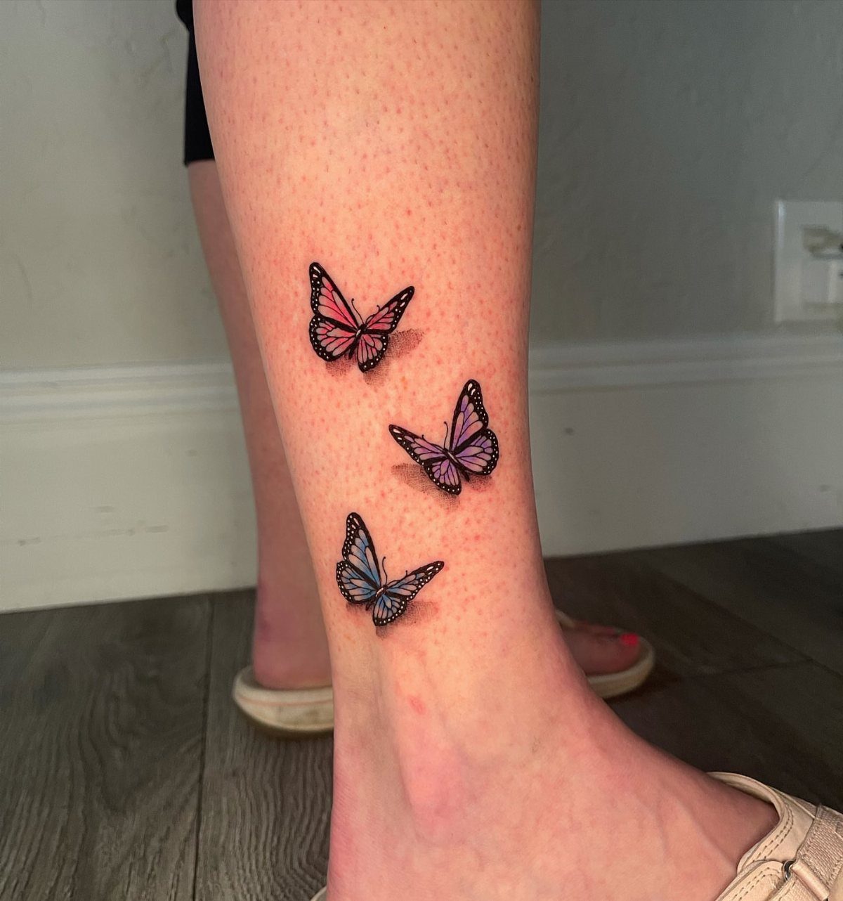
3 small butterflies in soft blue, pink, and purple scattered across the ankle and lower leg. Each one sits at a slightly different angle, which keeps the arrangement from feeling too rigid or evenly spaced.
Small multiples work well when you want color without committing to a large piece. The ankle placement shows the tattoos when you wear shorts or skirts, and you can hide them easily with pants or longer hemlines.
Keeping each butterfly under 2 inches means less pain during the session and faster healing. The thin skin around the ankle does make touch-ups more likely after a few years.
6. Vibrant Colourful Butterfly Tattoo with Rainbow Wings
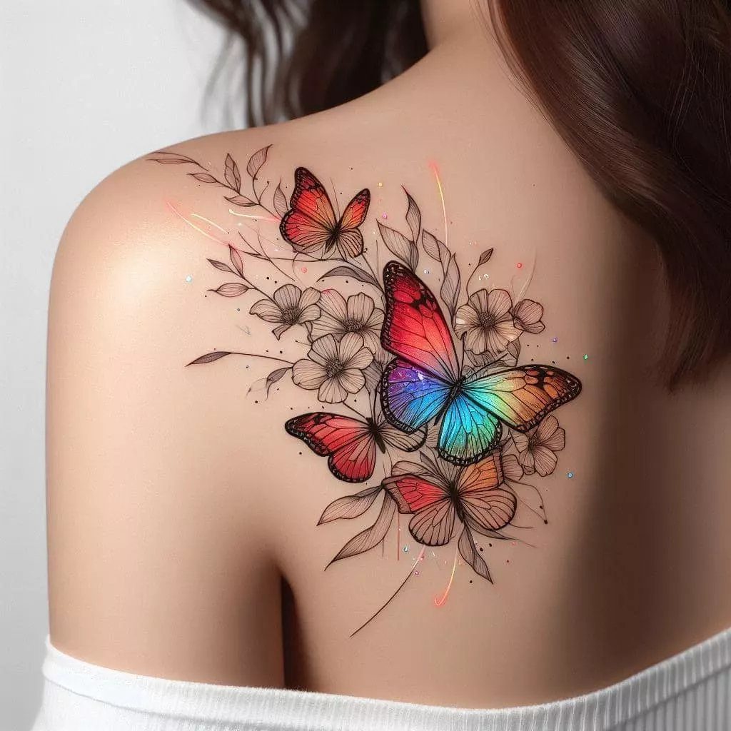
One butterfly carries red, orange, yellow, green, blue, and purple across its wings in smooth gradients, while the surrounding butterflies and flowers stay outlined in black without any fill.
That contrast puts all the attention on the rainbow wings and keeps the design from feeling too busy.
Mixing one fully colored element with several line-art pieces gives you the impact of color without covering too much skin in saturated ink. The black outlines around the florals frame the rainbow butterfly and make the color pop harder.
This layout works on the shoulder or upper back where you have enough flat space to spread the line-art elements around the central butterfly.
Smaller placements force you to shrink everything down, and the rainbow effect loses clarity once you size it down too far.
7. Butterfly Tattoo with Mixed Color Splashes
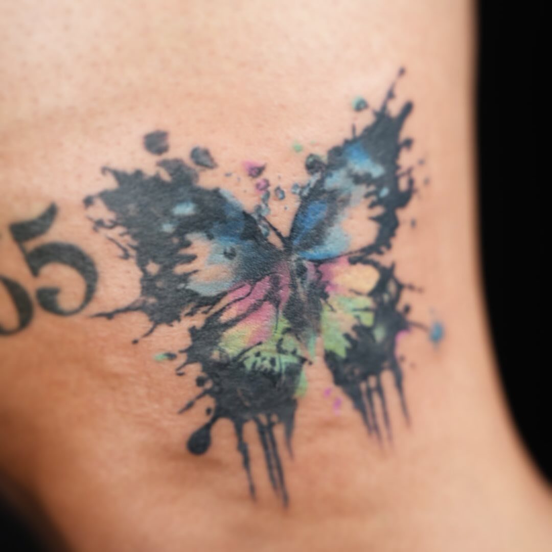
Color spills out past the butterfly’s body in loose drips and splatters, like the tattoo happened mid-splash. The effect softens the edges and gives the piece a looser, more painterly feel than a clean outline would.
The black drips add contrast and keep the color from floating without an anchor. Without them, the design can read as unfinished rather than intentional.
This style works best on flat areas like the upper arm or thigh where the splatters have room to spread without wrapping around curves. Smaller placements compress the splashes and lose the spontaneous effect.
8. Butterfly Tattoo with Galaxy-Inspired Wings
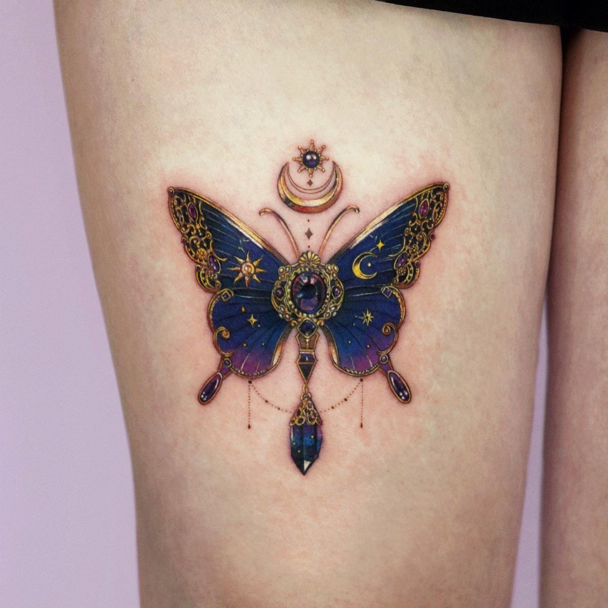
The wings carry deep purples and blues swirled together like nebula clouds, with small white dots mimicking stars scattered across the surface.
The crescent moon and hanging crystal add a mystical layer that ties the piece to celestial themes beyond the butterfly itself.
Galaxy wings give you rich color without bright, saturated tones, so the design stays visible on deeper skin tones while keeping a softer overall look. The purple-to-blue gradient holds up well over time because both colors fade at similar rates.
Placement on the outer thigh lets you size the butterfly large enough to show the star details clearly.
9. Dreamcatcher Butterfly Tattoo
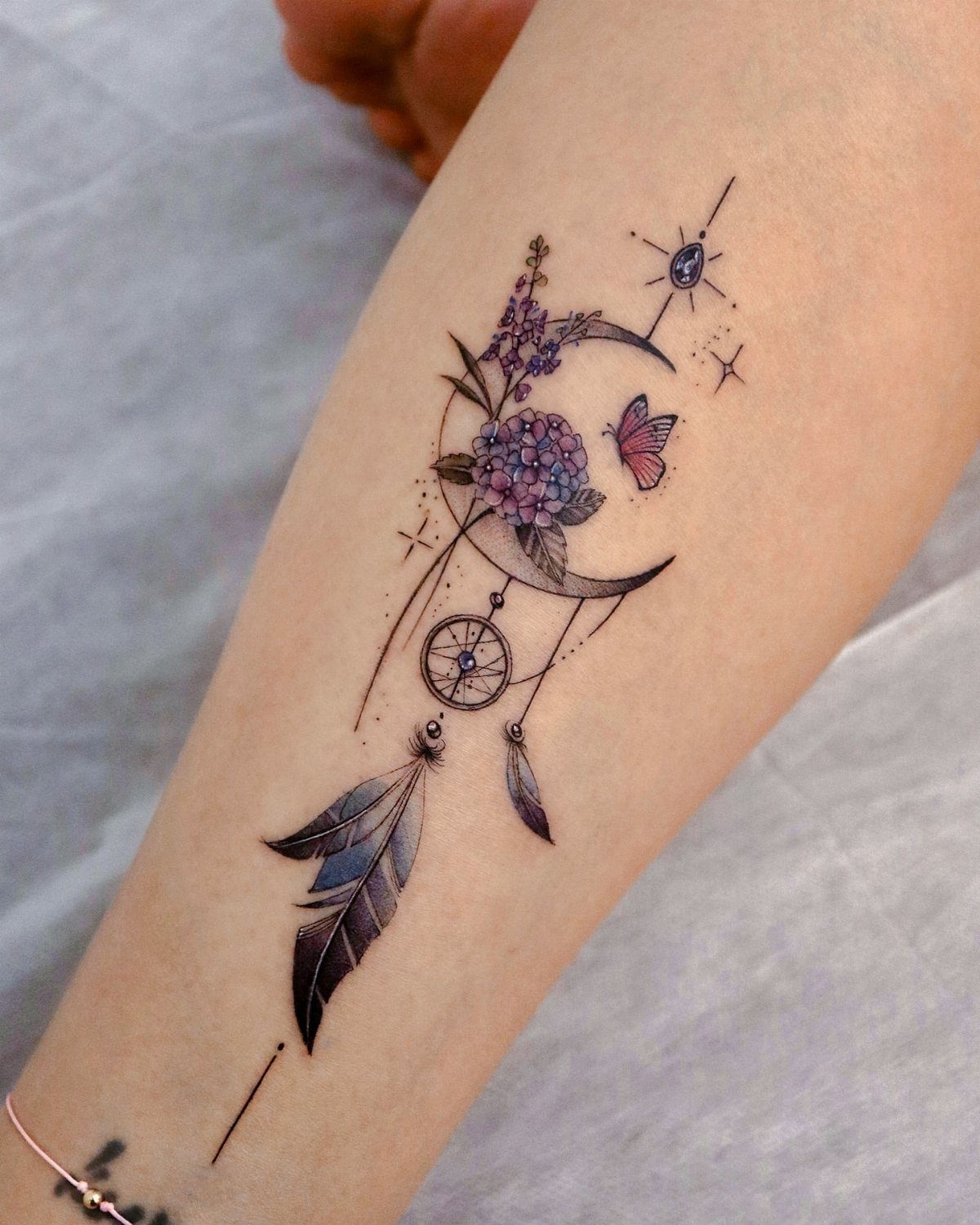
The butterfly can sit above the dreamcatcher or woven into the web itself, and adding flowers or a crescent moon between them ties the symbols together visually.
Each element carries its own symbolism, but together they build a cohesive piece that ties protection, transformation, and nature into one design.
The dreamcatcher’s web and feather add vertical length, which suits placements on the forearm or outer calf where you have room to let the composition stretch.
The pink butterfly contrasts against the purple flowers, so each piece stays readable even when the colors settle.
Add more flowers or a second butterfly if you want to expand the design later.
10. 3D Butterfly Tattoo
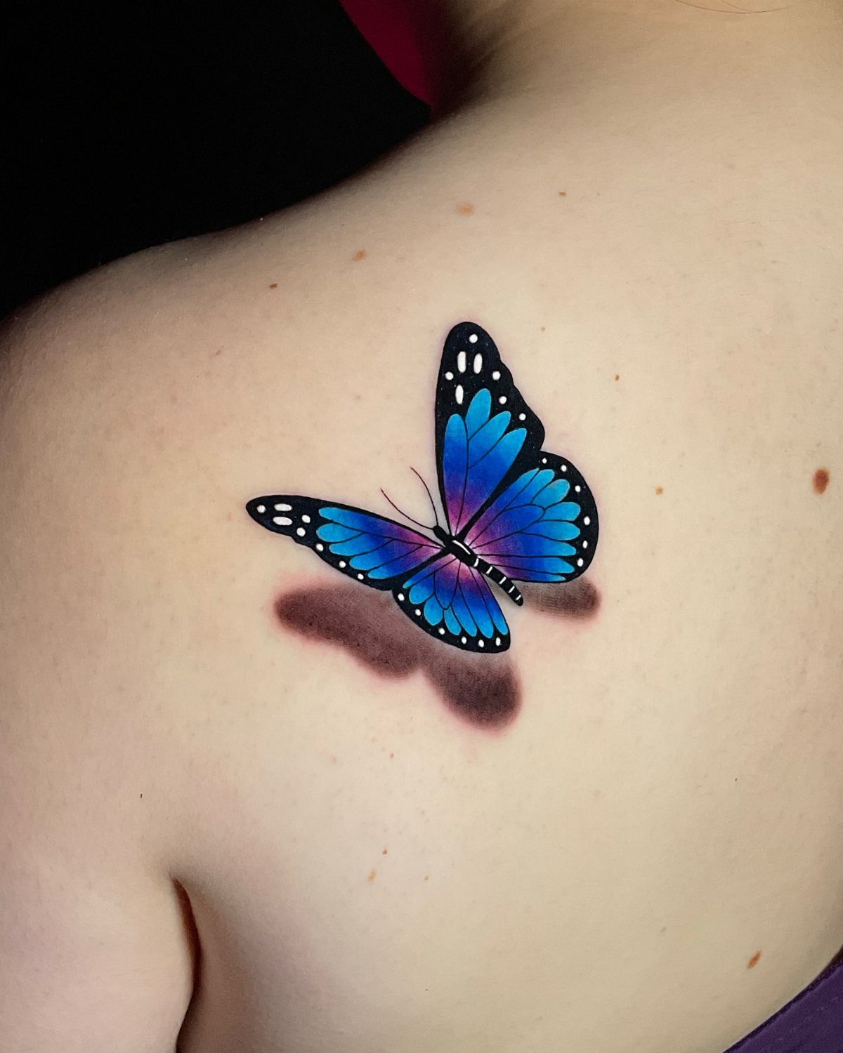
The drop shadow sits directly under the wings and gives the butterfly a lifted, three-dimensional quality, like it just landed on your skin and could lift off again.
The purple and blue gradient across the wings adds depth, and the shadow anchors it to your body instead of letting it float.
This effect only works when the shading stays consistent and the artist places the shadow in a logical direction. Overhead lighting makes the most sense, so the shadow falls straight down.
Upper back placement keeps the design flat and centered, which helps the 3D effect read clearly.
11. Traditional Colorful Butterfly Tattoo
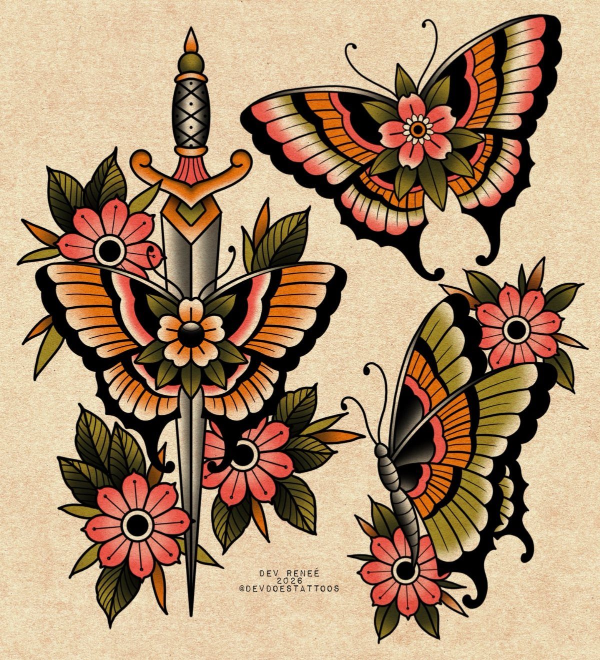
Bold black outlines, solid color fills, and minimal shading. Traditional tattoos hold their shape better than softer styles because the heavy outlines stay visible even as the color fades, and the high-contrast palette keeps each section distinct.
The flowers and dagger add symbolic weight to the butterflies and fill the space around them without crowding the design. Red, yellow, and green dominate the palette because those colors hold their brightness longest in traditional work.
Traditional pieces look best when sized large enough to show the clean lines clearly, usually 4 inches or wider.
12. Butterfly with Eye Tattoo
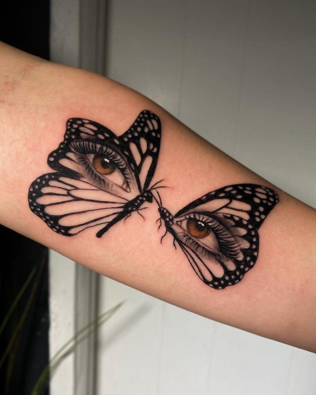
Each butterfly wing holds a realistic brown eye that stares outward, replacing the usual wing pattern with something unsettling and attention-grabbing. The eyes give the design a surreal quality that pushes past the typical beauty associated with butterflies.
This reads as either deeply symbolic or purely visual depending on what you bring to it. Some people connect it to themes of awareness or being watched; others just like the strange contrast.
The forearm placement keeps both eyes visible at once, which strengthens the impact. Split the butterflies across 2 arms and you lose that immediate double effect.
13. Memorial Butterfly Tattoo with Infinity Heart
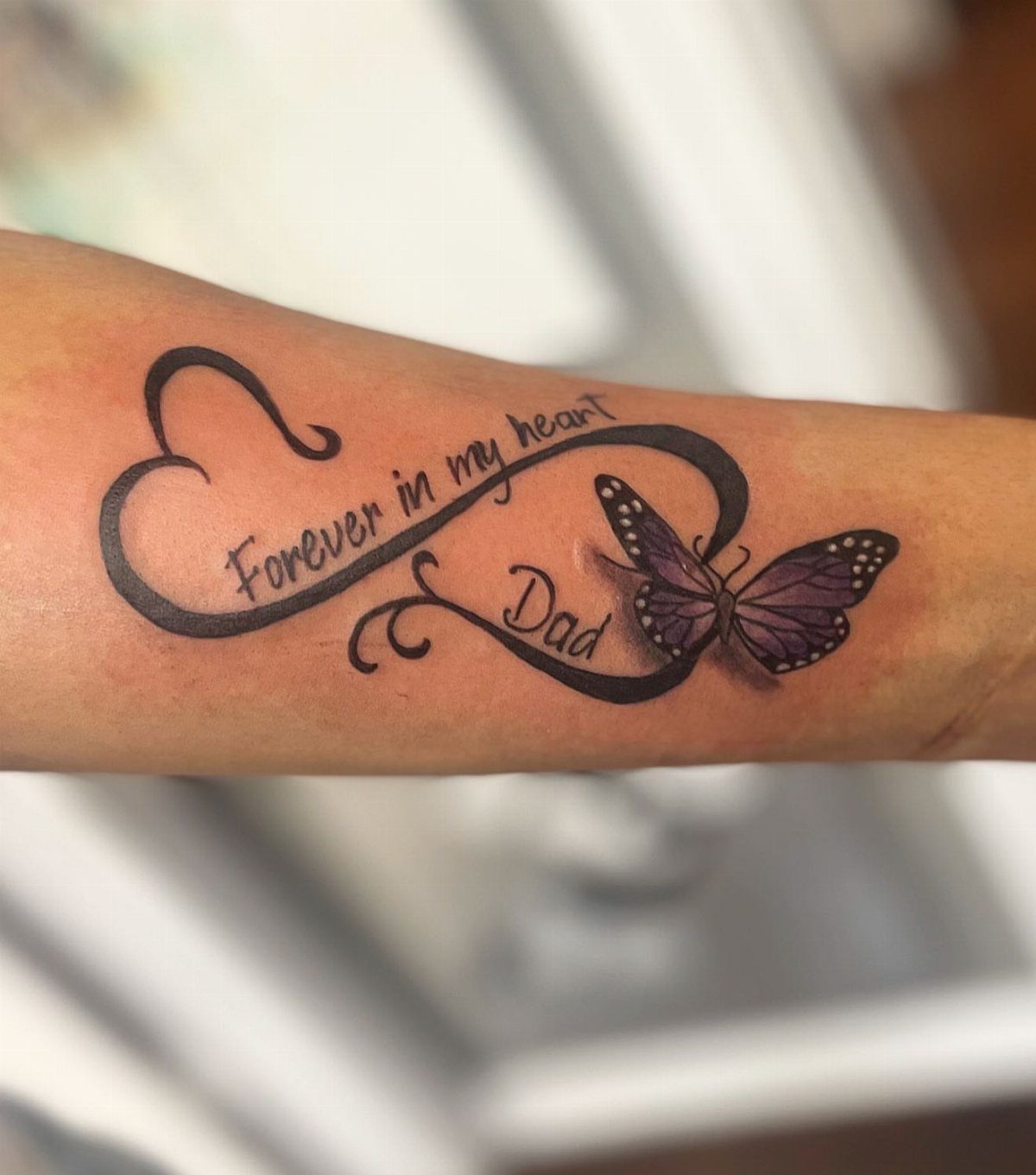
The infinity heart wraps the butterfly into a memorial design that states its purpose clearly. The purple wings soften the piece while the text and infinity symbol carry the weight of the message.
Memorial tattoos work best when the lettering stays readable, so size the script large enough to avoid blurring as the ink settles. Script fonts with too many flourishes fade into illegible shapes after a few years.
Forearm placement keeps the tattoo visible to you throughout the day, which matters when the design serves as a daily reminder.
14. Ornate Jewelry Butterfly Tattoo
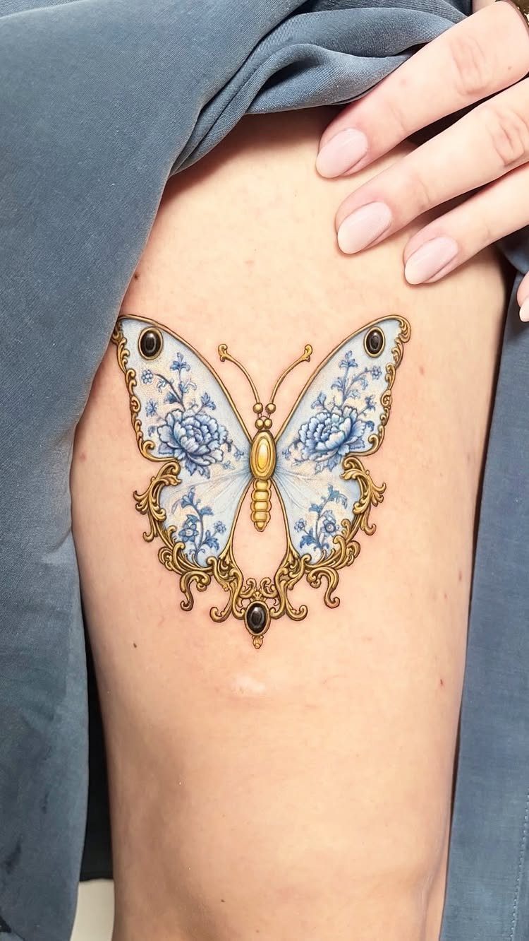
Gold filigree edges the wings and extends downward in hanging ornamental strands, turning the butterfly into a piece of decorative jewelry that sits on the skin.
The blue floral patterns inside the wings add color without competing with the gold detail.
This style needs enough space to show the filigree clearly, which makes the thigh a natural fit. Too small and the filigree starts to blur together, losing the fine metalwork that makes the piece feel precious.
The gold ink reads as warm metallic shading rather than true metallic color, since metallic tattoo inks tend to fade faster than standard pigments.
15. Geometric Butterfly Chest Tattoo
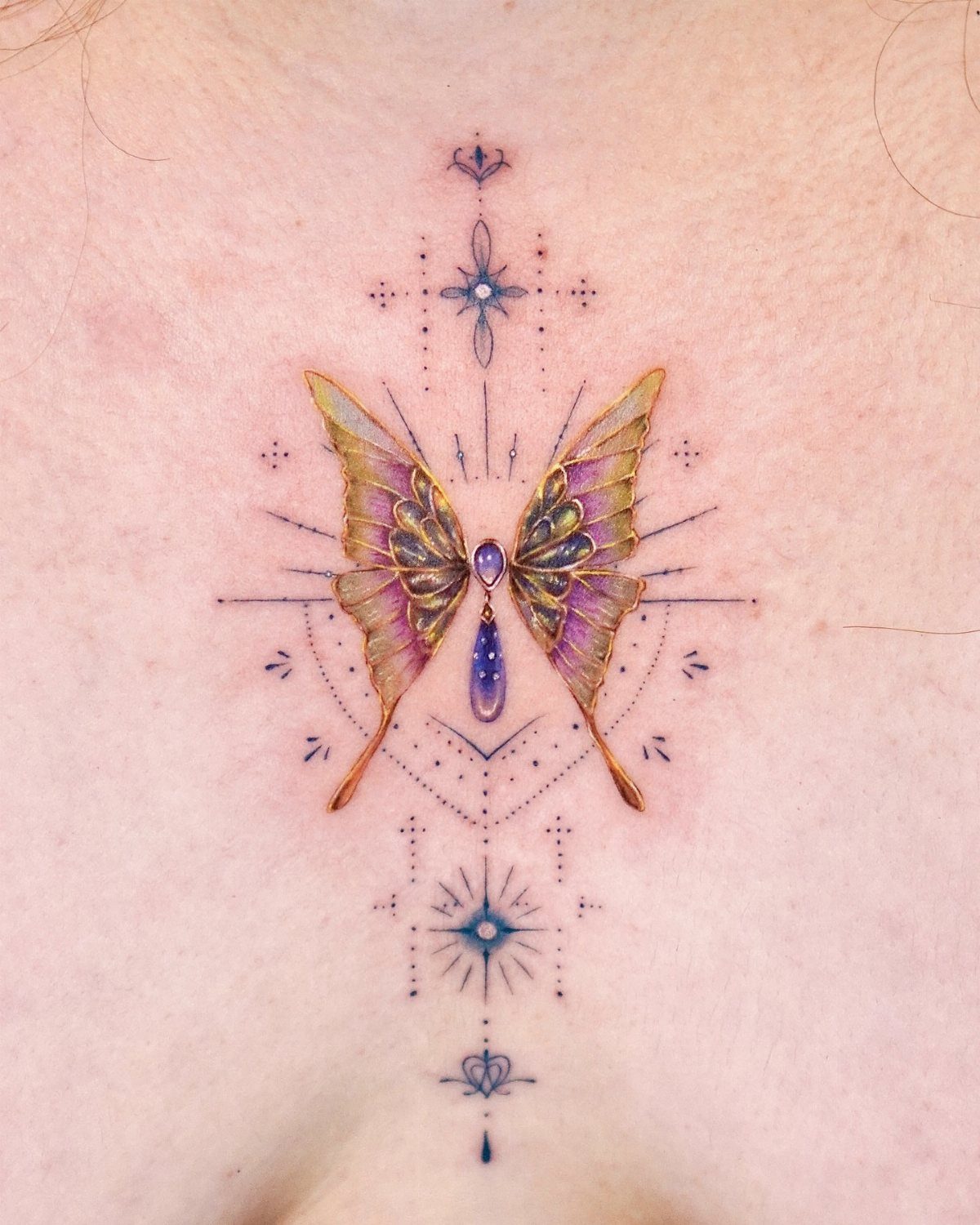
Symmetrical lines, dots, and star shapes frame the butterfly and anchor it to the center of the chest. The purple and gold wings gain structure from the geometric elements without losing their organic shape.
Chest placement lets you build symmetry around the sternum, which suits geometric designs that rely on balance. The ribs and sternum sit close to bone, so expect more discomfort during the session than you would on fleshier areas.
Keep the geometric lines thin so they age cleanly. Thick lines can blur together as the tattoo settles.
16. Forest Landscape Butterfly Tattoo
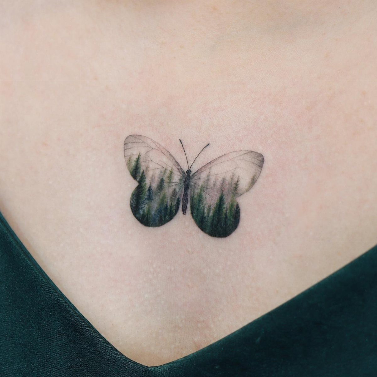
The wings hold a miniature evergreen forest instead of the usual butterfly pattern, turning the insect into a frame for a landscape.
The trees take their color from green fill, and silhouette work holds its clarity over time better than fine detail would.
Landscape-inside-butterfly designs work when the artist balances the detail inside the wings with the butterfly’s outer shape. Too much detail and the wings disappear; too little and the landscape feels empty.
Chest placement centers the design and gives the wings enough width to fit several tree rows without crowding.
17. Vibrant Green Butterfly Tattoo
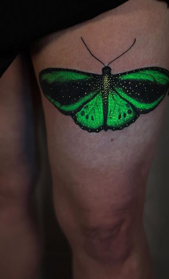
Bright green gradients fill the wings and shift from light lime to deep forest tones, while the black borders hold the shape and keep the green from bleeding outward.
Green butterflies stand out because most people choose blue, purple, or pink, so this reads as less common without requiring complex patterns or added elements.
Green ink holds its brightness well on lighter skin tones but can look muddy on deeper skin, so test the color with your artist before committing to a full fill.
Thigh placement gives the butterfly room to spread without wrapping around curves.
Symbolism of Butterfly Tattoos
Butterfly tattoos mark transitions people want to carry visibly: finishing something hard, leaving a chapter behind, choosing a direction that wasn’t available before.
The caterpillar-to-butterfly arc sits at the center of that symbolism because the change is total, not reversible, and the result looks nothing like what came before.
Freedom and hope layer in because butterflies move lightly and don’t stay in one place. That resonates with anyone who feels like they finally got unstuck or made a choice that opened things up instead of closing them down.
Femininity ties to the design’s curves and color, though plenty of men wear them. The association is cultural, not fixed.
A butterfly can look stunning on your skin whether or not you attach a personal story to it.
A butterfly can look right on your skin without representing a specific event, and the meaning can be as simple as liking the shape and what it suggests about movement and change.
Choosing Colors for Tattoos
Colors next to each other on the color wheel blend smoothly because they share pigment overlap: red into orange, blue into purple, yellow into green. That natural transition keeps gradients from looking muddy or abrupt when the ink settles.
Jumping across the wheel, like pairing blue with orange or red with green, gives you high contrast but makes blending harder.
The artist has to build a middle tone between them or leave the colors separate with black outlines holding the division.
If you want a rainbow effect across the wings, expect the artist to work through the spectrum in order rather than scattering colors randomly. That keeps the transitions readable and prevents adjacent sections from fighting each other visually.
Test the colors on your skin tone before the session if you’re unsure how a shade will read once it heals.