Butterfly tattoos on the arm range from single silhouettes to layered compositions with flowers, stars, abstract wings, or geometric accents.
The spot decides how much coverage you get and whether the design stays hidden or shows every time your hand moves. Inner arm placement shows when your arm is relaxed, outer arm catches light and stays visible through movement.
1. Small Black Ink Butterfly Silhouette on the Upper Inner Arm
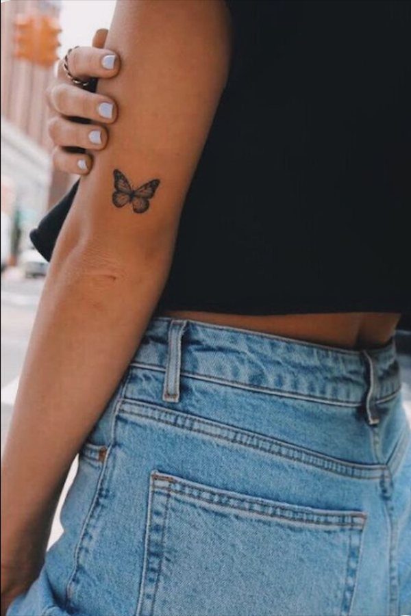
A single butterfly silhouette, small enough to fit between your bicep and inner elbow, stays discreet but readable from a few feet away.
The upper inner arm sits in what I call the soft pain zone: less bony than the wrist, more cushioned than the ribs, and most clients handle it well for a piece this size.
Black ink alone means the shape has to be confident.
If the wings lose their outline or the body blurs, the whole thing reads as a smudge after a few years, so I draw the silhouette with a single clean pass and keep the line weight consistent.
The spot hides under most sleeves and shows when you want it to. If you’re testing whether you like living with a tattoo, this is a low-commitment place to start.
2. Butterfly Arm Tattoo with Flowing Flight Path
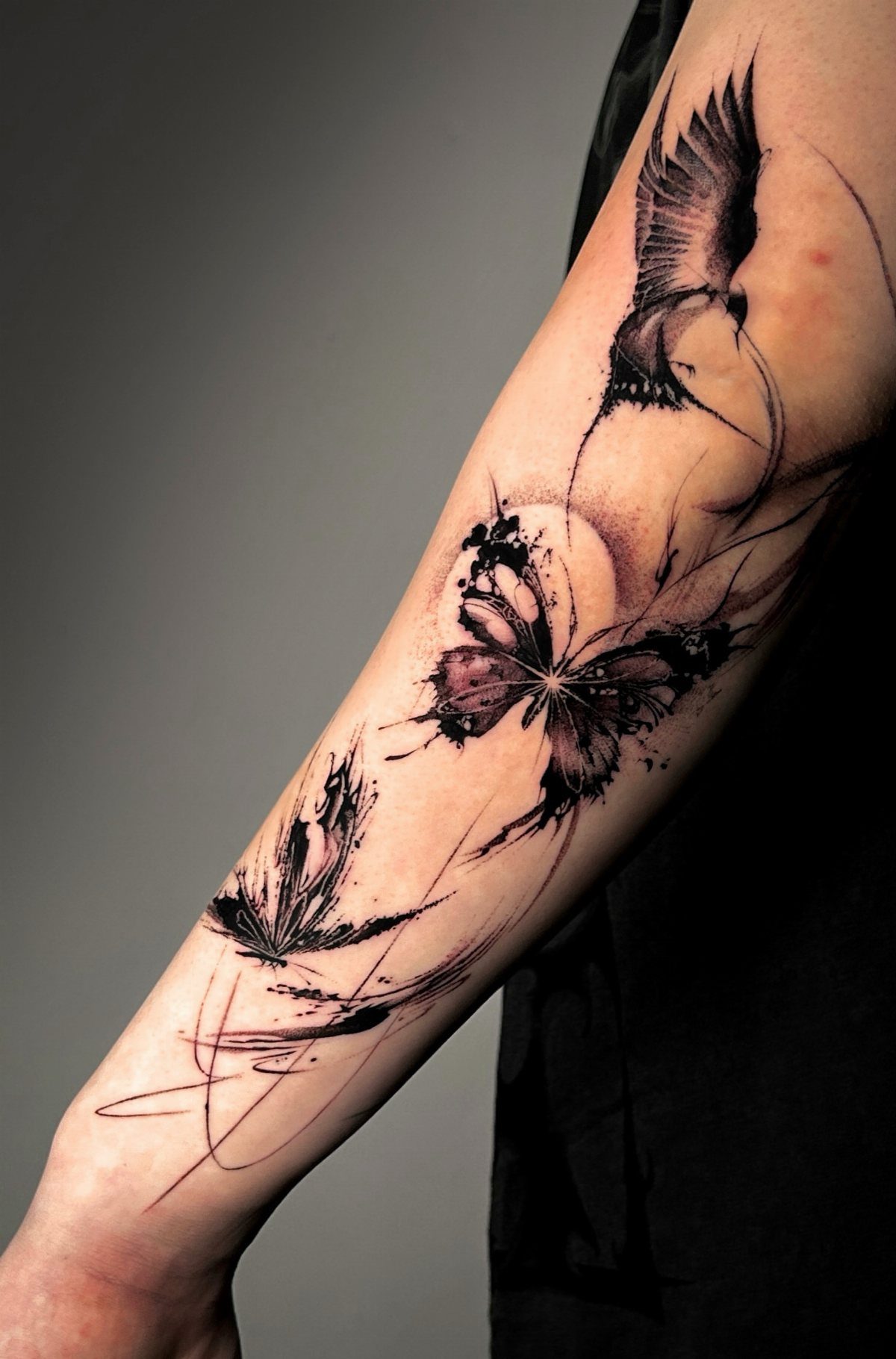
A flight path adds context: the butterfly didn’t just land on your arm, it moved through space to get there.
The trail can be a simple curved line, a scatter of smaller shapes, or abstract marks that suggest motion without spelling it out.
Pairing the butterfly with a bird shifts the read.
Two species, two flight styles, and the line between them can show a shared journey or a crossing of paths. I keep the trail light so it supports the main figures instead of pulling focus.
This version works best when the arm is extended. If the design wraps or bends with your elbow, the path can look broken when your arm is at rest.
3. Butterfly Arm Tattoo with Split Wing Design
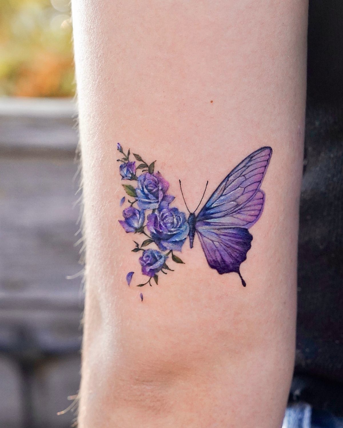
Split wing designs let you say 2 things at once. One side realistic, the other built from roses or geometric shapes, and the contrast makes both halves more visible than they would be on their own.
The challenge is balance. If one wing has dense shading and the other is all linework, the weighted side pulls the eye and the piece feels lopsided.
I match the visual weight by keeping both wings to similar levels of detail, even when the styles differ.
Placement matters more here than with a symmetrical butterfly. The forearm offers enough flat surface to show both wings clearly, while a curved spot like the bicep can hide one side depending on how you hold your arm.
4. Mid-Flight Butterfly Arm Tattoo
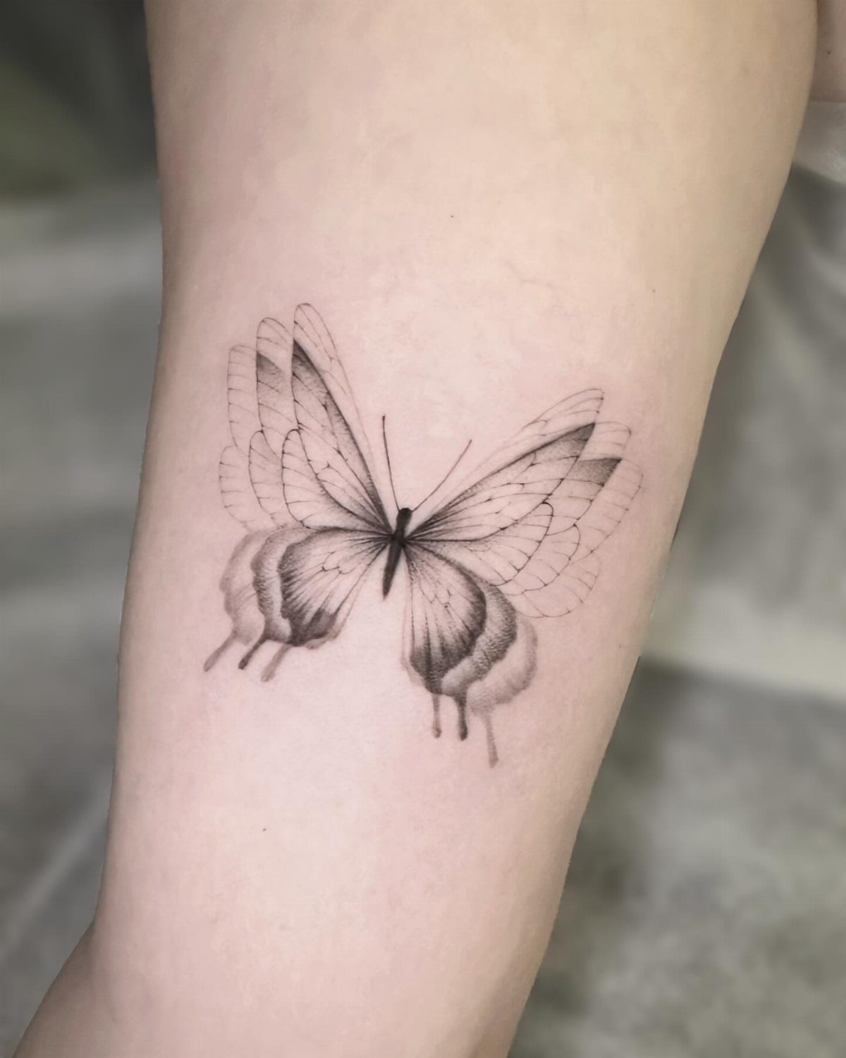
Mid-flight posture changes the shape.
Wings angled back, body slightly tilted, and the whole silhouette reads as motion instead of a specimen pinned flat. The difference is subtle but enough that the design feels alive rather than static.
I angle the butterfly slightly upward on the forearm so it appears to be climbing. If it points down, the read shifts to landing or falling, which changes the feeling entirely.
If you want the symbolism of transformation but nothing too delicate or decorative, this approach lands exactly there. The active posture gives it a bit more edge.
5. Butterfly Arm Tattoo with Abstract Wing Art
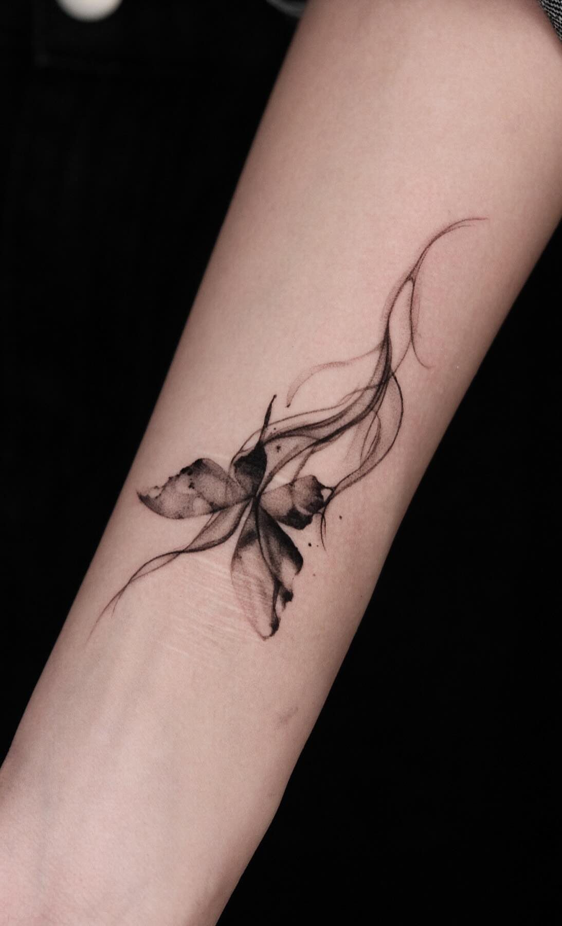
Abstract wings trade realism for movement.
Instead of veins and scales, the wings dissolve into loose marks, splashes, or fragments that suggest the shape without defining every edge. The butterfly is recognizable but not literal.
This style ages differently than fine line realism.
The abstract marks can soften over time, but since they were never precise to begin with, the loss of sharpness doesn’t hurt the design the way it would with a detailed wing pattern.
Best suited for clients who already have other abstract or watercolor work. If the rest of your ink is traditional or realism, an abstract butterfly can look out of place.
6. Butterfly Arm Tattoo with Layered Linework
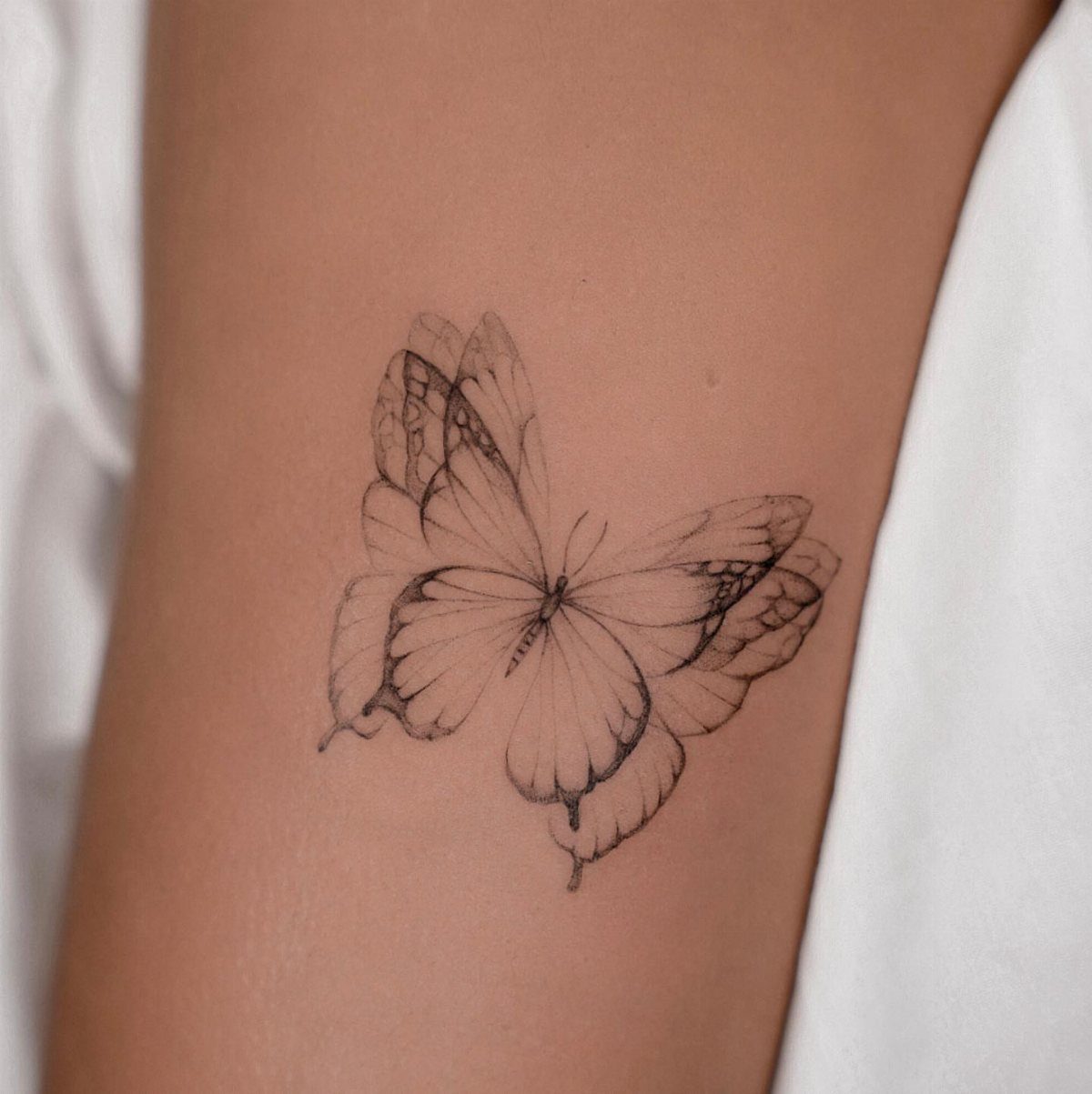
Layered outlines build depth with no shading at all. Each line sits slightly offset from the last, and the repetition gives the wings a sense of dimension and motion blur.
The effect is delicate but holds up better than single-line work because if one line fades, the others still define the shape.
The forearm is the right spot for this. The layered lines need flat skin to read clearly, and any curve or texture in the placement can make the offsets look uneven.
This version takes longer than a simple silhouette because each outline has to be drawn separately with consistent spacing. If the gaps vary, the effect falls apart.
7. Butterfly Arm Tattoo with Soft Motion Blur Wings
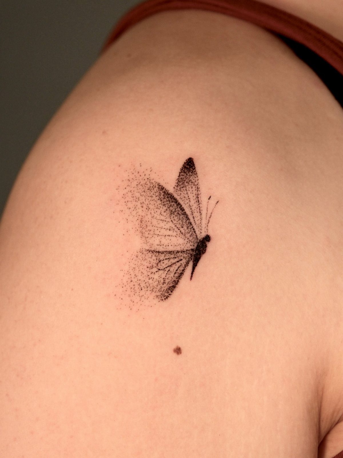
Motion blur softens one edge of the wing, usually just one side, so the butterfly looks like it’s moving through the frame instead of sitting still.
The blur is done with stippling or a gradient fade, and it has to be subtle or the whole wing disappears into nothing.
This effect works best on the upper arm where the skin is smooth and the design sits flat. Any texture or movement in the placement can make the blur look accidental instead of intentional.
If you’re after something that feels active without adding a full flight path or second butterfly, this is a cleaner option.
8. Butterfly Arm Tattoo with Fading Wing Effect
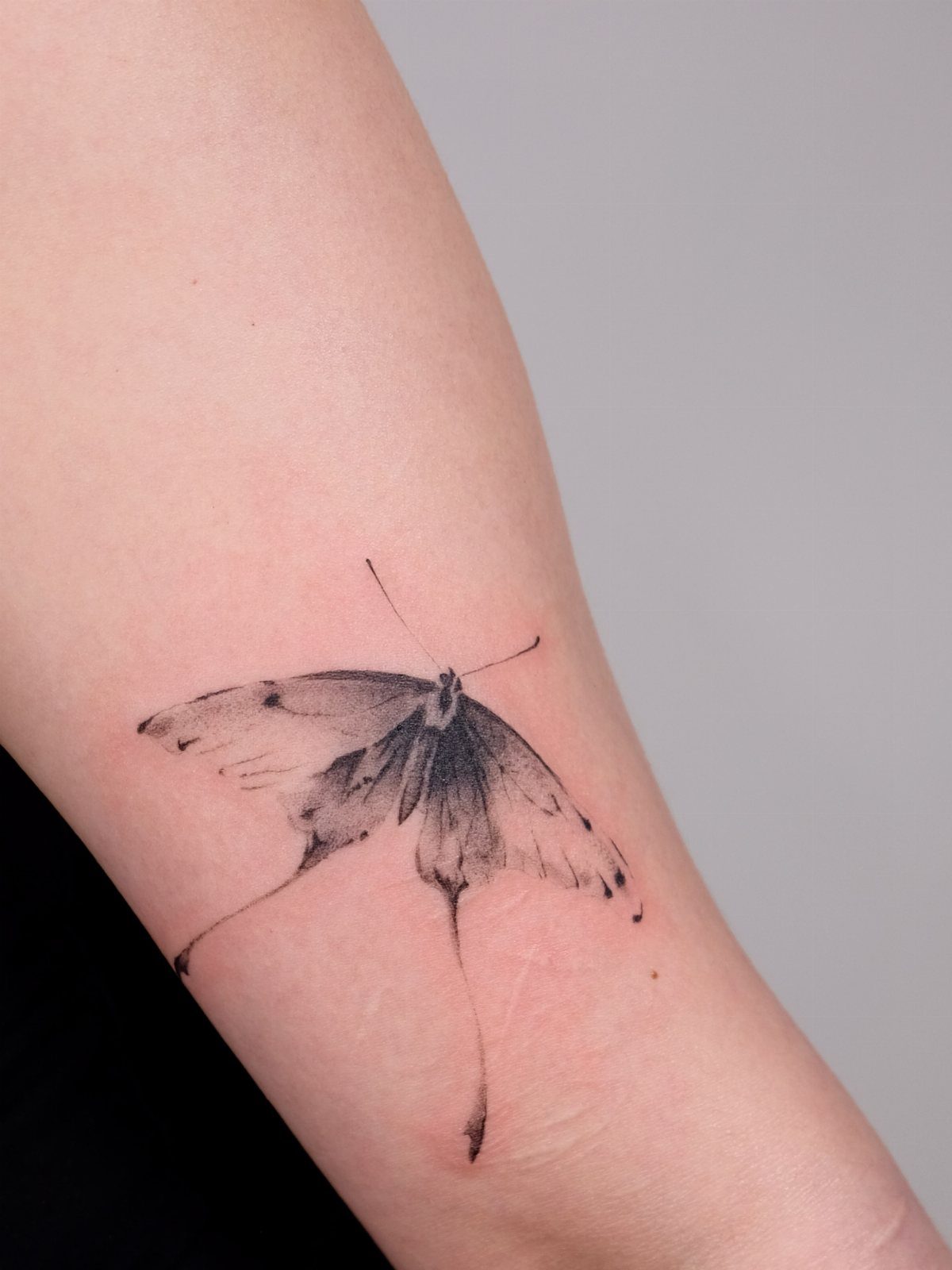
Fading wings step down from solid black at the body to nearly transparent at the tips.
The gradient gives the butterfly a sense of lightness, like it’s barely touching down, and the ink saves time since there’s less filling to do.
The fade has to be consistent across both wings or the design looks unfinished. When one wing carries most of the detail and the other fades too far, the whole design lists to one side.
This version ages well because there’s no fine detail to lose. As the ink settles, the gradient softens further, but the shape stays intact.
9. Butterfly Arm Tattoo with Artistic Brush Strokes
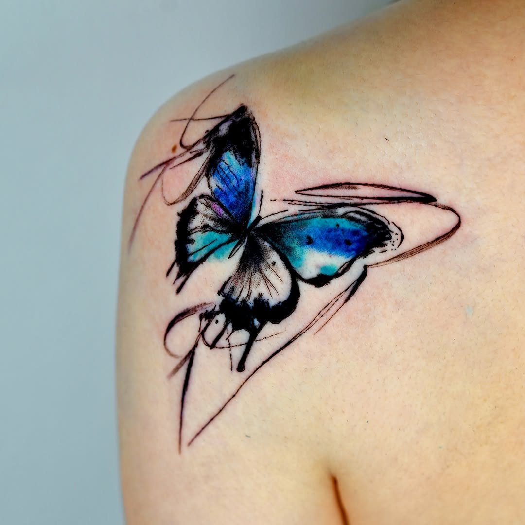
Brush stroke wings mimic the texture of paint dragged across canvas. The lines are thicker in some spots, thinner in others, and the uneven edges give the design a looser, more artistic feel than a clean outline.
Color turns up more often in this style than in minimal single-line designs.
Blue, red, or purple can sit inside the strokes without looking out of place, and the painted texture helps soften bright ink so it doesn’t read as harsh.
Upper arm placement gives you the most room for wide, expressive strokes. The forearm works too, but the narrow width can compress the design and lose some of the brush effect.
10. Butterfly Arm Tattoo with Geometric Accents
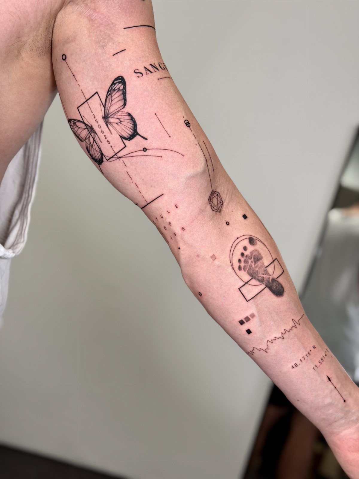
Geometric accents anchor the butterfly to a framework. Circles, triangles, or dotwork grids sit around or behind the wings, and the hard geometry sharpens the soft shape of the insect.
The geometry needs to be simple.
Too many intersecting lines and the butterfly gets lost in the structure. I stick to 2 or 3 shapes and keep them light so they frame rather than compete.
This style pairs well with other geometric ink. If you already have dotwork or sacred geometry on your arm, adding a butterfly this way ties the pieces together without forcing them to match exactly.
11. Butterfly Arm Tattoo with Angled Placement
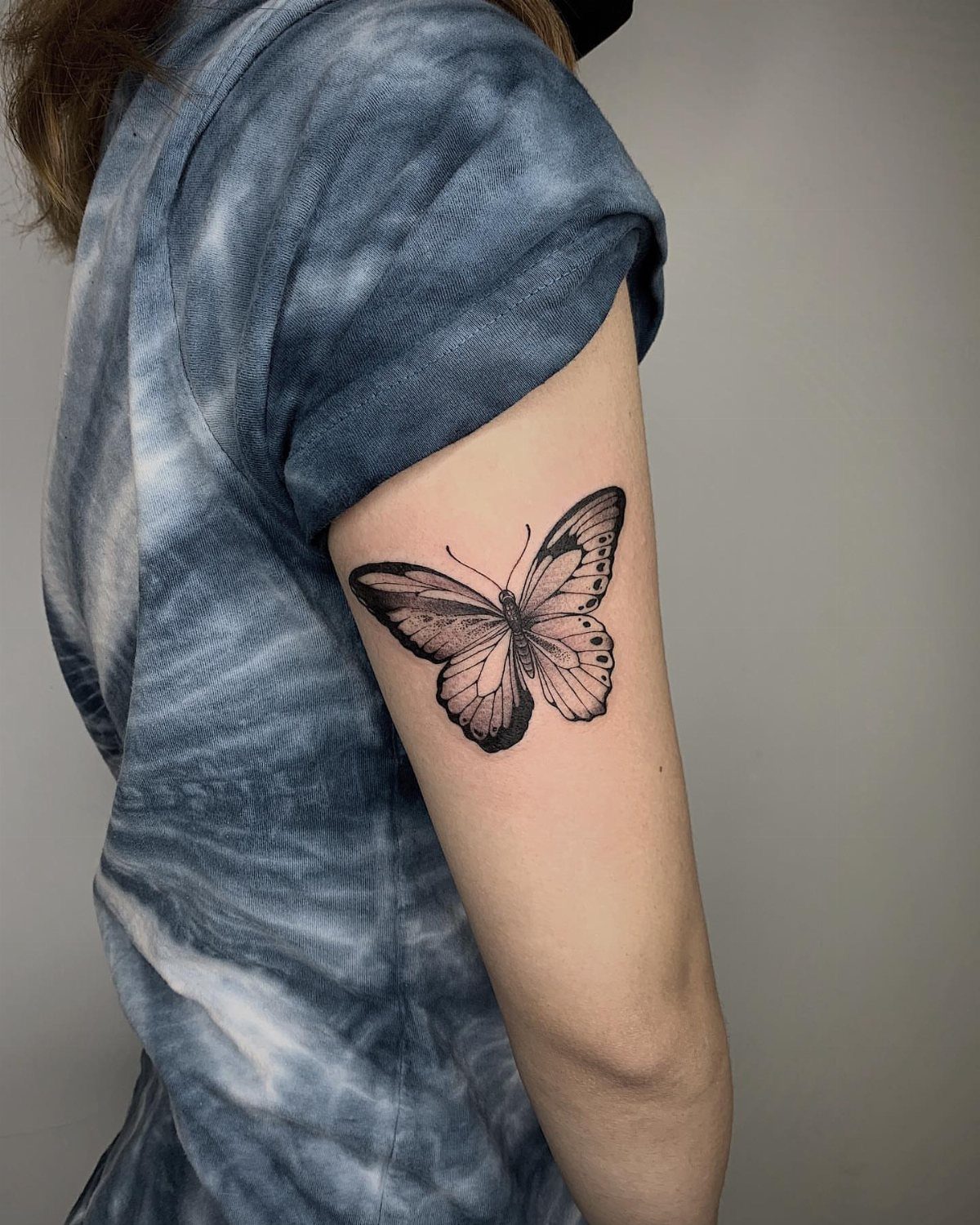
Angled placement breaks the symmetry. Instead of aligning the butterfly with the length of your arm, you tilt it so the wings cut across the muscle at a diagonal.
The angle makes the design feel more dynamic, but it also means one wing will always be closer to the edge of your arm.
If the butterfly is too wide, part of it can wrap around the curve and distort when your arm is relaxed.
Best for upper arm or bicep where the surface is broad enough to hold the full wingspan without wrapping. On the forearm, the tilt can push the design too close to the wrist or elbow.
12. Butterfly Arm Tattoo with Floating Effect
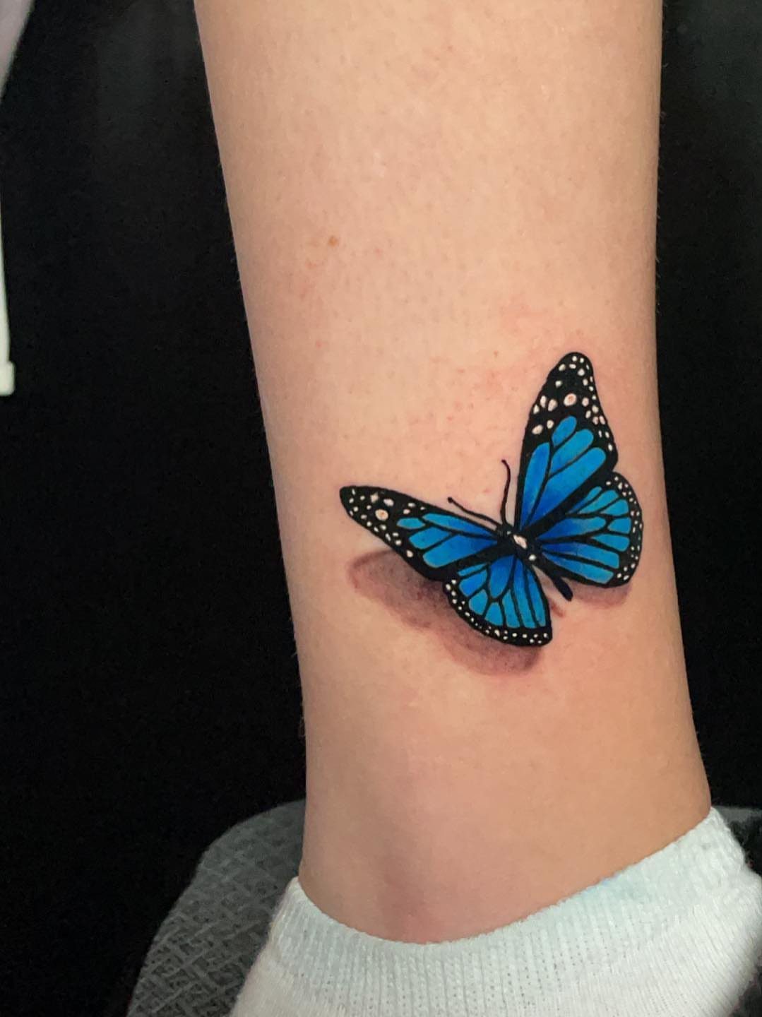
A drop shadow sits just below and offset from the butterfly, usually in a lighter shade of the main color, and the separation between the 2 makes the design look like it’s hovering a few millimeters above your skin.
The shadow has to be soft or it reads as a second, failed butterfly.
This effect works best with color. A blue butterfly with a brown or grey shadow gives you enough contrast to see the depth, while black ink with a black shadow can blend together and lose the floating effect entirely.
13. Butterfly Arm Tattoo with Wing Fragment Details
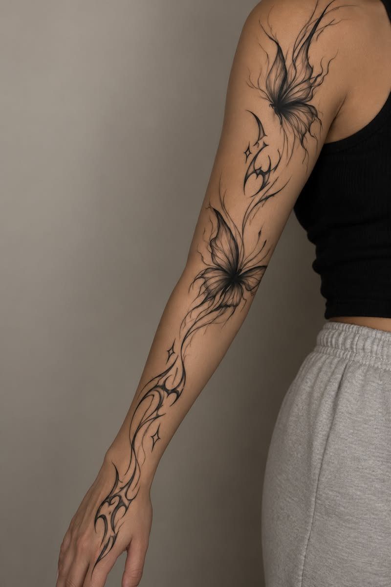
Wing fragments peel away from the main shape, usually at the outer edges, and scatter across the skin as if the butterfly is shedding pieces mid-flight.
The fragments can be small triangles, curved sections, or abstract marks that echo the wing pattern without repeating it exactly.
This approach gives you coverage while keeping the design open and light.
The fragments extend the visual reach of the tattoo down the arm or across the hand, but each piece is light enough that the whole thing still reads as minimal.
Breaking the wings into fragments creates the sense of motion on its own, letting a single design feel active without needing a full flight path.
14. Butterfly Arm Tattoo with Soft Gradient Wings
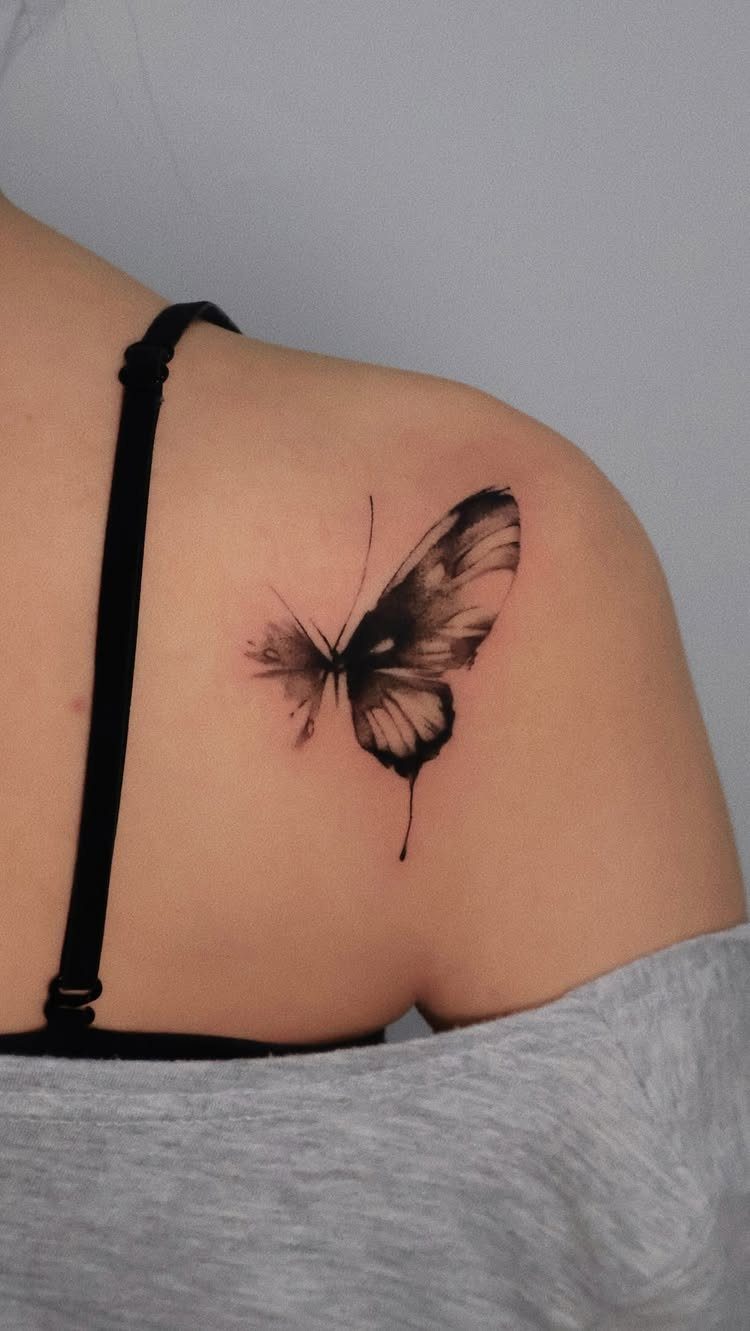
Gradient shading moves from dark near the body to lighter at the wing tips, and the transition has to be smooth or it looks like separate panels instead of one continuous fade.
The technique is stippling or soft passes with a liner, building up density gradually rather than filling in one go.
This version adds dimension without adding detail. The wings look rounded instead of flat, and the gradient gives the butterfly enough weight to hold its spot on the arm without needing outlines or patterns inside the wings.
Upper arm placement works best because the skin is smooth and the gradient can develop evenly. Any texture or scar tissue in the area can interrupt the fade and make it look patchy.
15. Two Butterflies in Motion Arm Tattoo
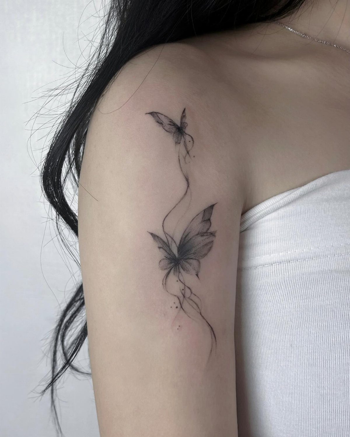
2 butterflies let you show different moments in the same flight. One can be climbing while the other glides, or both can tilt in opposite directions as if they’re circling each other.
The connecting line ties them together so the design reads as one piece instead of two separate tattoos placed near each other.
Spacing matters.
If the butterflies sit too far apart, the line looks arbitrary. Too close, and the wings overlap and lose their individual shapes.
This version suits the upper arm where you have enough room to separate the 2 figures without stretching the line too thin.
16. Butterfly Arm Tattoo with Continuous Line Design
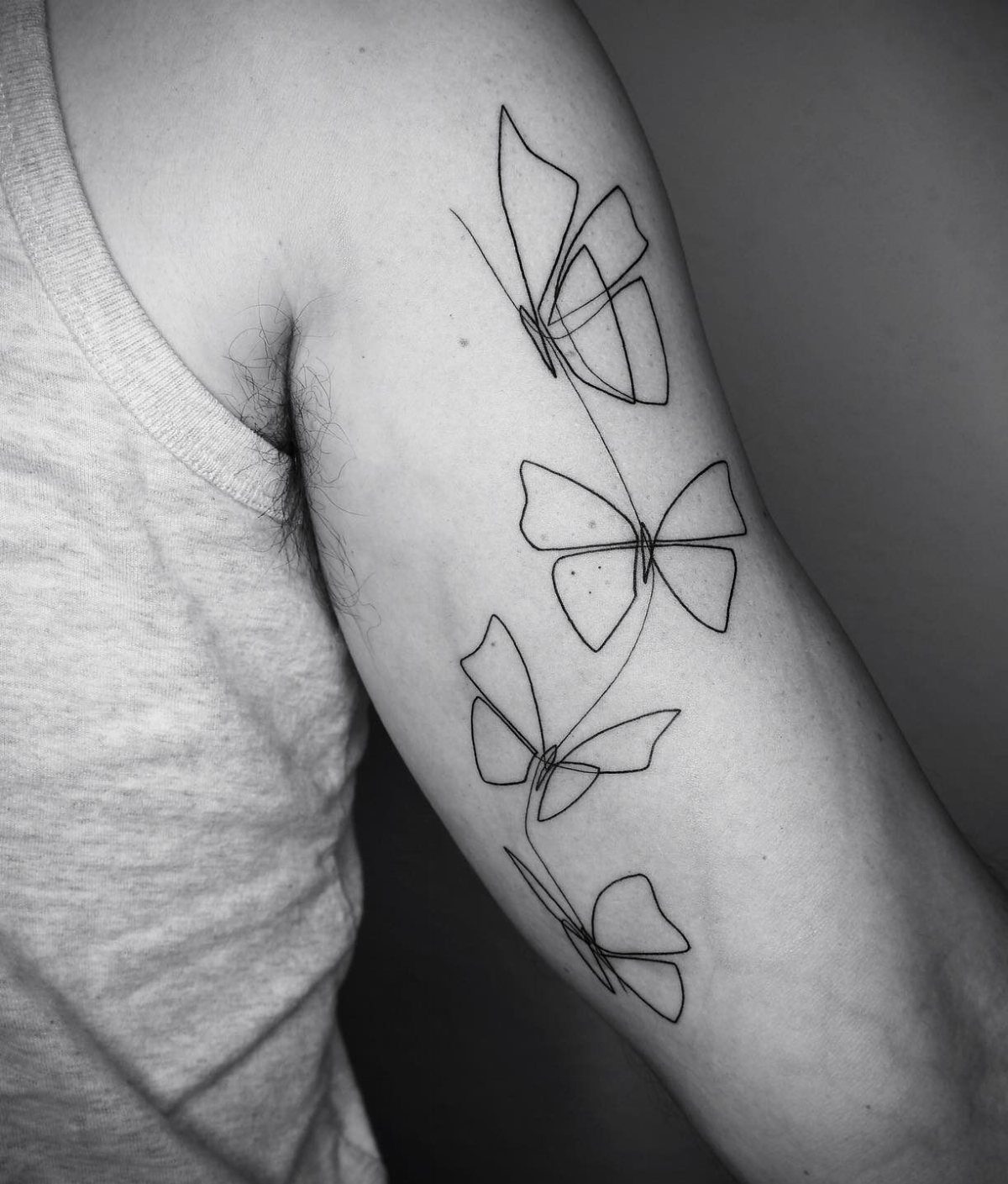
A continuous line design means the pen never lifts.
The line starts at one point, traces the entire butterfly, and returns to where it began, all in one pass. The result looks effortless, but the line has to be confident because any wobble or hesitation shows immediately.
This style works best with simple wing shapes. Detailed veins or patterns inside the wings break the continuous flow and force the line to double back on itself, which can make the design look cluttered.
If you’re after something minimal that still reads clearly from a distance, this is one of the lightest options. The single line keeps the design open and the skin visible underneath.
17. Butterfly Arm Tattoo Flowing with Arm Shape
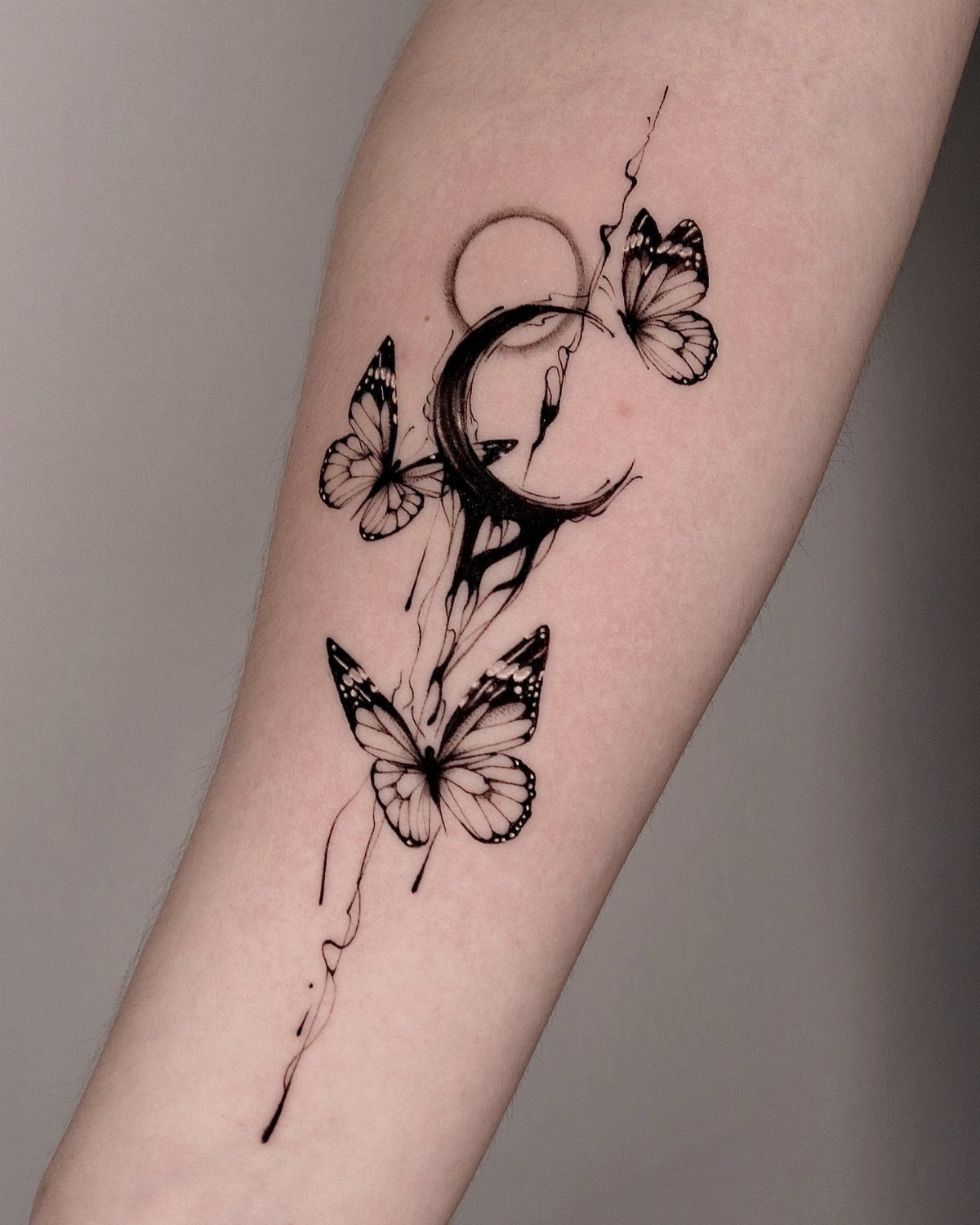
A design that follows the arm’s natural curve feels less like something placed on the skin and more like it grew there.
The butterflies taper as they move down the forearm, matching the way the arm narrows toward the wrist, and any extra elements like moons or lines follow the same direction.
This approach requires careful placement. If the butterflies are drawn flat and then applied to the arm, they can look tilted or stretched once the arm is at rest.
The design has to be drawn directly on the curve so it reads correctly in every position.
On the upper arm, where the width stays consistent, the effect is less obvious.
18. Butterfly Arm Tattoo with Artistic Negative Space
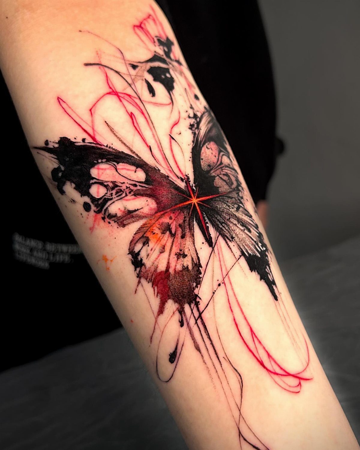
Negative space uses the uninked skin as part of the design.
Instead of filling the wings completely, sections are left open so the skin shows through as patterns, shapes, or abstract breaks in the color. The effect is lighter than solid fill and gives the butterfly a sense of transparency.
Color can sit around the negative space without covering it. Red or black ink frames the open areas, and the contrast between filled and unfilled sections sharpens the design without adding more detail.
This version works best on smooth skin where the negative space reads clearly. Any texture, freckles, or scars in the placement can fill in the gaps visually and weaken the effect.
19. Multicolored Butterflies Tattoo on Arm
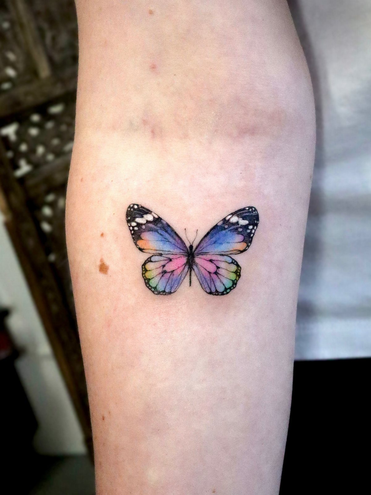
Color lifts a butterfly tattoo into a different category. Blue and purple wings hold attention longer than black ink, and the contrast between shades gives the design depth without needing shading or gradients.
The colors have to complement your skin tone or they can look washed out after healing. Cooler tones like blue and purple tend to age better than warm reds or yellows, which can shift toward orange over time.
Forearm placement keeps the colors visible and makes the design easier to show off. Upper arm works too, but the ink spends more time covered.
20. Realistic Butterfly Upper Arm Tattoo
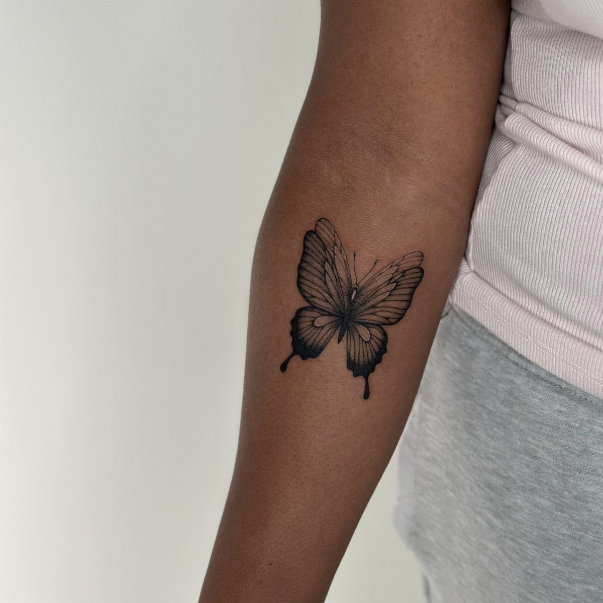
Realism adds detail that makes the butterfly look like it just landed.
Wing veins, texture along the edges, and soft shading under the body all contribute to the effect, and the result is a design that reads as an insect instead of an icon.
Black and grey keep the focus on the detail rather than splitting attention between color and shape. The shading has to be consistent or the wings look flat in some spots and rounded in others.
Upper arm placement gives you enough space for the detail to develop without cramming the wings into a narrow strip of skin.
21. Butterfly Tattoo with Flowers and Vines
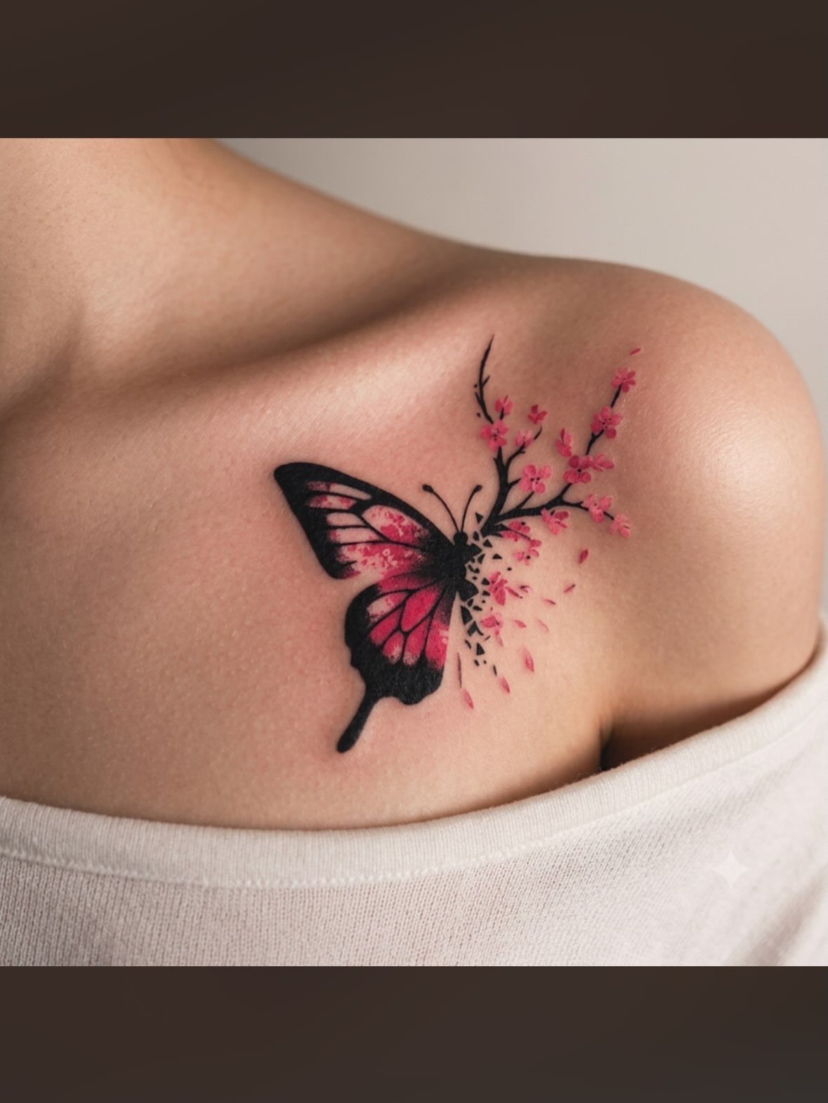
Flowers extend the butterfly into a larger composition. A branch or vine can grow from one wing, and blossoms fill the space around the body without adding a second insect or geometric shapes.
Pink petals soften the design and give you color without overwhelming the butterfly. The flowers can sit behind or in front of the wings depending on how much of the butterfly you want to keep in focus.
Shoulder placement lets the branch follow the curve of your body and gives the design room to grow down your arm or across your chest if you decide to expand it later.
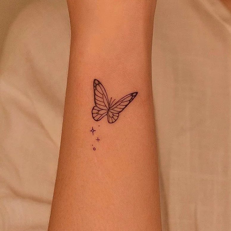
22. Butterfly Tattoo with Stars
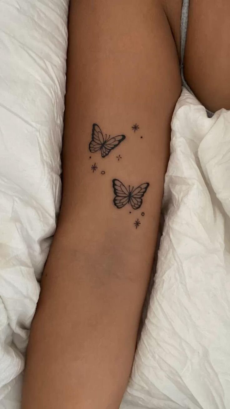
Stars add small accents without changing the scale of the design. A few scattered around the butterflies fill empty space and give the tattoo a lighter feel than a single solid figure sitting alone.
The stars have to stay small or they compete with the butterflies for attention. Tiny outlines or filled dots work better than large multi-pointed shapes.
Inner forearm placement keeps the design simple and the stars readable. If the butterflies are already minimal, the stars should match that weight instead of adding heavy detail.
Visibility and Placement
The arm offers control most placements don’t. A short sleeve shows the piece, a long one hides it completely, and you decide which version the day calls for.
Inner arm placement sits visible when your arm hangs relaxed but disappears the moment you press it against your side. The outer arm catches more eyes and shifts in light as your hand moves.
Movement changes the read. Flat placement on the upper arm or forearm keeps the image stable no matter how you move.
If the tattoo matters at work or in formal settings, the arm gives you the most flexibility without forcing you into spots that need clothing year-round.
Symbolism of Butterflies
Transformation anchors most butterfly ink, though the symbol stretches past a single reading. Some people mark the end of a difficult period, others a new beginning, and a few just want the visual without assigning it a story.
Freedom and impermanence show up nearly as often.
The butterfly moves lightly, lands briefly, and doesn’t stay long enough to be tied down. That lightness appeals to people who value movement over permanence or who see themselves as hard to pin in place.
Beauty alone is reason enough.
The shape reads well on skin, scales naturally to most placements, and doesn’t require a backstory to justify it. If you like how it looks and the spot feels right, that’s all the meaning it needs.
Frequently Asked Questions
What do two butterflies symbolize on a tattoo?
2 butterflies can represent transformation stages, showing where you were and where you are now, or they can symbolize partnership and connection.
Some clients use them to mark a significant relationship or to show 2 different moments in the same journey. The doubled shape also creates a more dynamic composition without needing extra elements.
How much should a butterfly tattoo cost?
Small butterfly tattoos typically run $80 to $350 depending on size, detail, and your location.
A simple silhouette takes less time than a realistic design with shading, and that difference shows in the price. If the design is 2 to 4 inches and stays straightforward, expect the lower end of that range.
What are some unique butterfly tattoo designs for females that have meaning?
Abstract wing patterns, negative space designs, and layered linework all shift the butterfly away from the standard silhouette while keeping the transformation symbolism intact.
Split wing designs let you combine two styles in one piece, like realistic on one side and geometric on the other, which adds contrast and makes both halves stand out.
Flight paths and wing fragments also extend the design without making it feel overly decorative.
Is butterfly a good tattoo?
Butterflies work well because the transformation symbolism holds up over time and the shape adapts to nearly any placement on the arm.
The design can stay simple or grow into something more detailed depending on your taste. If you want a piece that reads clearly from a distance and carries meaning without needing explanation, a butterfly does both.