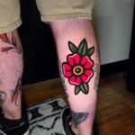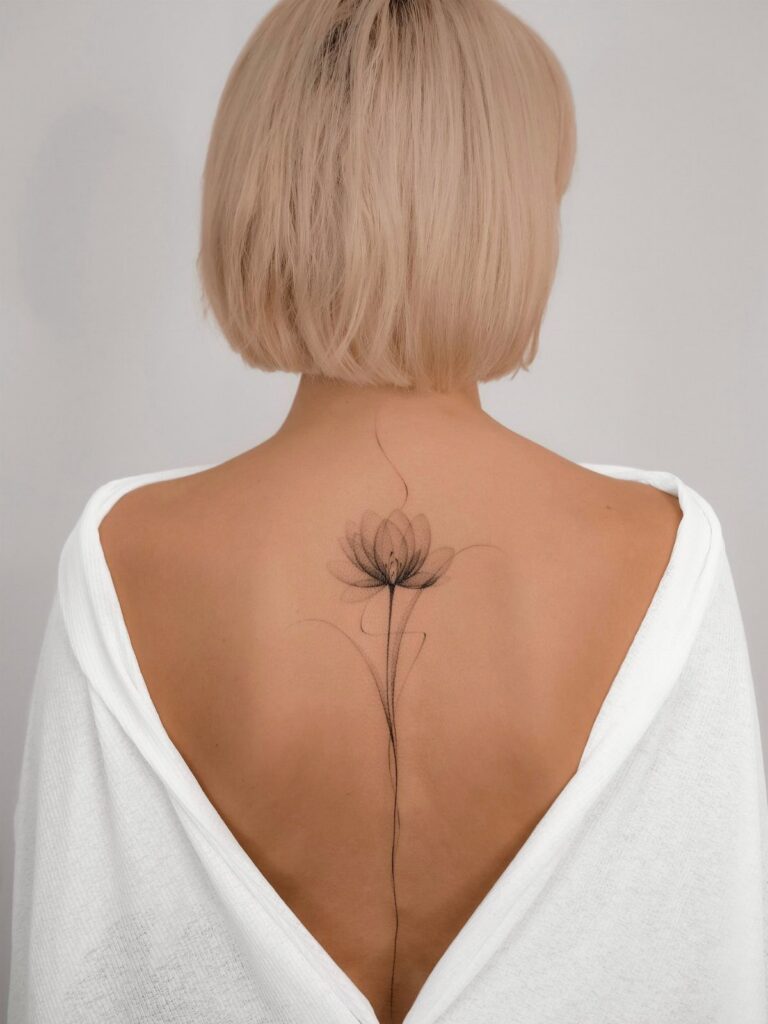
Lotus, rose, hibiscus, and lily each take different amounts of space, and adding cursive text or geometric elements changes how the whole piece reads when your back is bare.
Black ink holds better than color on the spine, and fine lines read more clearly here than on joints because the skin moves less.
1. Lotus Flower Spine Tattoo
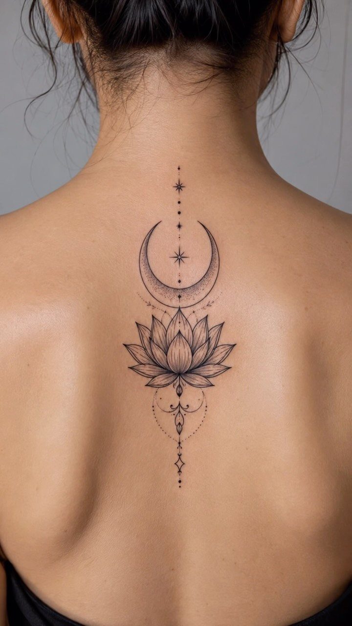
A lotus sits at the center of the spine, flanked by a crescent moon above and dots that follow the curve of the vertebrae.
The lotus brings its own symbolism of growth and renewal, while the moon and geometric elements frame it and stay out of the way.
Placing a lotus at the spine means it gets seen when you want it seen: backless tops, open dresses, or at the beach. The vertical format runs straight down your back, so the design reads clearly from any angle.
A lotus alone carries enough weight; the extras are optional. A single bloom centered between the shoulder blades can be just as striking.
2. Black Ink Lily Spine Tattoo
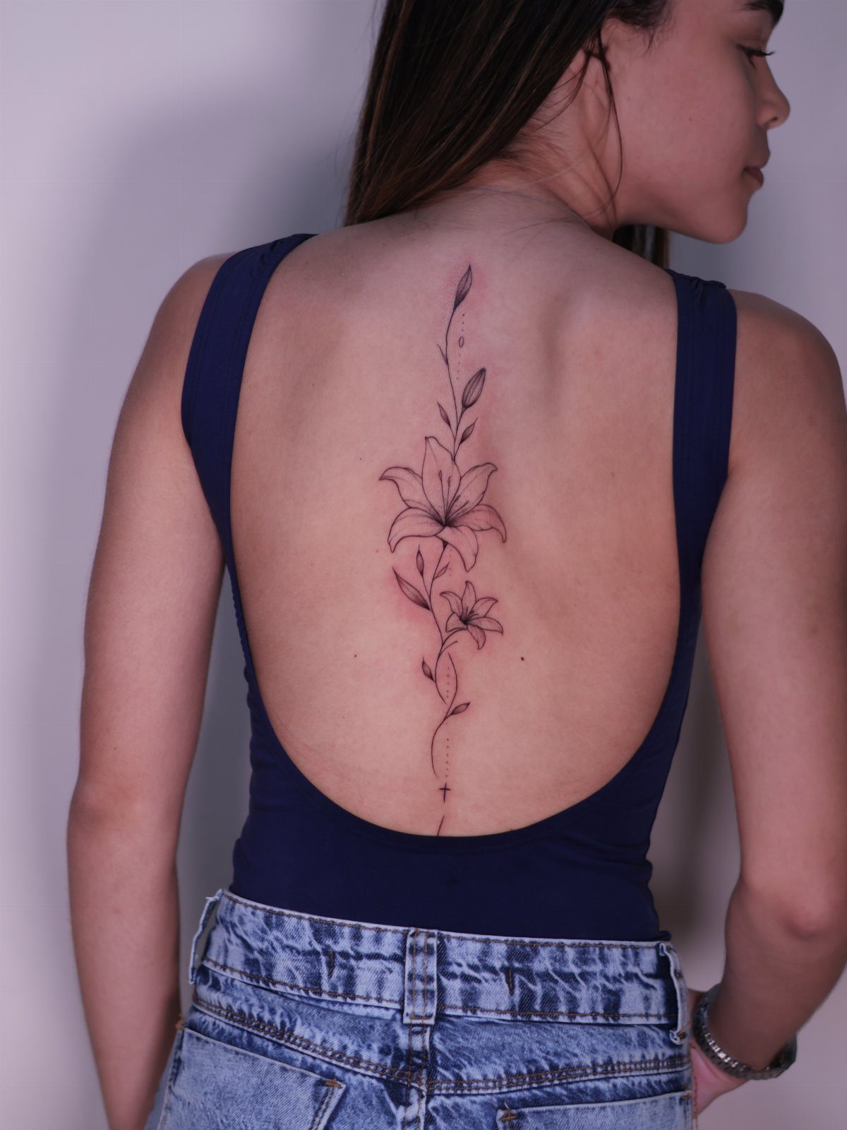
Lilies stack vertically down the spine, with stems and leaves linking each bloom into a single unbroken piece. Solid black keeps the focus on the flower shapes themselves, and the vertical arrangement suits the spine’s long, narrow canvas.
This is one of those designs that works best when you commit to the full length.
A single lily loses the impact, but a short run of blooms from the upper back down toward the lower spine gives you something cohesive. The leaves fill gaps between flowers and keep the composition balanced without feeling cluttered.
Lilies read well in black because their petal structure has enough detail to hold interest without needing shading or color.
3. Fine-line Flower Spine Tattoo
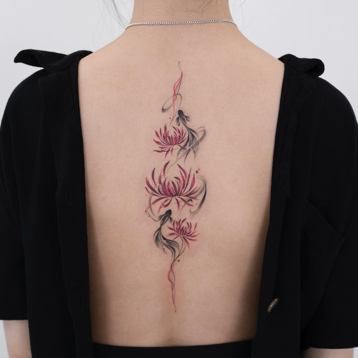
Red flowers with black linework and swirls track down the spine in a design that stays light but still reads clearly at a distance.
Fine-line tattooing keeps the petals and stems from looking heavy, which matters on the spine where detail stays crisp over time.
The red brings warmth without requiring a full color palette, and the black swirls give structure.
If you go fine-line, find an artist who specializes in it. Shaky lines show more when the design is delicate, and touch-ups down the spine are harder to blend than on the arm or leg.
This approach works when you want color but don’t want the tattoo to dominate every outfit you wear.
4. Rose Spine Tattoo
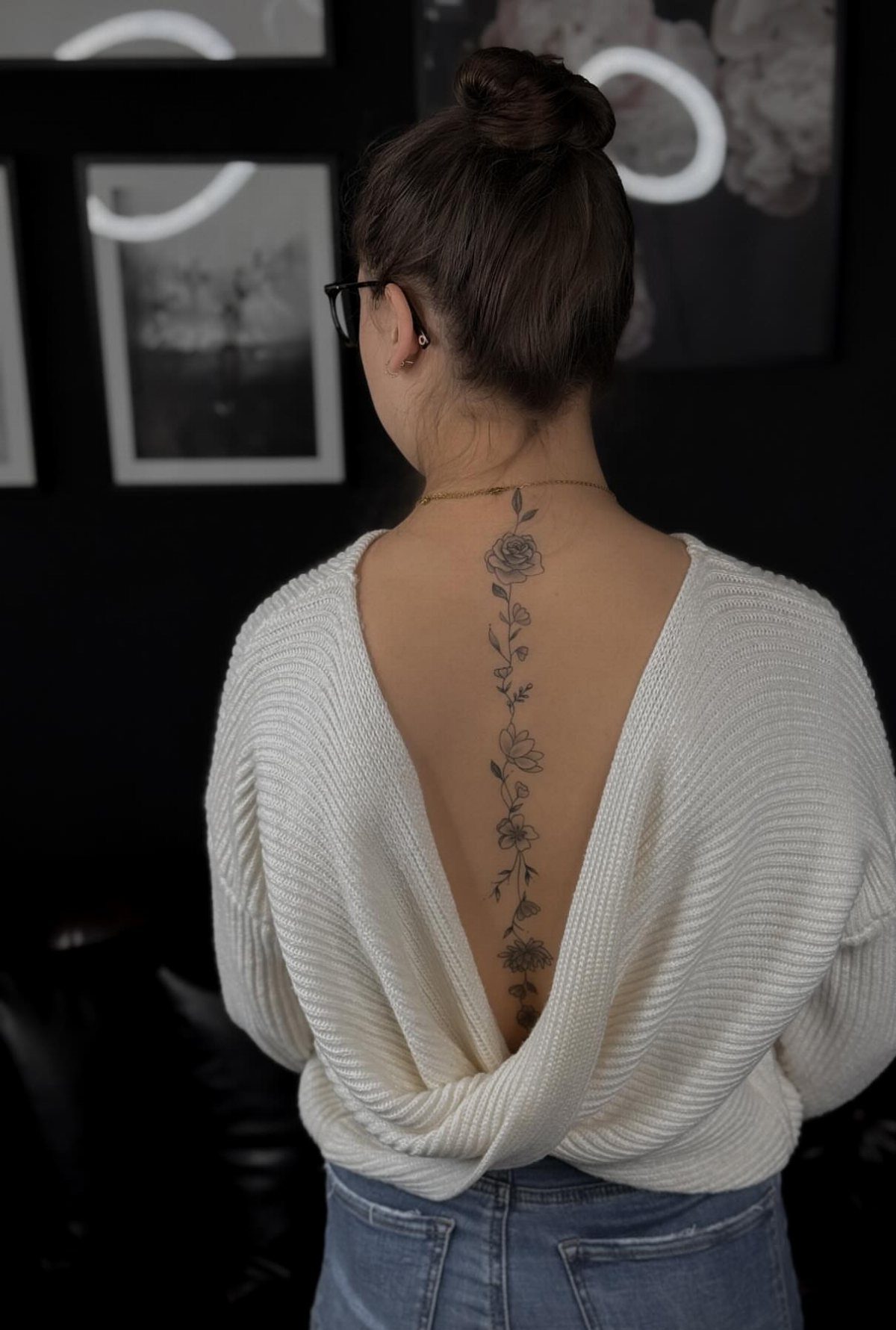
Roses trace the spine in a vertical line, often with buds, leaves, or small decorative details between the blooms.
Roses are one of the most requested flowers for spine tattoos because their shape adapts well to the body’s curve and they carry meaning without needing explanation.
Spacing matters here. Too many roses packed tightly together can look crowded, while too much space between them breaks the flow.
I usually recommend staggering a few roses depending on how much of the spine you want to cover, starting just below the neck and running down to the mid-back.
Roses hold up well over time in black ink, but for color, reds and pinks stay truer longer than purples or blues.
5. Hibiscus Flower Spine Tattoo
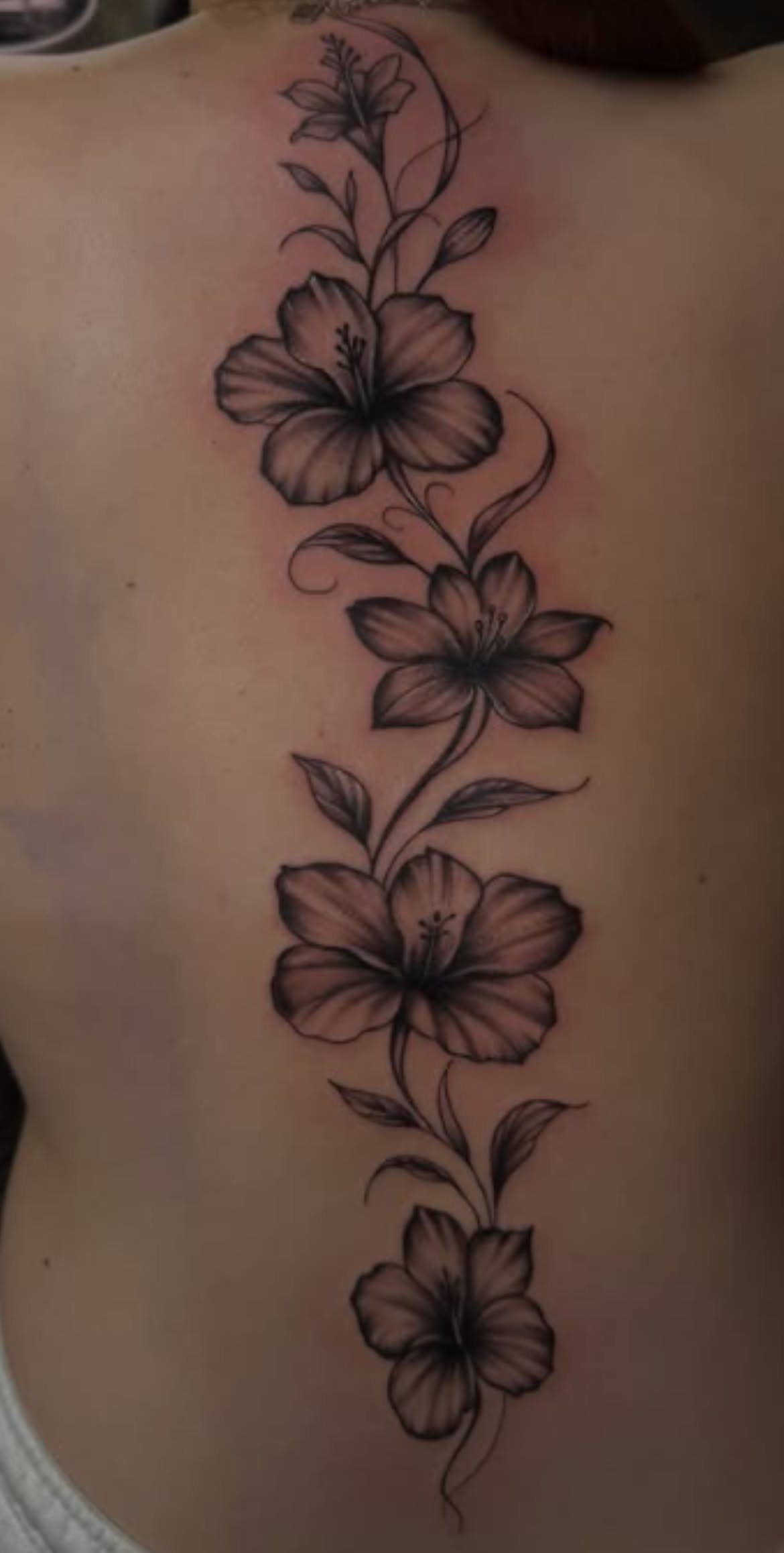
Hibiscus flowers run down the spine with leaves and vines connecting each bloom, keeping the design grounded in its tropical origins.
The hibiscus has larger, more open petals than a rose or lily, so fewer flowers fill the same amount of space without the design feeling sparse.
Black and grey shading gives the petals dimension without needing color, and the vines keep the composition from floating.
Hibiscus takes red, orange, or pink well when you’re ready to add color, but the black and grey version stands on its own.
This suits someone who wants a flower that feels less traditional than a rose but still reads clearly as a specific bloom.
6. Cursive Text with Flower Spine Tattoo
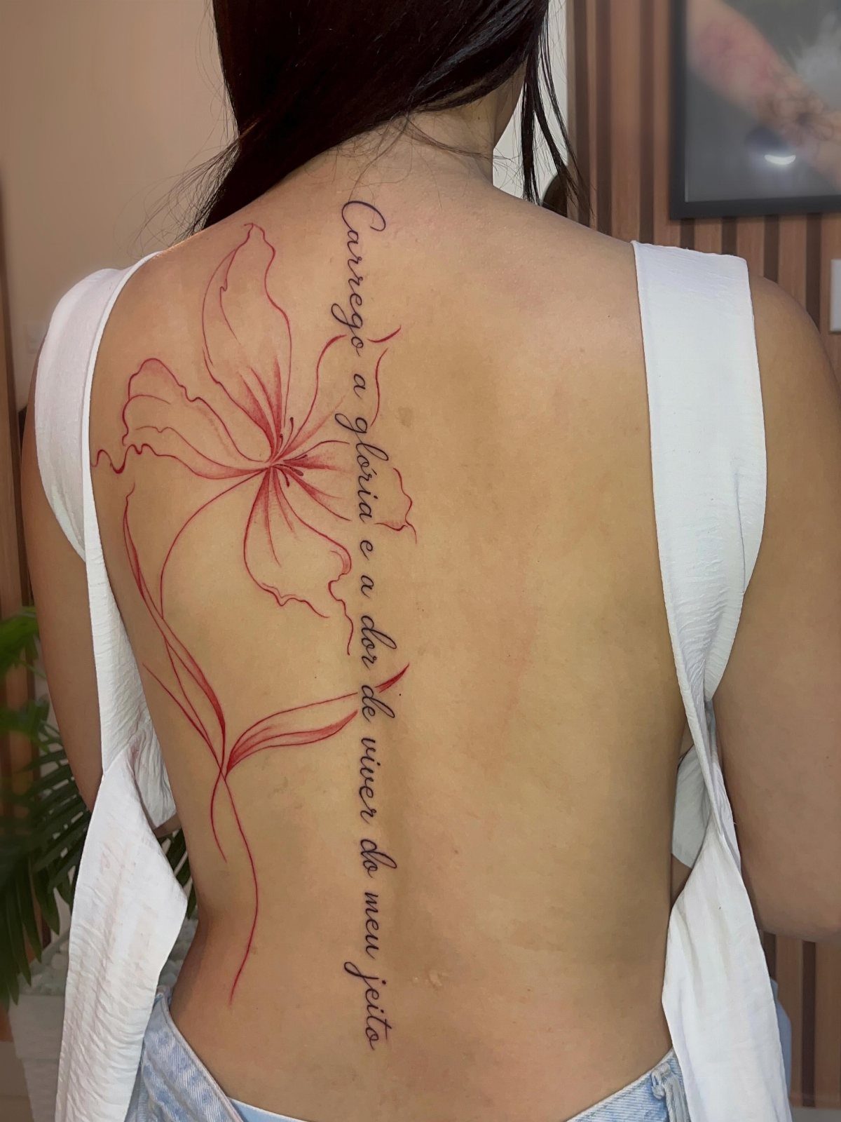
A flower anchors the design while cursive text runs vertically down the spine, the two elements working as one piece rather than sitting side by side.
The text can be a name, a date, a phrase, or a line in another language, and the flower softens the rigidity of vertical script.
Placement depends on how long the text is. Red ink on both the flower and the text keeps the design unified, though black works just as well if you prefer higher contrast.
This is for someone who knows exactly what they want the text to say and wants the flower to frame it, not the other way around.
7. Geometric Flower Spine Tattoo
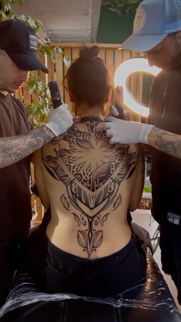
Geometric shapes surround or frame the flowers, turning the design into something structured rather than purely organic. Triangles, mandalas, or hexagons anchor the composition, and the flowers soften the hard edges without losing the symmetry.
This suits someone who wants a floral spine tattoo but doesn’t want it to read as traditional or soft. The geometric elements give the design a modern edge and help it sit evenly on the body.
Black ink keeps the shapes crisp. Adding too much shading to both the flowers and the geometry can make the design feel heavy, so most artists pick one element to detail and let the other stay clean.
Choosing Flowers for Tattoos
Birth flowers show up often enough in spine designs that artists keep reference sheets for each month.
August births get gladiolus, which runs tall and narrow like a lily but with smaller, clustered blooms. Adding stars or dots between flowers fills space without crowding the composition.
Roses hold meaning for most people without explanation, which makes them safe when you’re not sure what else to pick.
Pain Level of Spine Tattoos
The spine sits close to bone with little muscle or fat to cushion the needle, so expect more sensation than you’d get on the forearm or thigh.
The pain spikes over each vertebra and eases slightly in the soft tissue between them.
The upper spine between the shoulder blades tends to hurt less than the lower back, where the bones sit closer to the surface and nerves branch out toward the hips.
Sessions longer than 2 hours get harder to sit through because you can’t shift position much without throwing off the stencil.
Breathing helps. Holding your breath tenses the back and makes every pass of the needle feel sharper.
Aging of Spine Tattoos
Spine tattoos age better than pieces on joints or hands because the skin doesn’t fold or stretch as much through normal movement. Fine lines stay clearer longer when they’re placed along bone rather than over muscle that flexes constantly.
Color fades faster on the spine than black ink does, partly because the skin there sees less sun but also because touch-ups are harder to sit through.
If you start with color, expect to refresh it every few years if you want it to stay bright.
Weight changes affect the lower spine more than the upper back. Gaining or losing significant weight can stretch the skin enough to blur fine details, though bold linework holds up better.