Bumble bee tattoos range from tight minimalist outlines that fit a wrist to realistic pieces that need 2 inches minimum to hold wing detail over time.
If the design includes shading or color, expect longer sessions and plan for placement on flat surfaces like the forearm or shoulder where gradients age cleanly.
A bee in flight adds energy and works best on the shoulder or upper back, while a static bee paired with honeycomb or flowers suits smaller, tighter spots.
Yellow and black is the safest color pairing for longevity, though watercolor effects soften the look at the cost of some blur as the ink settles.
1. Realistic Bumble Bee
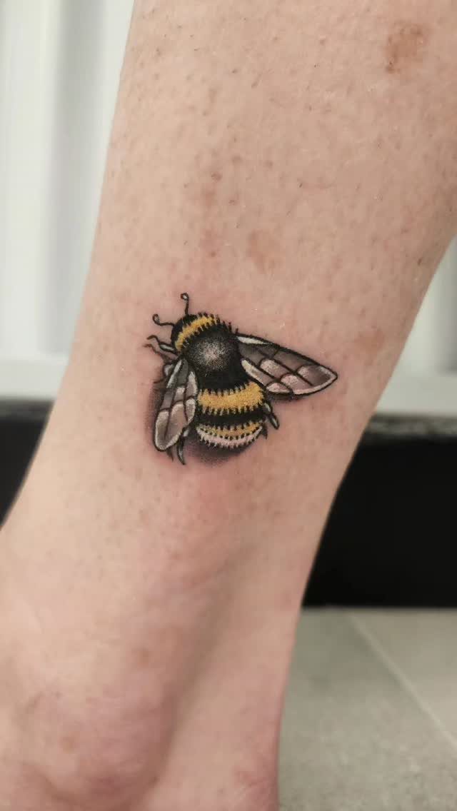
A realistic bumble bee brings the full weight of the insect to skin: yellow bands, dark fuzz texture, translucent wings with visible veining.
The shading makes the difference here. Flat color reads cartoonish; soft gradients and highlight placement give the bee dimension and make it look like it just landed.
Size matters more than most people expect.
Below 2 inches and the wing detail starts to blur within a year or two. If you want the realism to hold, go bigger, especially on areas that see a lot of sun or movement.
Forearm, shoulder or thigh give the artist room to work and let you see the full detail without a mirror.
2. Minimalist Bee Outline Tattoo
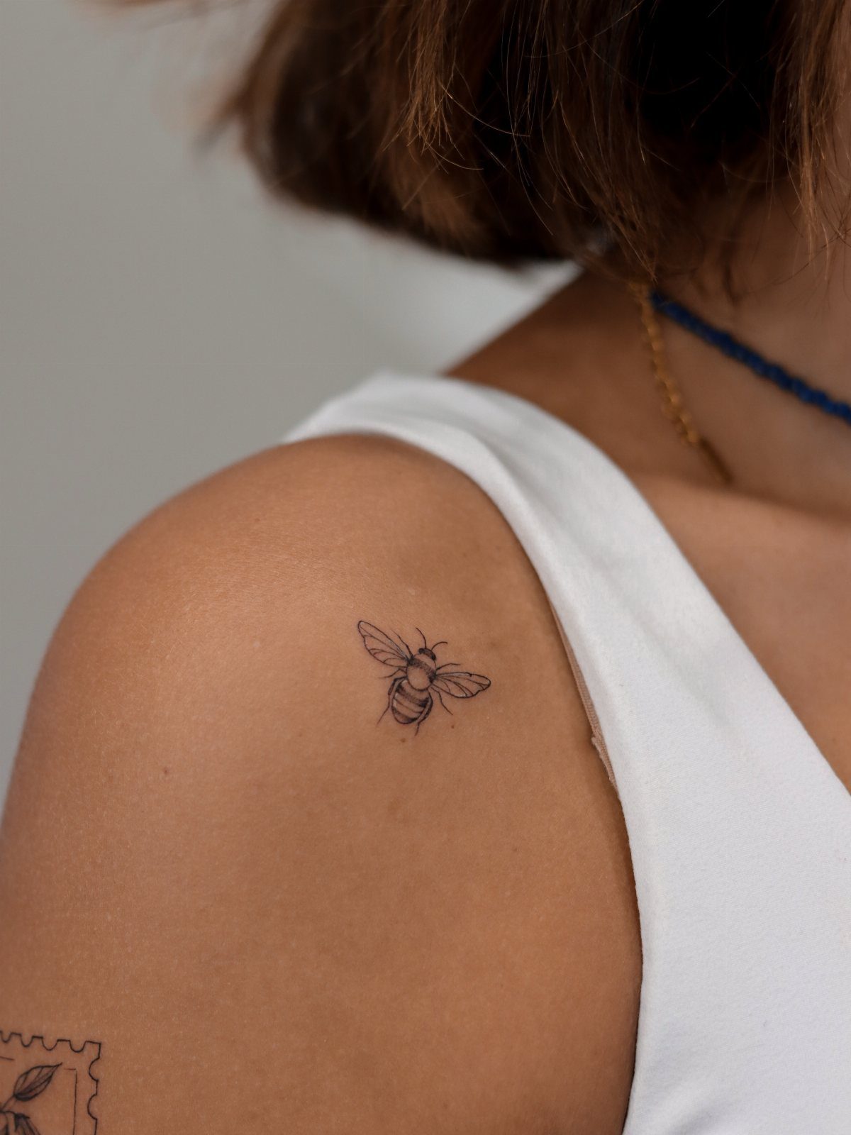
An outline strips the bee down to its skeleton: wings, body segments, antennae, maybe the suggestion of stripes.
No fill, no shading, just black line. The result feels light and moves well on skin that flexes.
This approach works small.
A small bee holds its shape on a wrist, behind the ear, or along the collarbone because there is no fine detail to lose over time. Line weight is the only variable, and a consistent needle keeps it crisp.
Placement flexibility is the real advantage. You can tuck this version into tight spots where a shaded piece would feel cramped or lose readability.
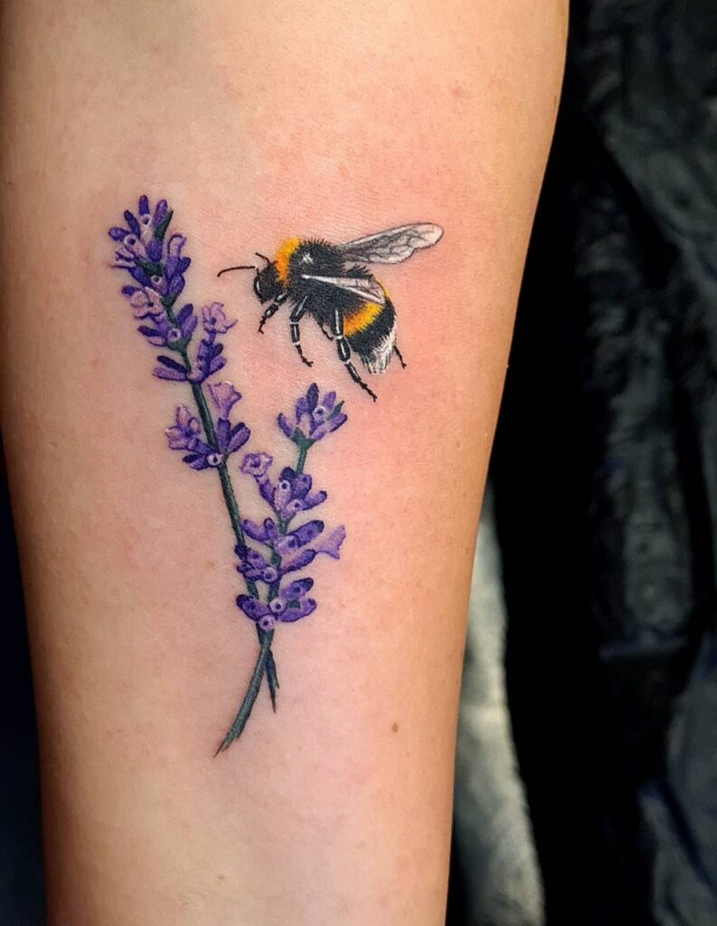
3. Bumble Bee with Flowers
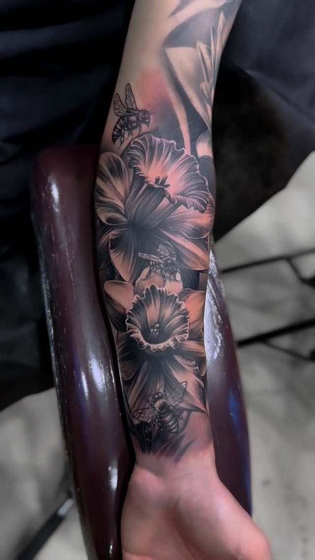
Pairing a bee with flowers gives context: the bee is pollinating, working, doing what bees do.
The floral choice changes the mood. Wildflowers feel casual and organic, roses add formality, daisies lean cheerful.
Scale the flowers to match the bee or let one element dominate.
When the flowers are large and the bees are smaller, the design fills the space without making the bee fight for attention. Reverse that and the bee becomes the anchor.
Black and grey keeps the composition unified. Color is an option, but it adds cost and sitting time, and the flowers can easily overpower the bee if the yellow is too bright.
4. Bumble Bee with Honeycomb
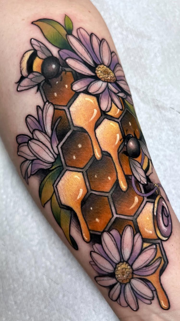
Honeycomb adds geometry and gives the bee a home.
The hexagon pattern fills negative space cleanly and reads well even at a distance. Dripping honey is optional but popular; it softens the hard edges of the comb and adds motion.
Color shifts the tone.
Golden yellows and warm browns lean realistic, while black and grey keeps it graphic. Adding purple flowers pulls the palette wider, which works if you want a more decorative feel.
This design scales up easily. The comb can extend as far as you want, making it a good choice for larger placements like the thigh, upper arm or ribcage.
5. Bumble Bee in Flight
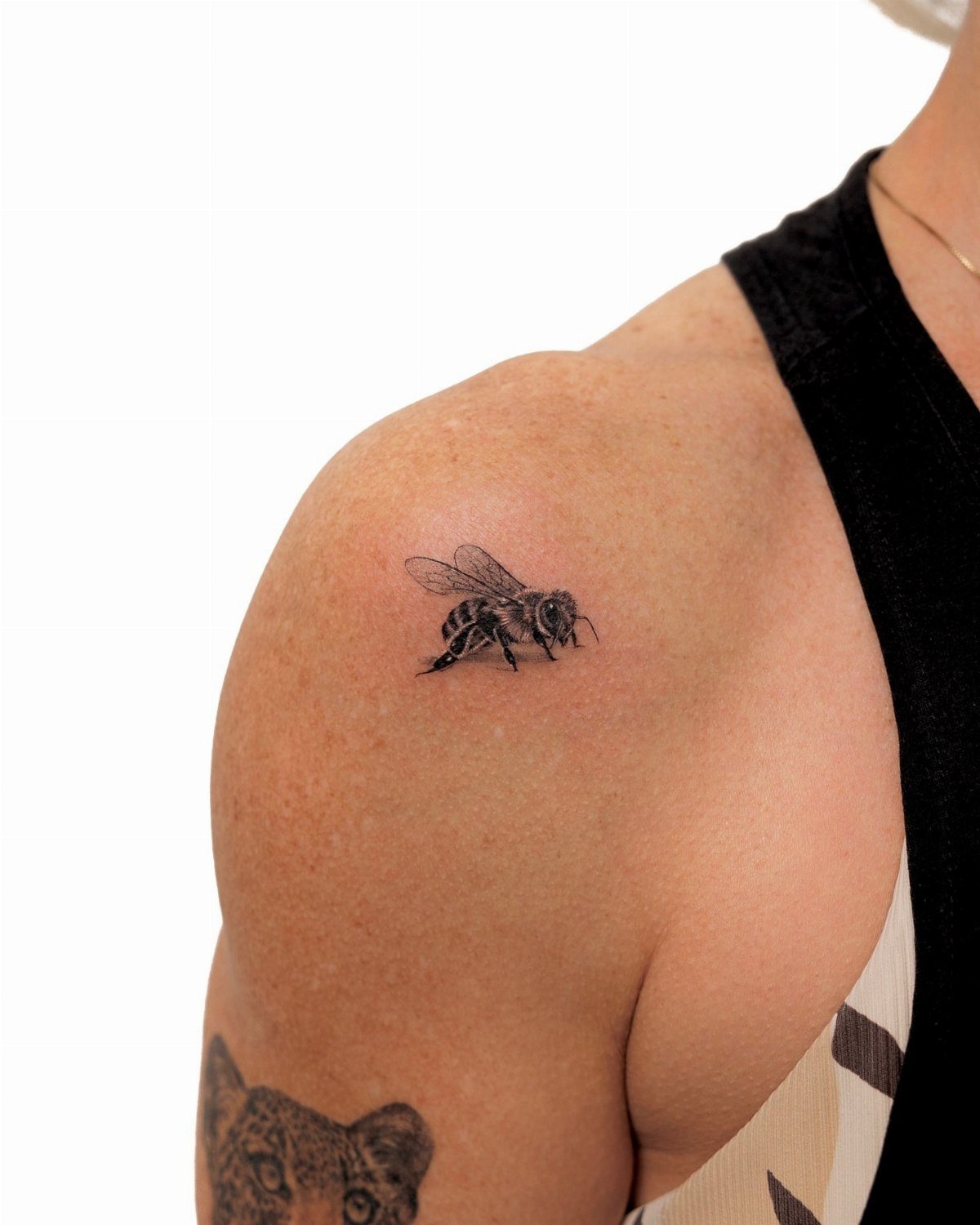
A bee in flight captures the moment mid-motion: wings blurred or fanned, body angled, legs tucked or trailing. The pose adds energy and breaks the static feeling of a bee sitting flat.
Wing position decides how the design reads.
Fully extended wings take up more space and need careful placement to avoid awkward cropping at the edge of the shoulder or arm. Tucked or partially folded wings stay compact and fit tighter spots.
Black and grey shading gives the bee weight without needing color. If you want the yellow, expect longer sessions and touch-ups down the line as the color fades.
Shoulder and upper back are natural fits for the directional movement.
6. Bumble Bee with Heart
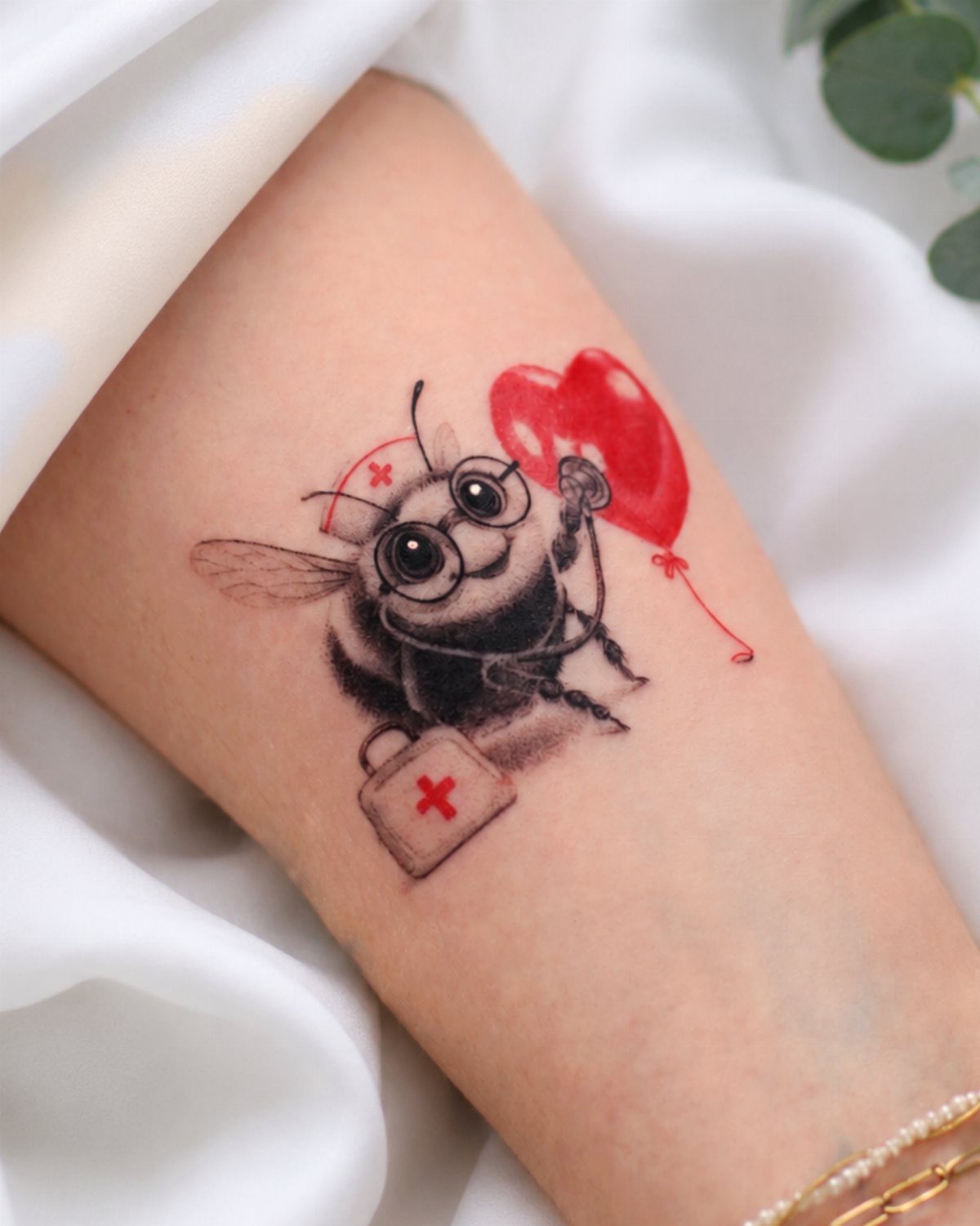
A bee holding or surrounded by a heart shifts the design toward symbolism: love, care, affection. A bee with a nurse theme, glasses and first-aid kit, works if you want something personal or tied to a specific role or memory.
Cartoon styling suits this idea better than realism.
The heart shape is already abstract, and matching that with simplified bee features keeps the tone consistent. Realistic bees paired with flat hearts often clash visually.
Red is the usual choice for the heart and pulls focus immediately. If you want the bee to stay central, keep the heart outline-only or match the bee’s color palette.
Small to medium sizes work best on the forearm, ankle or shoulder.
7. Bumble Bee Sketch Tattoo
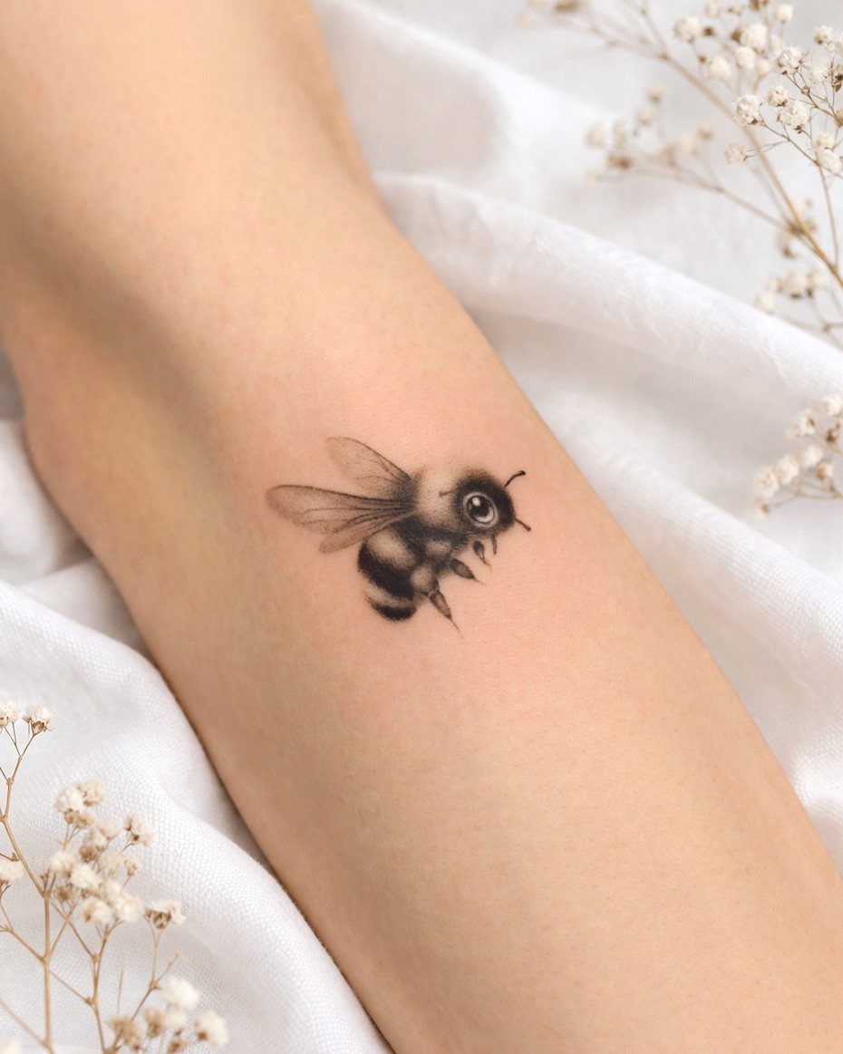
A sketch-style bee keeps the rough edges: unfinished lines, visible pen strokes, hatching instead of smooth shading.
The look mimics a drawing still in progress, which gives the tattoo a loose, less permanent feel even though the ink is just as permanent as any other style.
The unpolished lines age differently than clean outlines. Expect some softening over time, but the sketchy aesthetic absorbs that blur better than precise work does.
This style suits people who want something that feels more artistic than technical. Inner forearm or upper arm work well because the design stays visible and the flat surface keeps the linework readable.
8. Bumble Bee with Crown
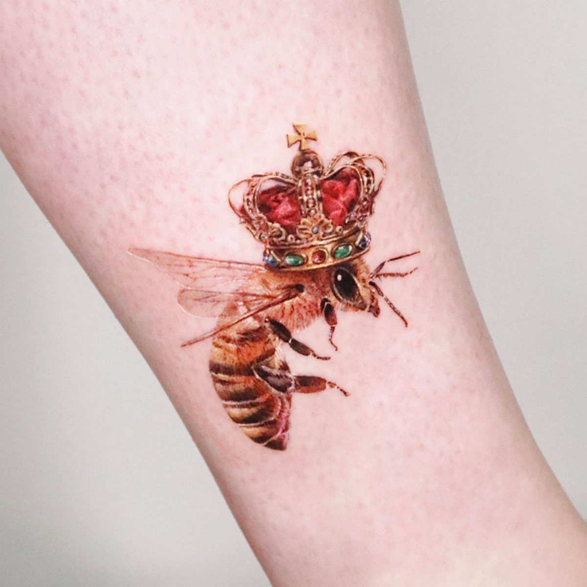
Adding a crown to a bee gives it authority or elevates it to something special. The red and gold colors make it feel ceremonial, while the realistic bee body keeps the contrast between the insect and the ornament sharp.
Color on the crown pulls the eye immediately, so the bee needs enough detail to hold its own. If the crown is too bright or too large, the bee becomes a prop instead of the subject.
This works for people who want symbolism without subtlety.
The crown says exactly what it means: royalty, importance, maybe a nickname or inside joke. Forearm placement keeps it visible and gives the crown enough space to read clearly.
Symbolism of Bee Tattoos
Bees work in teams, defend their hive, and keep going through weather that would ground most insects.
That persistence translates well to ink. Strength and resilience show up in nearly every description of bee tattoos, and the community angle fits anyone who values collaboration or feels part of something larger than themselves.
The symbolism holds whether you go realistic or minimalist. A detailed bee reads as deliberate and grounded, while an outline still carries the same associations without the visual weight.
Others just like what the insect represents and don’t need the backstory attached to it.
Placement Ideas for Bee Tattoos
Wrist placement keeps a bee visible without demanding attention. The flat surface suits small designs, and you can cover it with a watch or bracelet when you need to.
Ankle works the same way: easy to hide, easy to show, and the shape of the joint gives a small bee natural boundaries.
Upper chest centers the design and keeps it close to you.
It stays private under most shirts but reads clearly when you want it seen. The flat plane between collarbones gives an outline bee room to sit without distortion.
Collarbone, finger, and behind the ear all work for line art or very small bees where detail is not the priority.
These spots flex and move more than forearm or shoulder, so skip shading and stick to clean outlines that age well in high-motion areas.
Color Options for Bee Tattoos
Yellow and black is the default, and for good reason: it reads as a bee instantly.
The contrast between the 2 colors gives the design clarity even at a distance, and both pigments hold well over time if the artist uses quality ink.
Watercolor effects soften the edges and add a painterly feel. Expect the color to spread slightly as it ages, which suits the loose style but can blur fine details if the bee itself is too small.