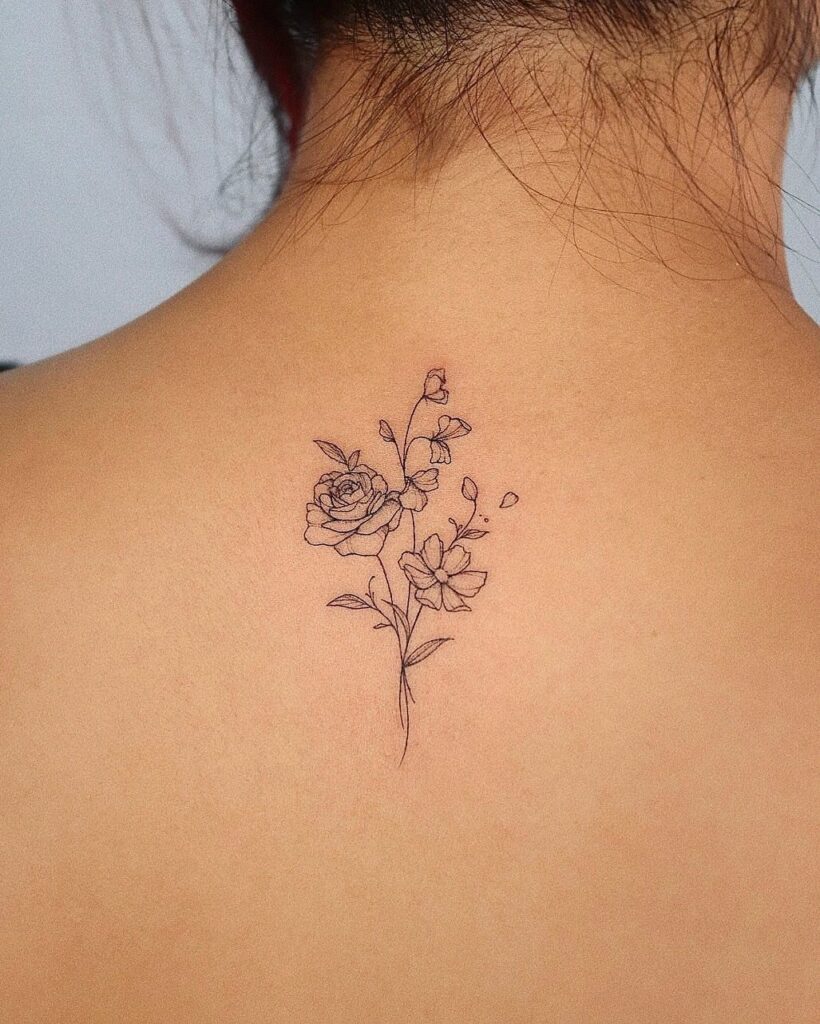
Birth flowers range from February’s violets to August’s gladiolus, and the structure of each bloom dictates where it works best on the body.
A single violet stays legible under 3 inches on the wrist or collarbone, while gladiolus needs vertical space along the forearm or shin to keep the stacked petals from crowding.
Fine line suits delicate flowers like snowdrops and daisies, but chrysanthemums and poppies gain definition from the petal layering itself, which holds up in black ink without needing color or heavy shading.
1. Violet Birth Flower Tattoo
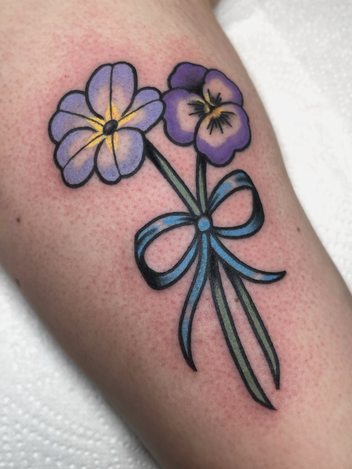
Violets sit low to the ground and bloom in soft purple clusters, making them instantly recognizable even when simplified in ink.
The February birth flower carries a quiet confidence: small, delicate petals that hold strong meaning without needing to announce it.
I like how well violets translate to fine line work. The shape is simple enough to read at small sizes, and adding a ribbon or bow brings a bit of softness without pushing it into overly decorative territory.
A single stem works on the wrist or behind the ear, while a small cluster fits the collarbone or ankle. Keep it under 3 inches for detail that stays crisp over time.
2. Daisy Birth Flower Tattoo
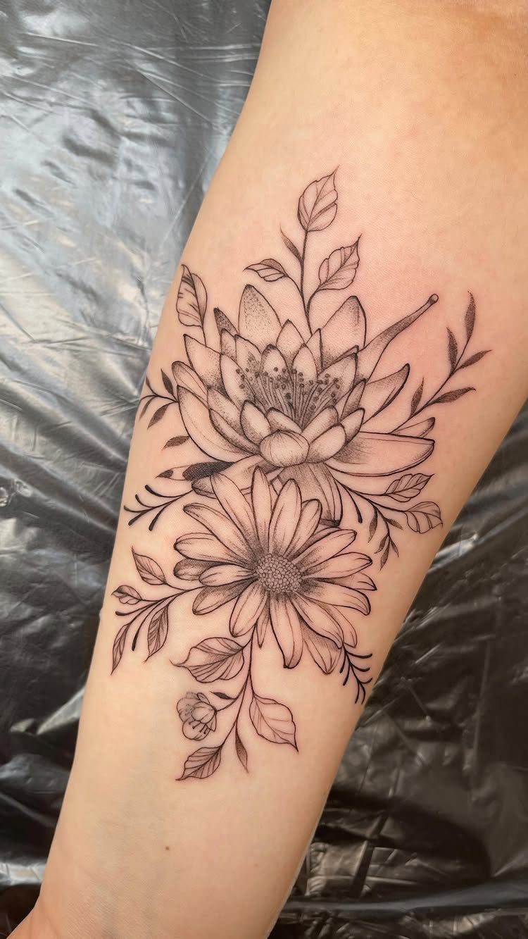
April’s birth flower is one of the easiest to recognize and one of the most forgiving to ink.
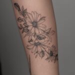
A daisy reads clearly at almost any size, and the simple petal structure holds up well in black and grey or fine line styles.
The visible design pairs a daisy with a lotus, which creates room to layer meanings or represent multiple people in one piece.
I see this approach often when someone wants to honor a parent or sibling alongside their own birth month. Both flowers share a clean, symmetrical shape, so they sit well together without competing for attention.
Forearm placement works because the design can run along the arm’s contour, and the contrast between black ink and skin keeps the flowers readable without needing color.
3. Lily of the Valley Birth Flower Tattoo
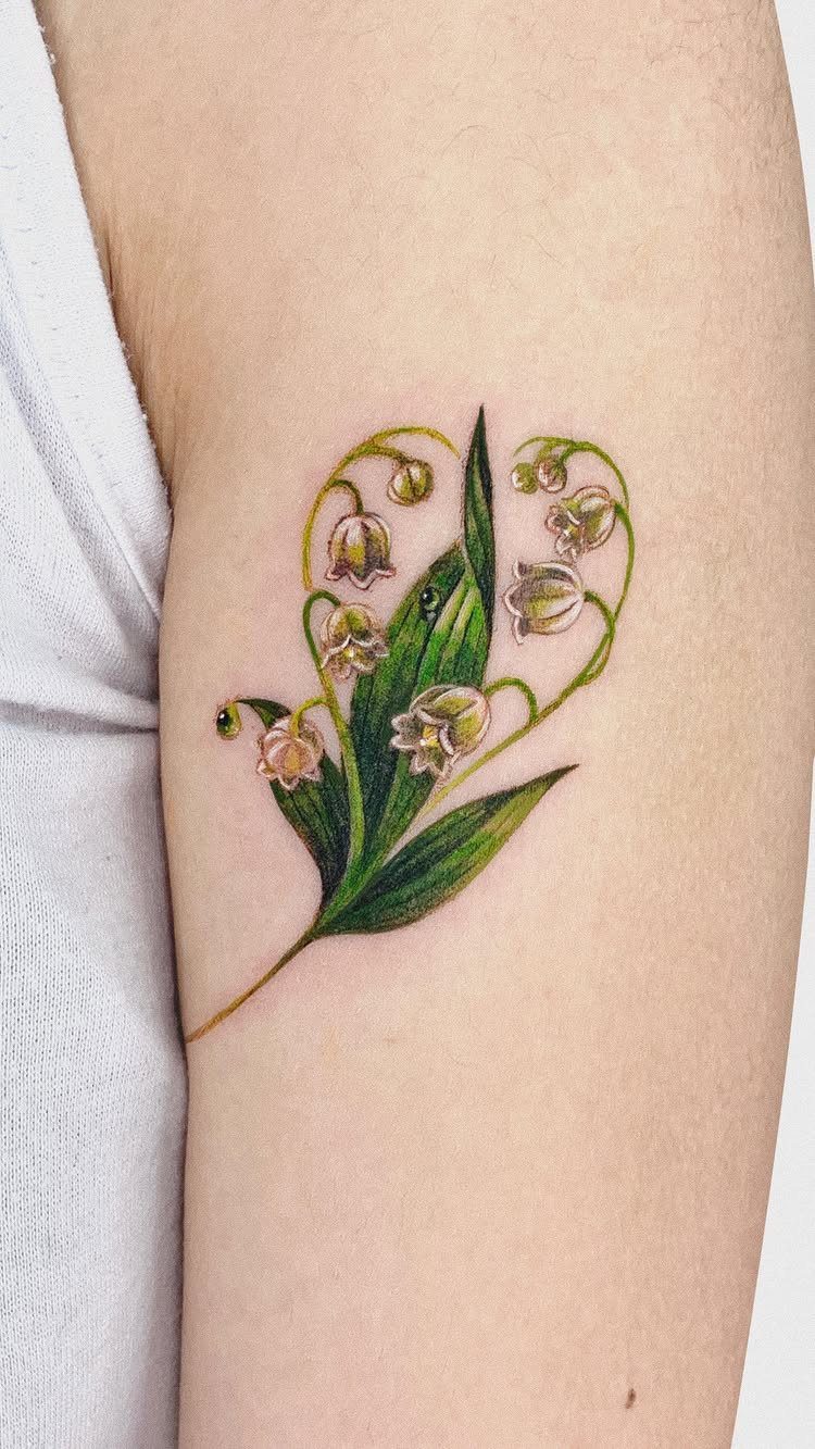
May’s birth flower hangs in tiny bell-shaped blooms along a single arching stem, and that downward cascade creates natural movement.
The shape works best when the tattoo follows a curve: the inside of the forearm, the side of the ribs, or along the collarbone.
Color makes a difference here. White bells with green leaves stay true to the flower’s appearance and give the piece a softer, more illustrative feel.
In black and grey, the bells can flatten out if the shading isn’t handled carefully, so I prefer keeping the linework crisp and the bells outlined rather than filled solid.
Size should be large enough to keep the individual bells legible.
4. Larkspur Birth Flower Tattoo
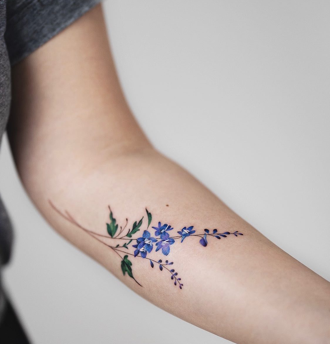
July brings larkspur, a tall bloom with stacked petals that climb the stem in a vertical line. The structure gives you built-in length, which is why larkspur works so well on the forearm, shin, or side of the thigh.
Color suits this flower. The natural palette runs from deep blue to purple, pink, and white, and those tones read cleanly on most skin tones without needing heavy saturation.
If you’re adding other birth flowers to the design, larkspur’s vertical shape balances well against wider blooms like peonies or roses. Keep the stem tall enough to maintain the flower’s proportions and prevent the petals from crowding together.
5. Chrysanthemum Birth Flower Tattoo
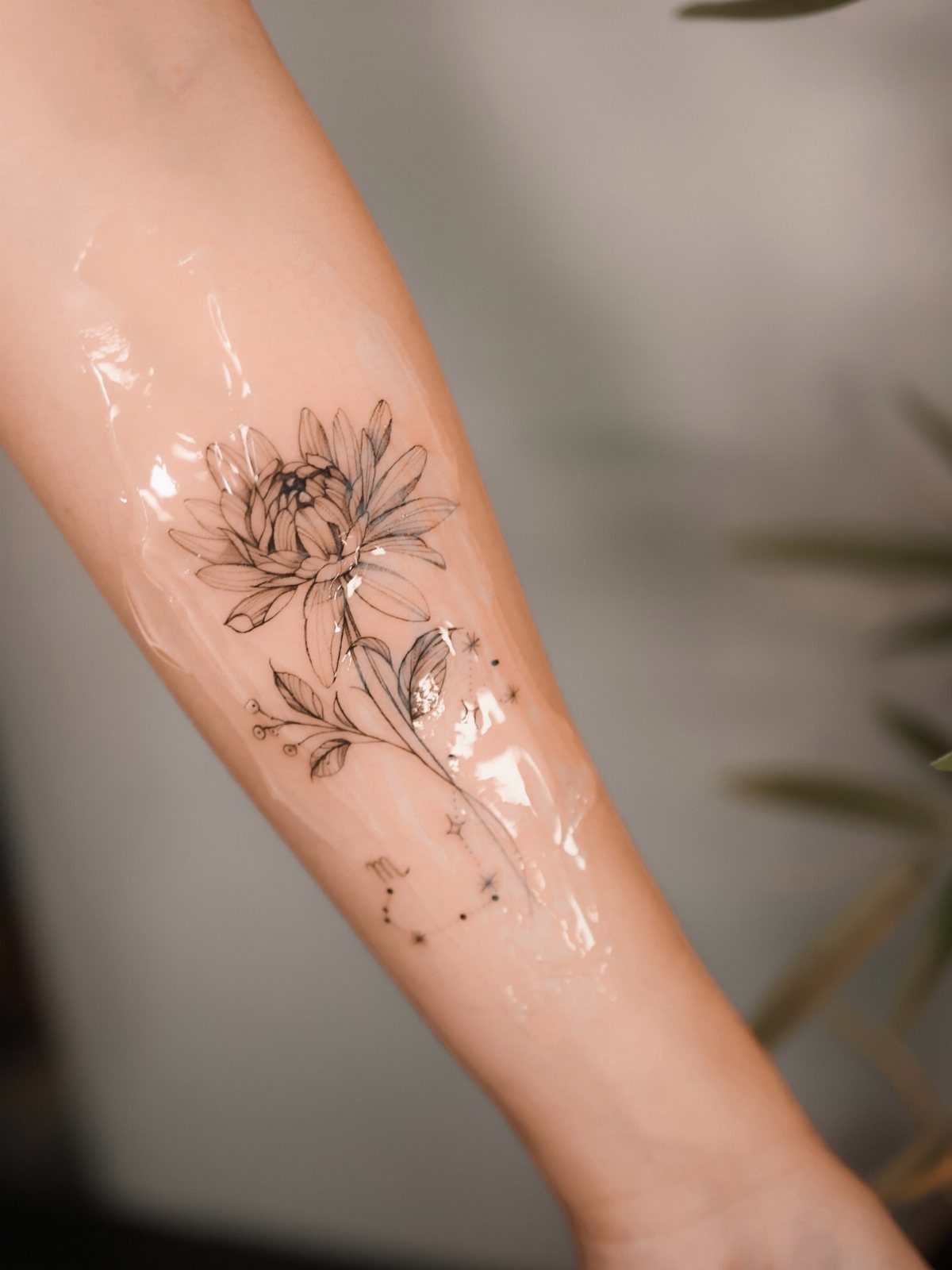
November’s chrysanthemum has layered petals that radiate from the center, giving the bloom volume and texture. The flower reads well in black ink because the petal structure creates natural contrast without needing shading or color fill.
I like chrysanthemums for their versatility in size. The visible design includes small celestial symbols, which is a common pairing when someone wants to tie the birth flower to astrology or a specific date.
That combination works best when the symbols stay small and don’t pull attention away from the flower itself.
6. Carnation Birth Flower Tattoo
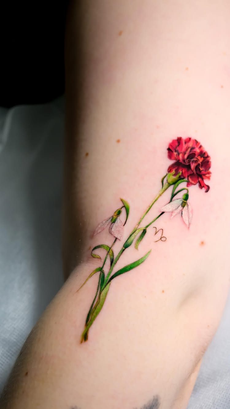
January has two birth flowers, and the carnation is the one with the most texture. The ruffled petals give the bloom a soft, full appearance that holds up well in both color and black ink.
Red carnations carry the strongest visual weight and pair well with other flowers or symbols in a single design. The visible piece combines a red carnation with snowdrops and a zodiac glyph, which layers personal meaning without overcrowding the space.
Forearm placement keeps everything visible and easy to read. If you’re adding multiple elements, keep the carnation as the focal point and size it large enough so the petal detail doesn’t get lost.
7. Poppy Birth Flower Tattoo
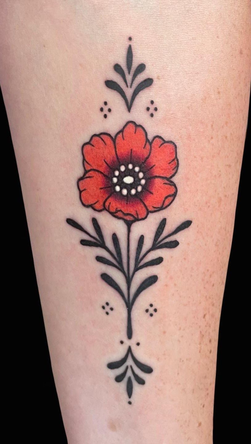
The red holds strong in ink, and the contrast between the petals and the black decorative leaves balances the composition without needing much shading.
I like how symmetry works here. The black foliage frames the flower without overwhelming it, and the dotwork adds texture without cluttering the space.
Placement on the upper arm or forearm allows the petals and leaves to spread naturally. Saturated red keeps the flower bold over time.
8. Gladiolus Birth Flower Tattoo
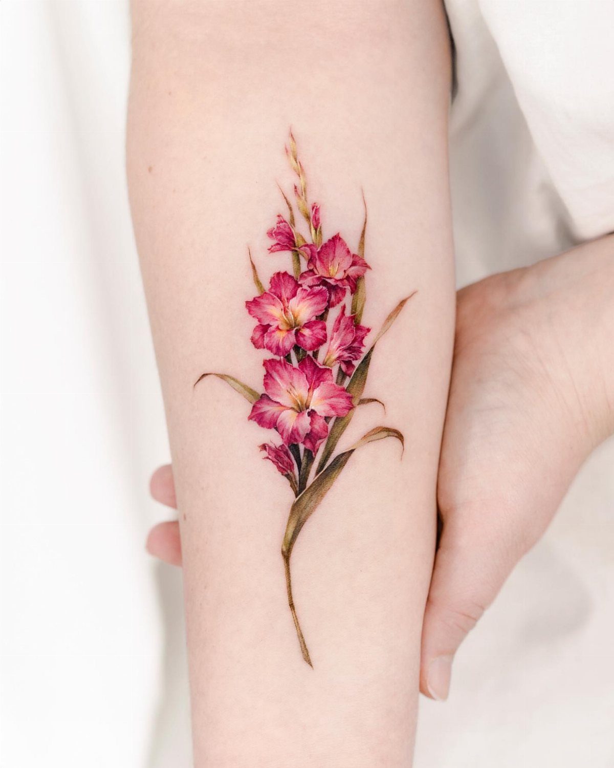
The vertical structure makes it a natural fit for the forearm, where it can follow the arm’s length without feeling cramped.
Color brings out the flower’s best qualities. The visible piece uses pink with green leaves, and that combination stays soft without losing definition.
If you’re working with a longer stem, the forearm or shin gives you the space to keep the proportions right. Size matters here: too small and the individual petals blur together.
9. Watercolor Birth Flower Tattoo
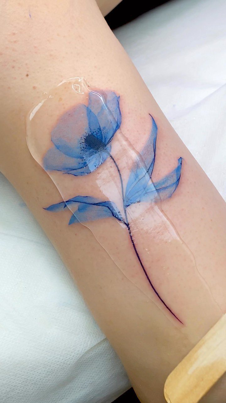
This style skips hard outlines and uses color washes to mimic the look of watercolor painting.
Watercolor fades faster than traditional tattooing because the lack of black outlines means there’s less structure to hold the color in place over time.
If you choose this style, plan for touch-ups every few years to keep the vibrancy. Forearm placement works well because the flat surface shows the color without distortion.
10. Bouquet of Birth Flowers Tattoo
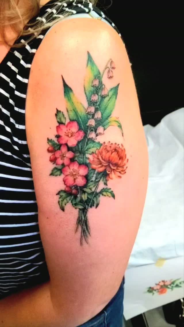
Stacking multiple birth flowers into one bouquet lets you represent several people or months in a single design.
The visible piece combines pink and orange blooms, which creates enough color variation to keep each flower distinct without needing different species to be immediately recognizable.
Upper arm placement works because the rounded surface accommodates the bouquet’s width.
If you’re adding more than 3 flowers, size the piece large enough so each bloom gets its own space. I prefer keeping the palette limited to two or three main colors so the design reads as cohesive rather than chaotic.
11. Family Birth Flower Tattoos
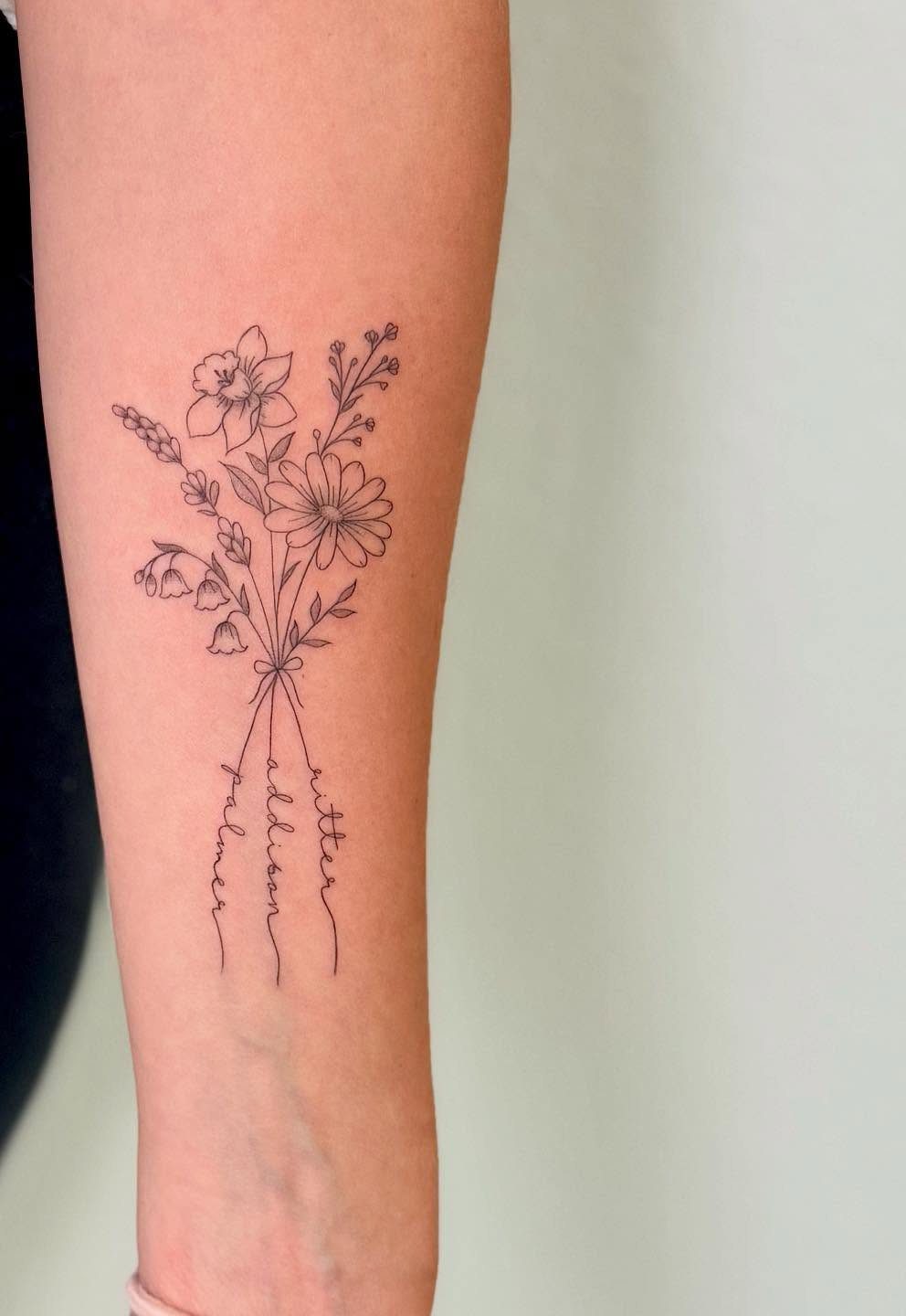
This approach pairs birth flowers with names, so each bloom represents a specific person. The visible design writes the names in cursive along the stems, which ties the elements together without needing extra symbols or labels.
Forearm placement keeps the names legible and the flowers visible at a glance.
Fine line work suits this style because it keeps the design from feeling heavy, but the names need to be large enough to stay readable as the tattoo ages.
When adding several people, spacing the flowers vertically rather than clustering them often reads more clearly.
12. Snowdrop Birth Flower Tattoo
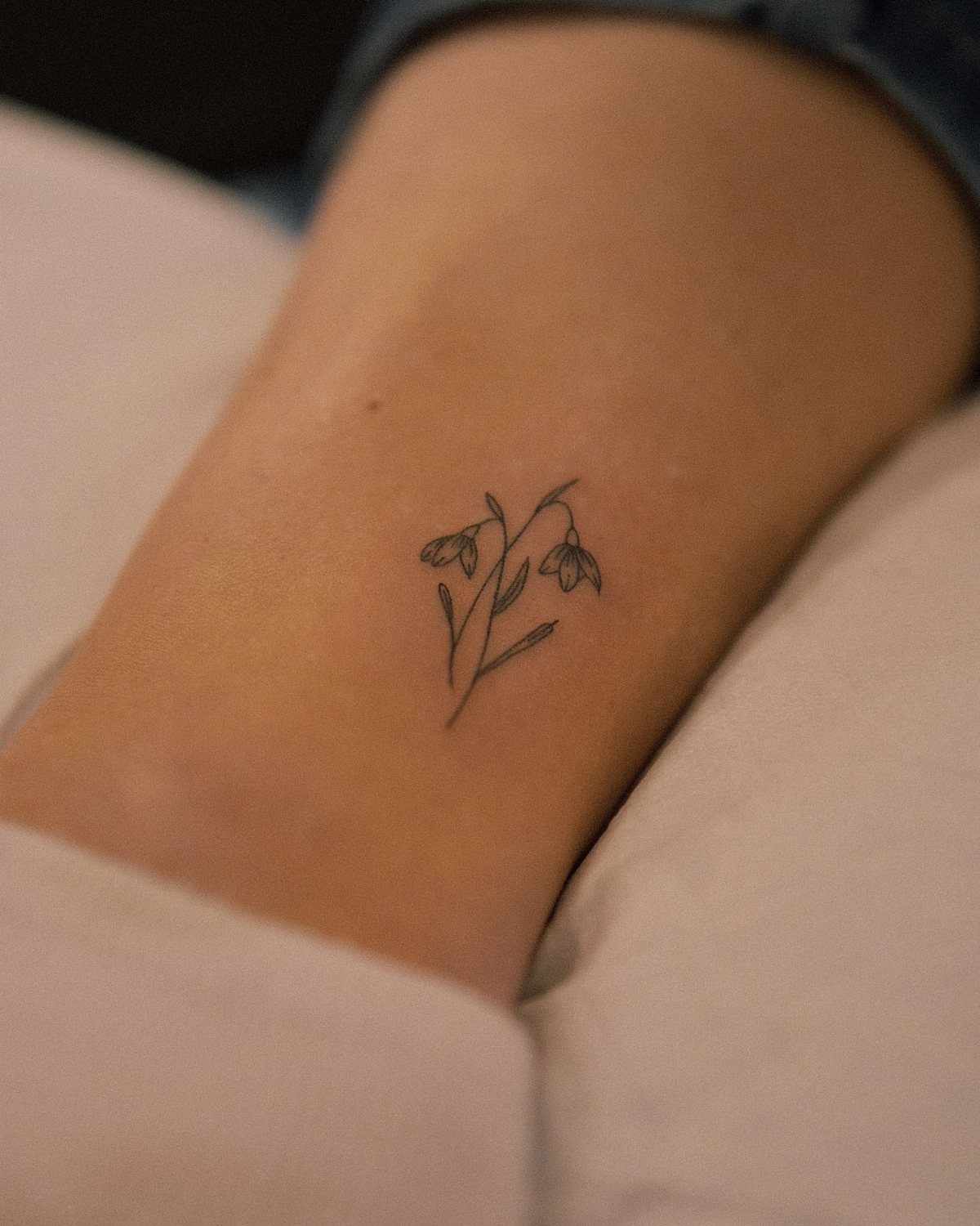
January’s second birth flower hangs in small, teardrop-shaped blooms that point downward.
The shape is simple enough to read at tiny sizes, which is why snowdrops work well behind the ear, on the wrist, or along the side of the finger.
Black ink keeps the design clean and holds up better over time than white or light grey.
The visible piece stays small, and that’s the right call: snowdrops lose their delicate quality if you size them too large. If you’re pairing snowdrops with another flower, keep them smaller to maintain the visual hierarchy.
13. Fine Line Birth Flower Tattoo
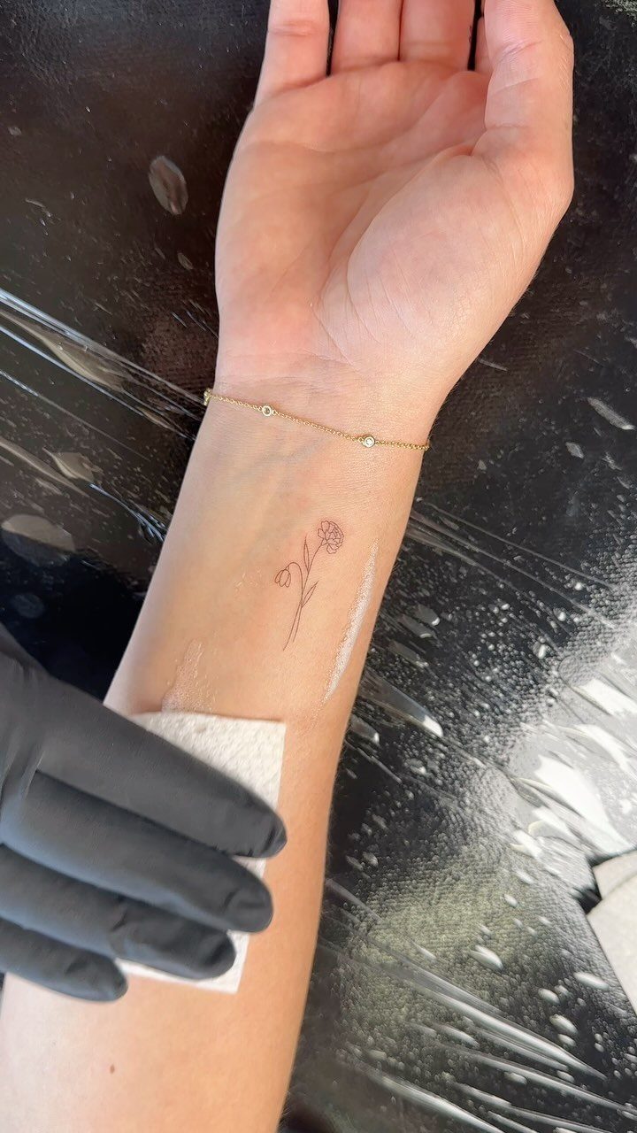
Fine line keeps birth flowers simple. Thin, consistent linework means the design reads clearly without heavy shading or color fill, and it ages well when the flower’s shape is kept recognizable.
The visible snowdrop uses black ink and stays small, which suits fine line best.
Delicate flowers like snowdrops, daisies, or violets hold their detail at smaller sizes, while blooms with layered petals need more space to stay legible. Wrist, forearm, or behind the ear all work for pieces under 2 inches.
Skip fine line if you want bold color or heavy contrast. This style relies on precision, so touch-ups are rare but the initial work needs to be clean.
14. Sweet Pea Birth Flower Tattoo
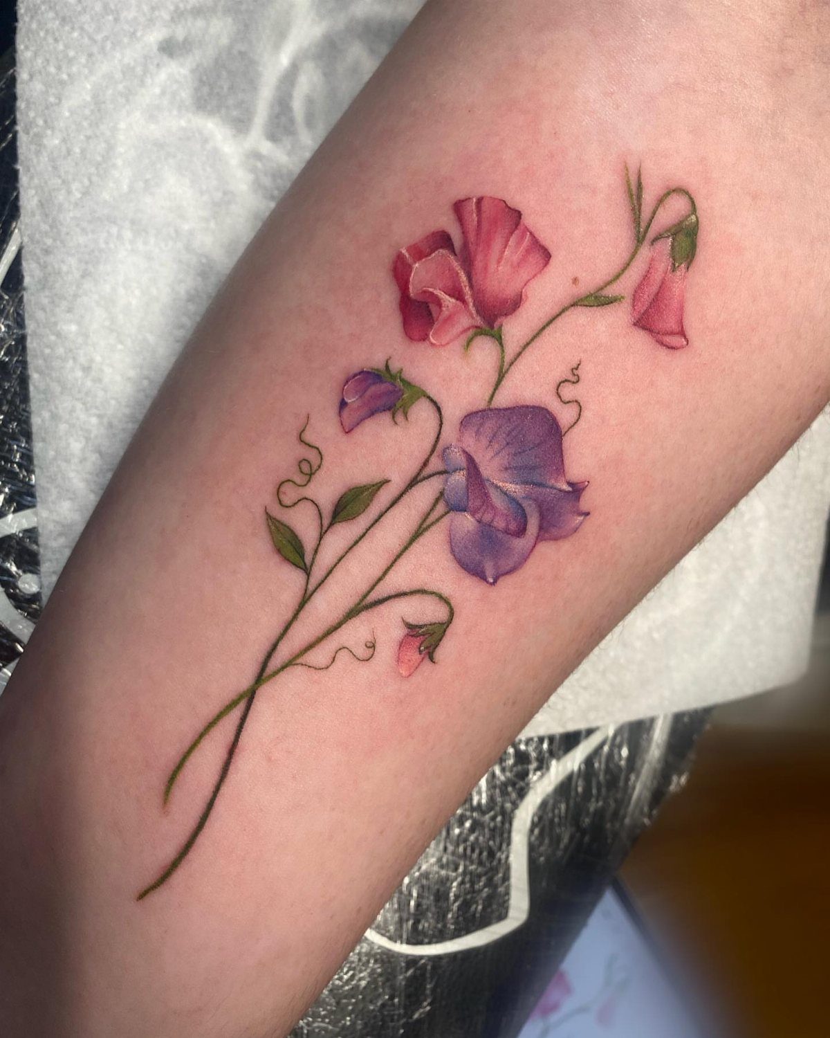
April’s sweet pea climbs in ruffled blooms that layer softly along the stem, and the color makes it stand out. Pink and purple tones read well together without needing outlines between petals, which keeps the design from feeling busy.
The meaning ties to departures and appreciation, so this flower suits memorial pieces or tattoos marking the end of one chapter before another starts.
Forearm placement gives the bloom room to spread without cramping the petals. Size it large enough so the ruffled texture stays visible as the tattoo settles.
Meaning of Birth Flower Tattoos
Each month has a birth flower tied to specific meanings, and those associations come from Roman tradition and seasonal symbolism. Carnations carry admiration and devotion in January, violets hold faithfulness in February.
Daffodils mean new beginnings in March, daisies signal innocence in April. May’s lily of the valley conveys sweetness and humility, June’s rose means love and passion, and July’s larkspur carries positivity.
August’s gladiolus represents strength, September’s aster means love and wisdom, and October’s marigold signals creativity. November’s chrysanthemum stands for optimism, and December’s narcissus represents rebirth.
The meaning can guide your choice if you want the design to reflect a specific trait, but the visual appeal of the flower matters just as much.
A birth flower tattoo works whether you connect deeply with the symbolism or simply like how it looks on your skin.
Choosing a Tattoo Artist
The artist’s experience with floral work determines how well the petals, stems, and details translate to skin.
Look at portfolios that show botanical tattoos, fine line florals, or the specific style you want. If the flowers look flat or generic in their past work, that’s what you’ll get.
Discuss placement, size, and whether you want color or black ink before the session.
When you want names, dates, or zodiac glyphs worked in, reference images or sketches help the artist see exactly how those pieces should nest with the petals.
A tattooist who specializes in florals will know which details hold up over time and which ones blur or fade.
That experience shows in the finished piece, so choose someone whose work already looks the way you want yours to age.
Combining Elements in Tattoos
A name, a date, or a zodiac glyph layered with the flower shifts it into memorial or tribute territory.
Death dates anchor a memorial, a child’s birth date anchors a parent piece. A zodiac glyph ties the flower to astrology without needing extra explanation.
Cursive works if the letters are spaced well, but block lettering holds up better over time.
Place the text along the stem or under the bloom so it integrates with the flower rather than sitting in a separate area. Too many additions and the piece reads as cluttered instead of personal.
Frequently Asked Questions
What are pretty flowers to get tattooed?
Birth flowers offer both beauty and personal meaning, making them consistently popular choices. Roses, peonies, daisies, and violets all translate well to ink because their shapes stay recognizable at different sizes and they hold detail over time.
The visual appeal matters as much as the symbolism, so pick a flower whose structure and proportions you actually like looking at.
What is the February birth flower tattoo?
February’s birth flower is the violet, which sits low to the ground and blooms in soft purple clusters. A ribbon or bow softens the look while keeping the piece grounded and wearable.
Where to put a birth flower tattoo?
Wrists, ankles, and forearms work for small, delicate flowers like violets or daisies that stay under 2 inches.
The collarbone, upper arm, or ribs suit designs that follow a natural curve, particularly flowers with vertical structure like larkspur or lily of the valley.
Larger bouquets or multi-flower pieces need the forearm or upper arm because the surface accommodates width without cramping the blooms.