The designs here move from tight single-bloom pieces under 3 inches to full garden compositions that need multiple sessions, and linework versus watercolor shading changes how the piece ages.
Color choice matters: solid petals in roses and camellias hold saturation longer than watercolor edges in cosmos or lilies, which soften faster and may need a refresh every few years.
1. Sunflowers
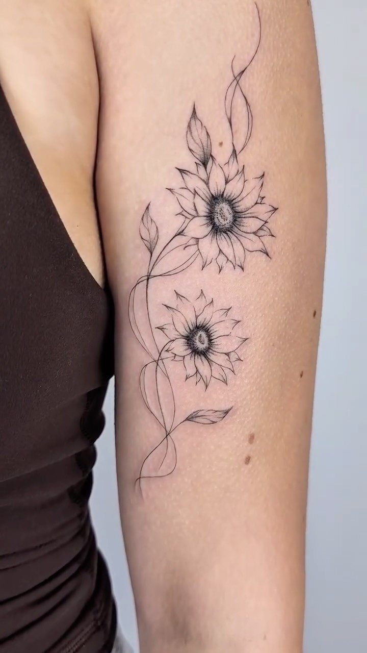
Sunflowers face the light and hold it, which is why they read as loyalty and adoration once they’re inked. A pair like this stays balanced without feeling heavy.
Black ink alone lets the petals read clearly over time.
Shading in the center gives depth, and the stems keep it grounded instead of floating. Upper arm placement works because you get enough width for 2 flowers without crowding them.
For something bright, a single sunflower scales down better than a pair.
2. Plum Blossoms Branch
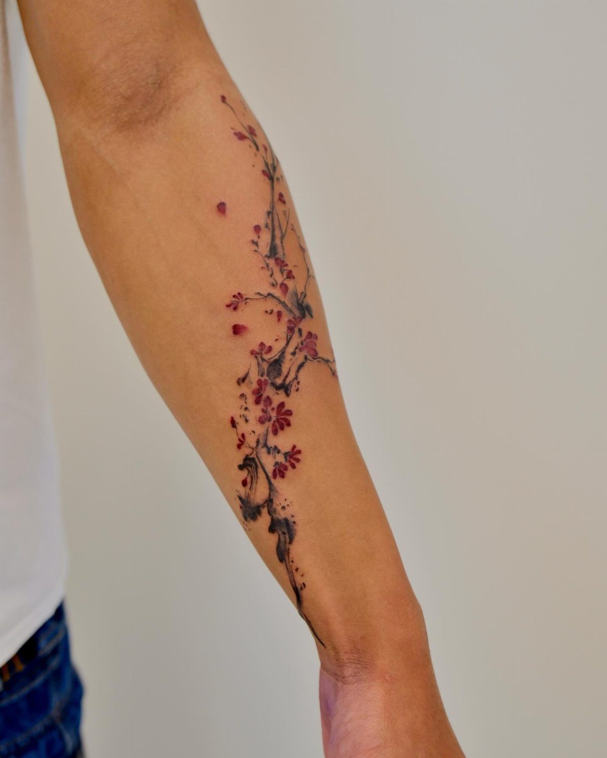
Plum blossoms bloom early, often in late winter, so they carry resilience and renewal. A branch that curves along the forearm works with the line of the arm instead of fighting it.
Red flowers with dark stems give you contrast that stays readable over the years.
The winding shape works on longer placements like the forearm, ribcage, or along the collarbone. Keep the branch thin so the flowers stay the focus.
If you prefer something softer, pink blossoms with lighter linework will give you a gentler look.
3. Tiny Wildflowers Bouquet
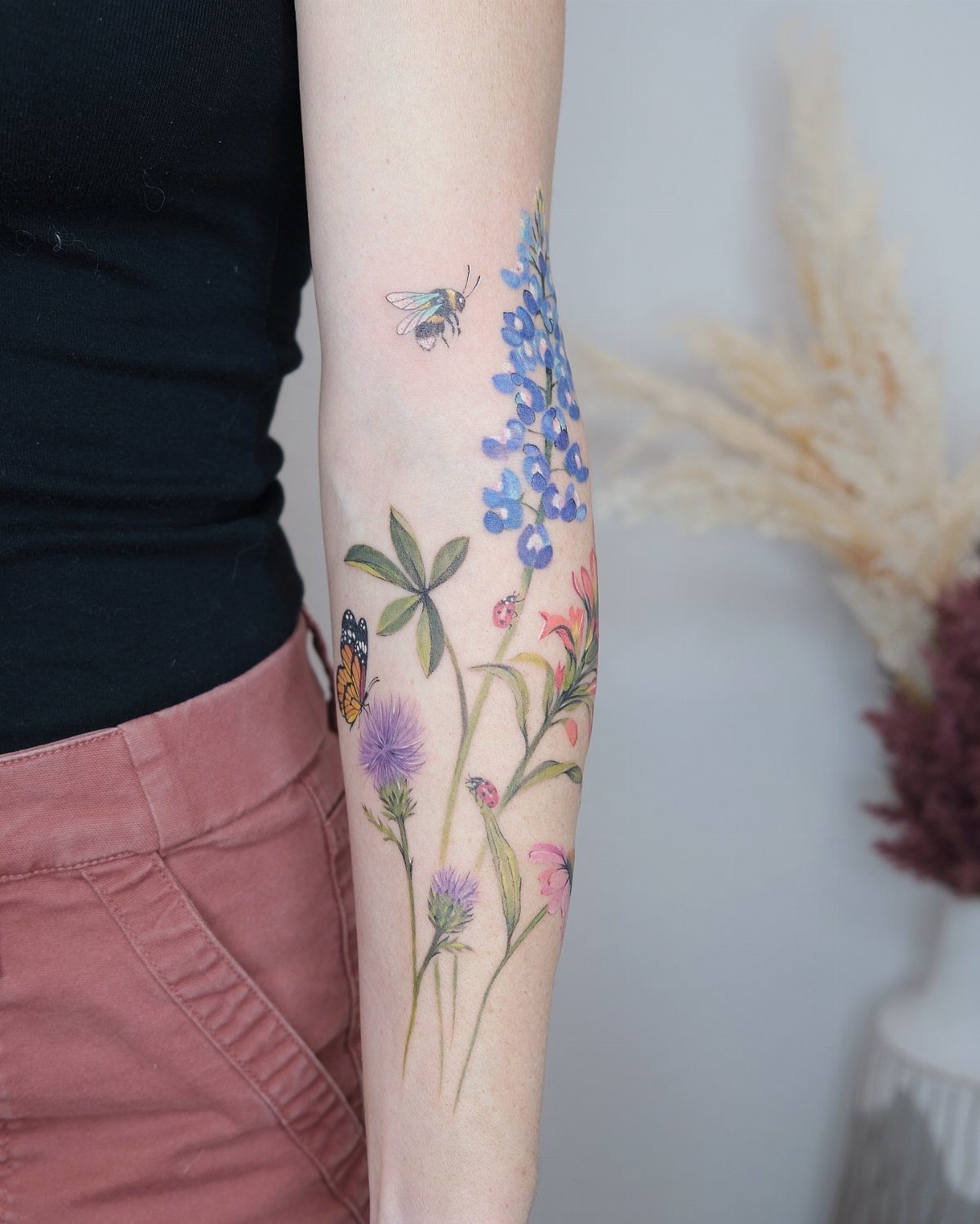
A wildflower bouquet lets you mix species without looking chaotic, and adding a bee or butterfly brings movement to the design. This one stays small but could scale up to cover more of the forearm or shoulder.
Color makes each flower distinct, but black and grey holds up longer with less touch-up. Placement on the forearm keeps it visible, or you could tuck it onto the ankle or collarbone for something more private.
The bouquet shape reads well at any size.
4. Watercolor Lilies
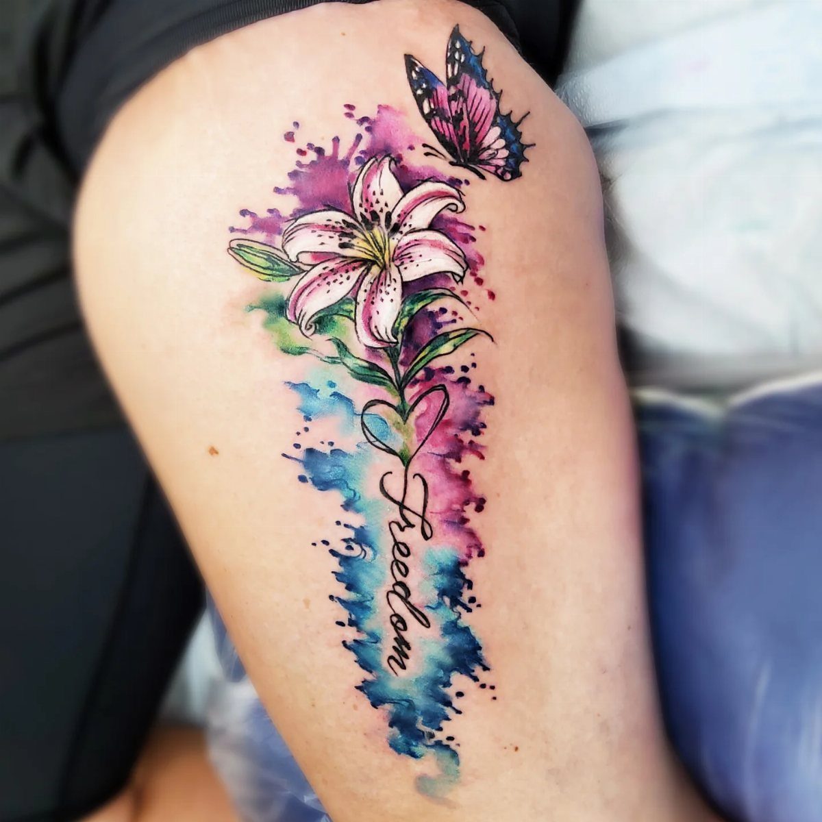
Watercolor lilies soften the edges and let color bleed past the linework, which mimics how paint behaves on paper.
Adding a word like "Freedom" personalizes it, though the lily carries its own meaning of purity and renewal. Thigh placement gives you enough space for the full bloom and leaves without cramping the design.
Watercolor fades faster than solid color, so expect a touch-up every few years to keep the vibrancy.
5. Japanese Honeysuckle
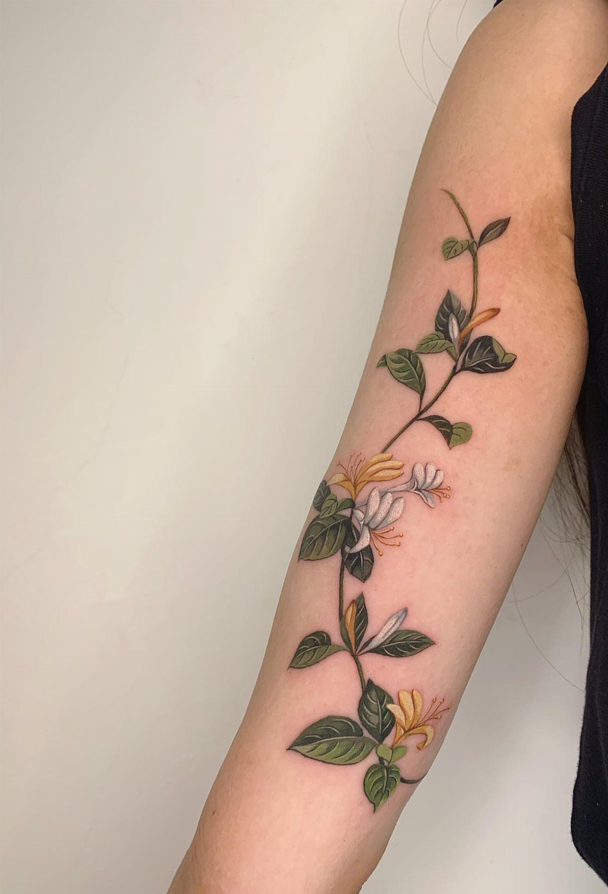
Japanese honeysuckle climbs and twists, so a vine design follows the curve of your forearm or wraps around your ankle naturally.
Color here makes the flowers recognizable, but you could simplify it to black linework for something that ages cleaner. Forearm placement keeps the vine visible, or you could run it along your ribcage for something more private.
Honeysuckle blooms in clusters, so the design never looks sparse.
6. Watercolor Cosmos
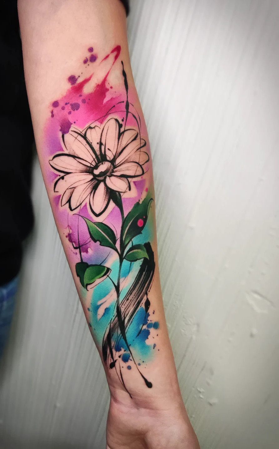
Watercolor cosmos replicate the soft, layered look of petals on paper, with color bleeding past the edges and splashes of pink and blue mimicking a painter’s brush.
A single flower keeps it simple, or you could add a few more blooms if you have a larger canvas.
Forearm placement lets the color show, but this style fades faster than solid ink.
You’ll need a touch-up every few years to keep the splashes bright. Green leaves anchor the design and keep it from looking too abstract.
If you want something that lasts longer without touch-ups, skip the watercolor and go with solid petals and black linework.
7. Apple Blossom
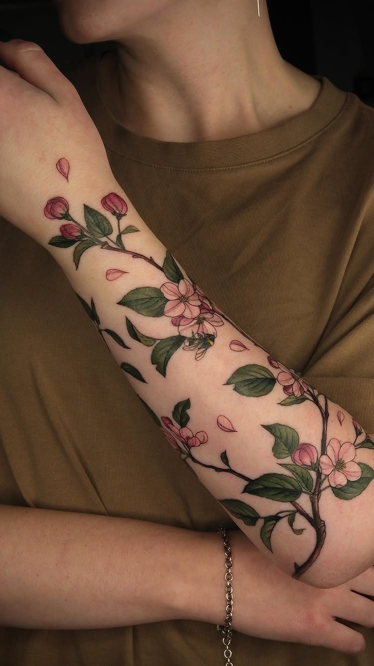
Apple blossoms carry spring renewal, and keeping color only on the petals lets them pop against the black-and-green stems and leaves. The pink reads clearly without overwhelming the design.
Forearm placement like this gives you enough room for multiple blooms without cramping them.
If you want something that fades slower, go with black and grey shading on the petals instead of color.
8. Chrysanthemum
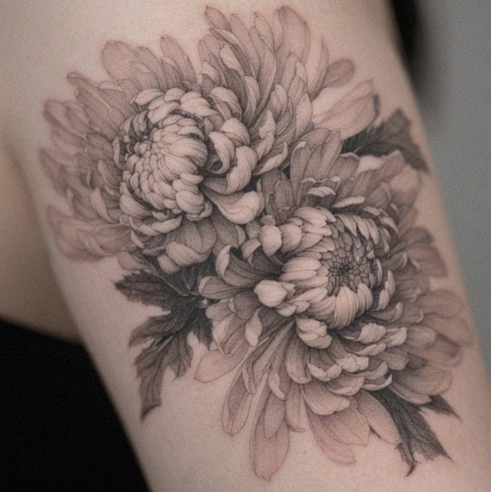
Chrysanthemums layer dozens of thin petals, which gives you texture even in black and grey. Shading between the petals creates depth without needing color.
Abstract versions simplify the layers into geometric shapes or bold linework if you want something less detailed. Realistic versions like this one need space to breathe, so forearm, shoulder, or thigh placements work better than smaller spots.
2 blooms give you room to see each petal.
9. Peony
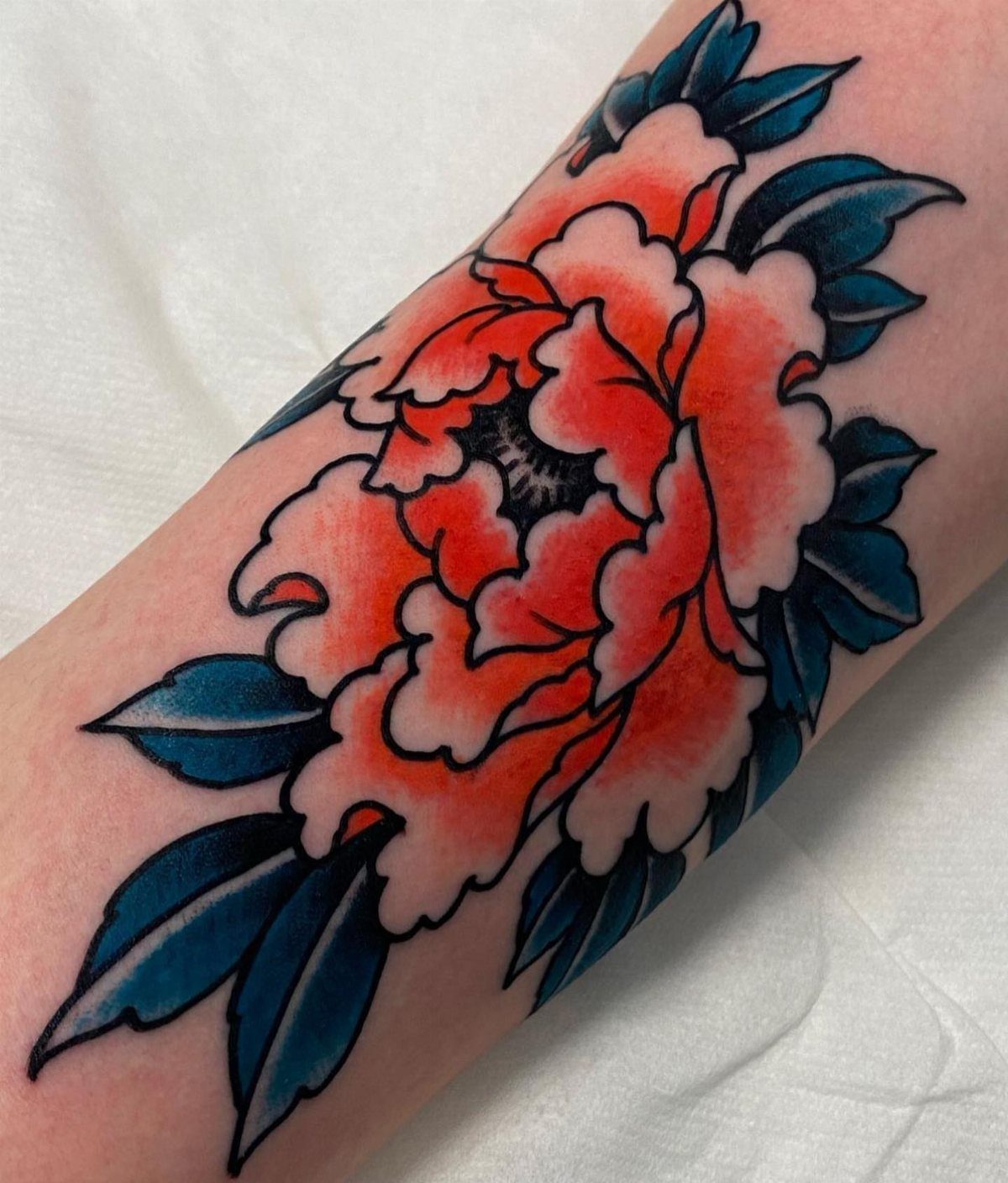
Peonies symbolize love and honor, and their full, layered blooms give you a lot of visual weight in a compact design. Color on the petals makes each layer distinct, and darker leaves provide contrast.
Shifting the palette to red and blue instead of pink and green makes the piece read bolder. Arm placement keeps it visible, or you could scale it up for a thigh or shoulder piece.
Black and grey holds up longer if you want to avoid touch-ups.
10. Vervain
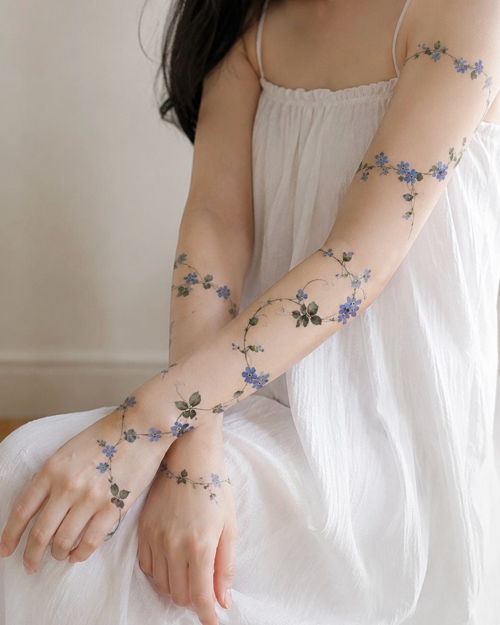
Vervain winds naturally, so wrapping it around your arm or wrist follows the curve of your body instead of sitting flat. Blue flowers like this stand out, though you could go with black linework for something more subtle.
The delicate stems and small blooms keep it light, and the wraparound placement makes it feel intentional rather than stitched together. Upper arm to wrist gives you continuity if you want the design to flow.
This style suits someone who wants coverage without heavy shading.
11. Floral Garden
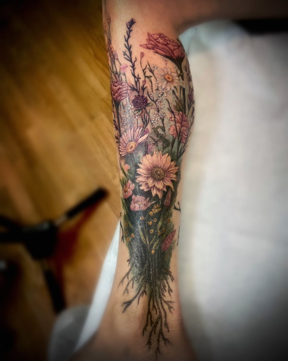
A floral garden brings multiple species together in one piece, and adding roots below the blooms gives it structure and grounds the design. Color here lets each flower stay distinct without blending together.
Lower leg placement works because you get vertical space for the roots and flowers both. This style suits someone who wants a piece that represents growth or connection, and mixing flowers lets you include personal significance for each bloom.
Expect longer sessions and higher cost for a design this detailed.
12. Wisteria
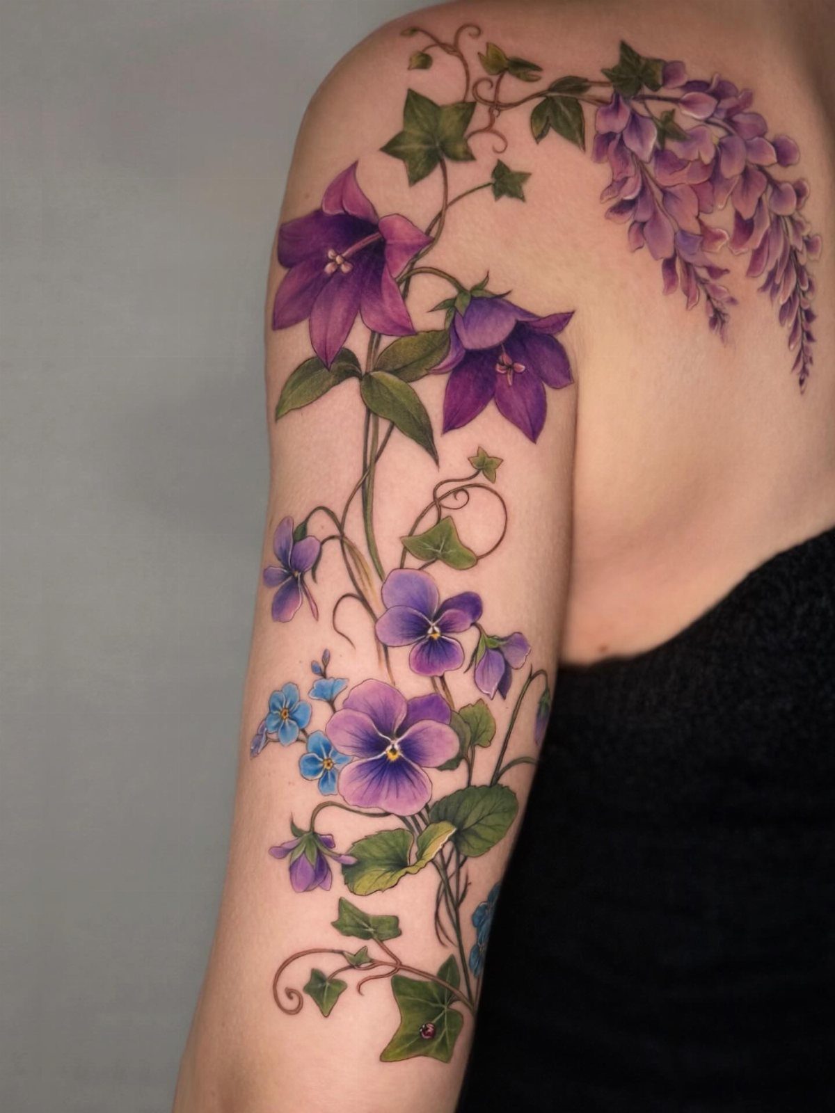
Wisteria hangs in cascading clusters, so the design naturally follows curves like your shoulder, upper arm, or ribcage. Purple flowers with green leaves give you enough contrast to keep each bloom readable.
Mixing wisteria with bellflowers and violets adds variety without losing the viny flow.
13. Linework Rose
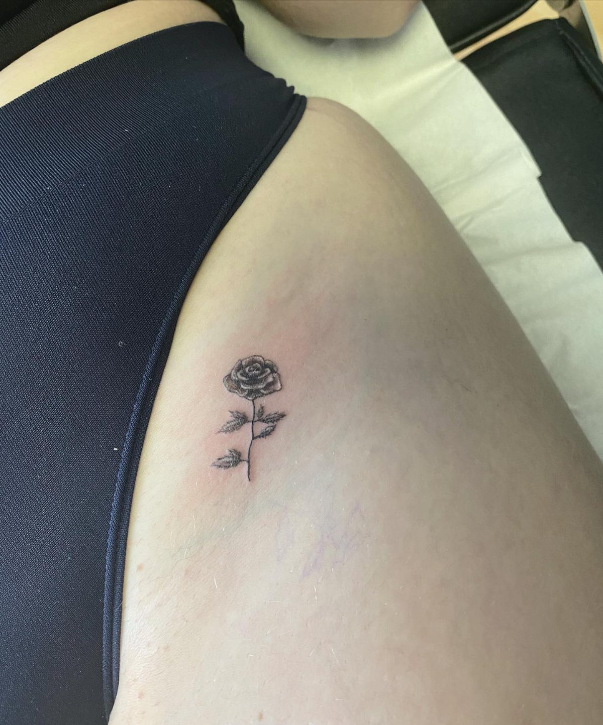
A single rose in black linework gives you the classic shape without shading or color, which keeps it readable long-term. Hip placement like this tucks it somewhere private without making it too small to recognize.
Fine lines on the stem and leaves add detail without crowding the petals. If you prefer clarity over decoration, this one delivers.
If you want more contrast, add light shading in the center of the bloom.
14. Bleeding Rose
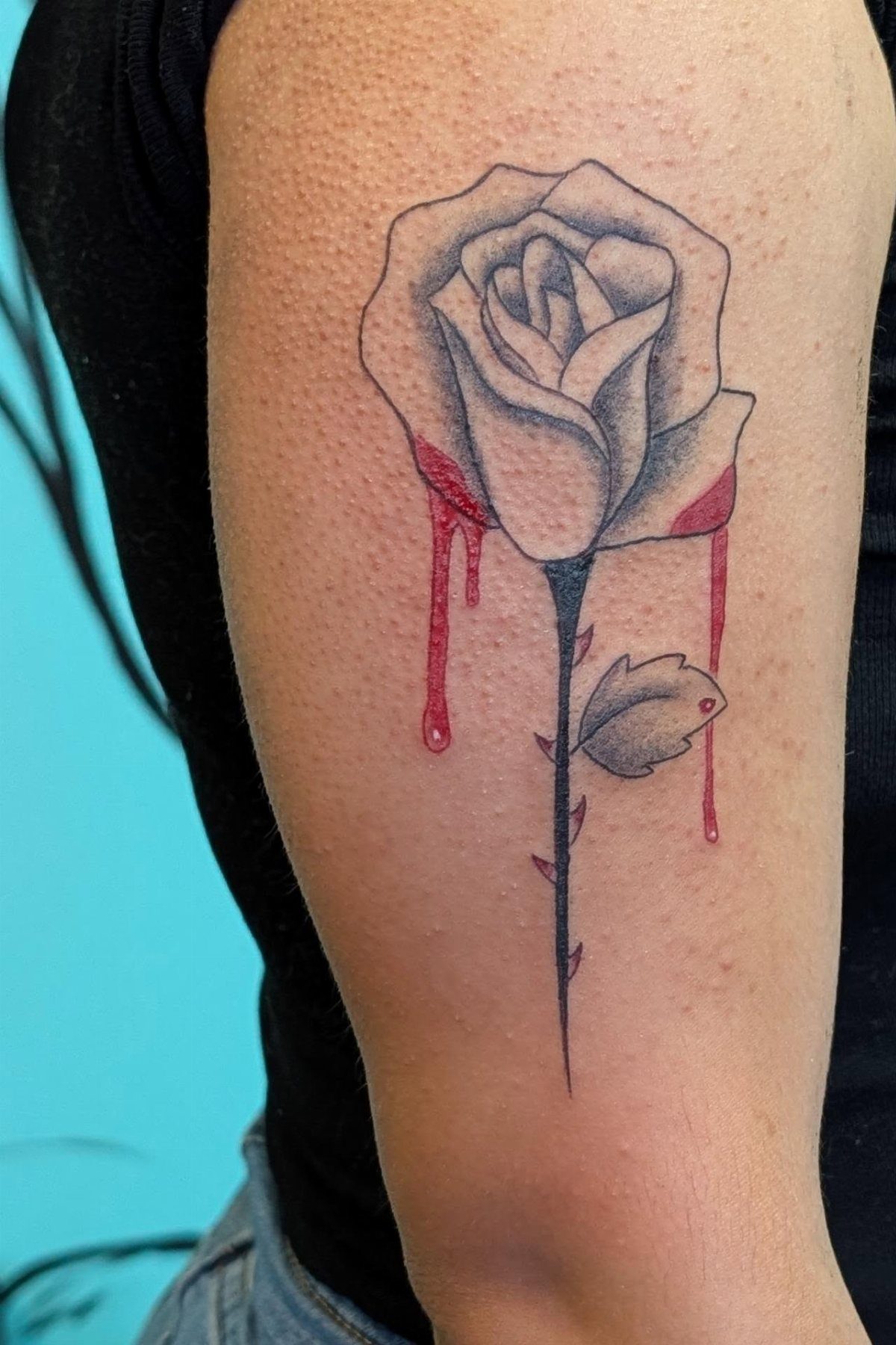
A rose with red drips falling from the petals adds literal weight to the symbolism of loss or sacrifice. Grey shading on the flower keeps the focus on the color, and the thorns reinforce the sharp edge.
Arm placement keeps it visible, and the vertical drip works with gravity instead of against it. If you want the feeling worn on the surface, this reads fast.
Black and grey alone softens it if you want the shape without the drama.
15. Red Camellia Tattoo
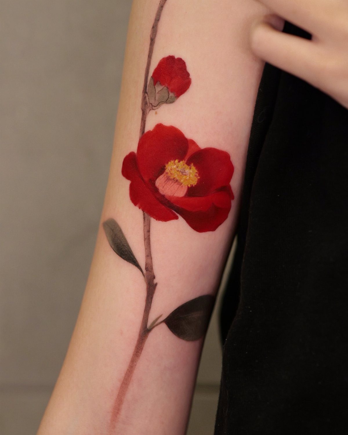
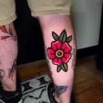
Red camellias carry longing and devotion, and the color here makes the bloom stand out against dark leaves. Adding a bud shows growth alongside the full flower.
The thin stem keeps it delicate, and arm placement gives you room for the bloom and foliage both. This style works if you want something that feels painted rather than outlined.
A single bloom without the bud scales down better for smaller placements.
16. Camellia Ink Drawing
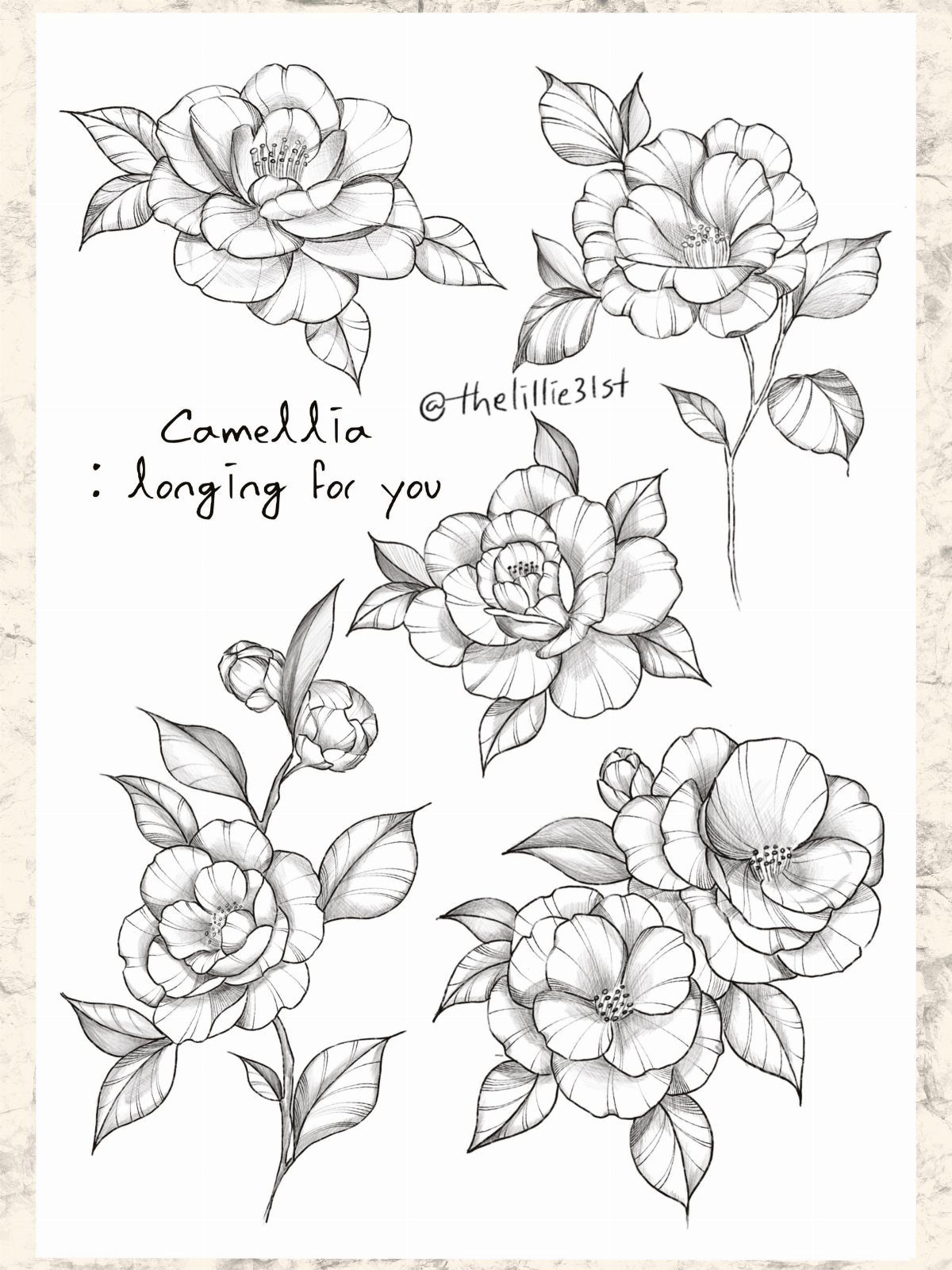
Ink sketches like these translate well to skin if you keep the loose, hand-drawn quality. Multiple views of the same flower let you show petals, buds, and leaves in one piece without making it look cluttered.
Black linework alone keeps it sharp, and you could place each bloom separately or group them together. If you like ink that looks drawn rather than polished, this fits.
Adding text personalizes it, though the flowers carry their own meaning.
17. Rose and Heart Diamond
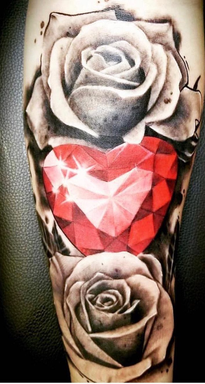
Framing a faceted heart with 2 roses lets the color sit in the center and draws the eye there first. The neutral roses let the red hold focus, and mirrored sides give the eye somewhere to land.
You need horizontal room for a pair of blooms, so chest or forearm gives you that span. This style suits someone who wants romance and permanence in one design.
Reversing the color, with red roses and a grey diamond, shifts the focus back to the flowers.
18. Black Linework Lilies Drawing
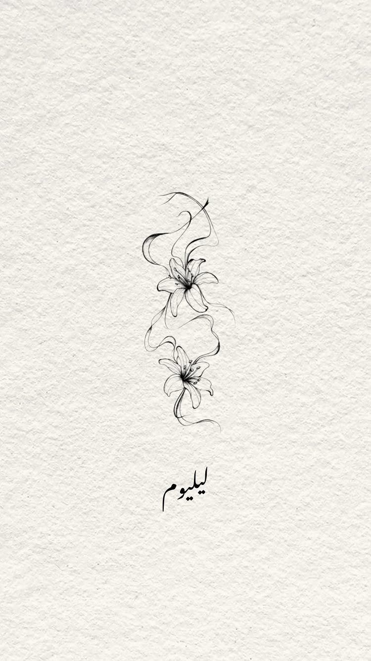
2 lilies with swirling stems create movement without needing shading or color. The linework here stays minimal, which lets the shape of the petals and the curve of the stems do the work.
This style translates to skin cleanly, and you could place it on your forearm, ribcage, or shoulder blade. Lilies symbolize purity and renewal, and the swirling stems add a decorative element without making it too busy.
Adding light shading inside the petals gives depth if you want more dimension.
19. Fine Line Cosmos Bouquet
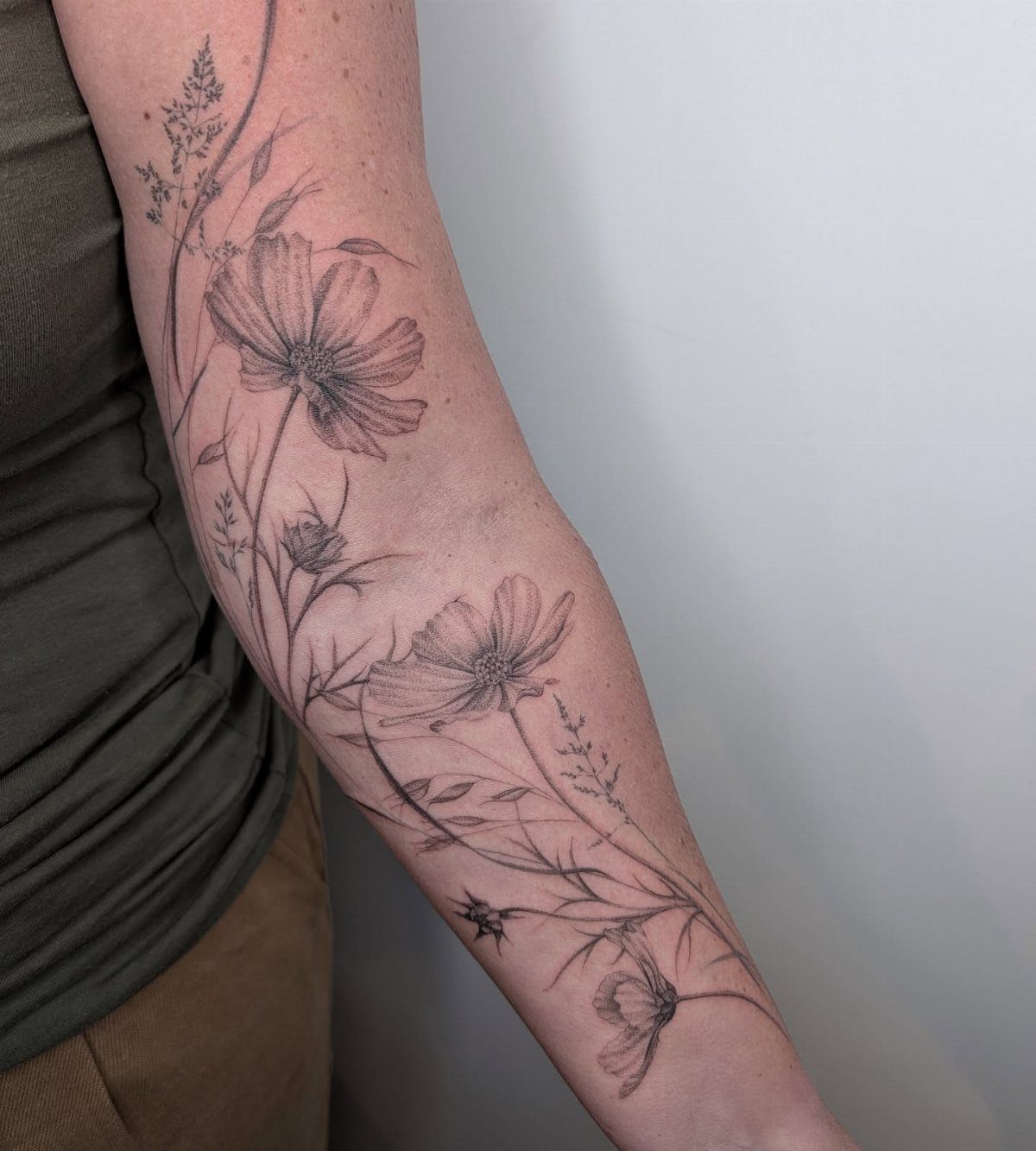
Cosmos petals layer light enough that fine linework and stippling can hold the shape without heavy shading. Black ink alone keeps each bloom readable, and the slender stems tie multiple flowers together without crowding them.
Stippling in the center adds texture where solid black would flatten it.
20. Realistic Red Rose
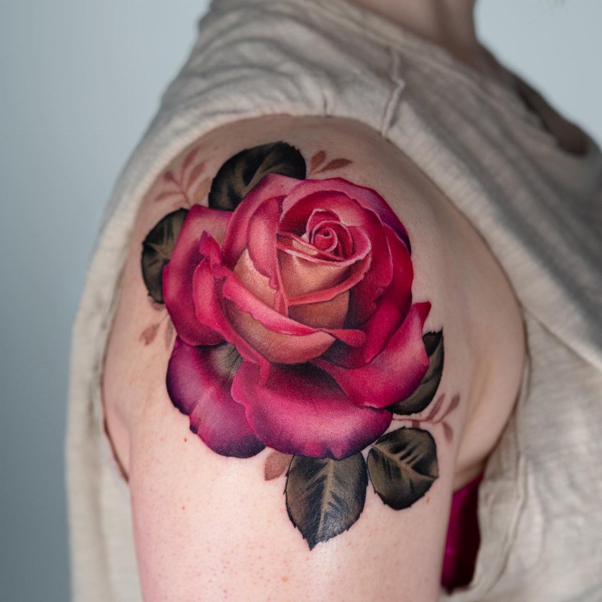
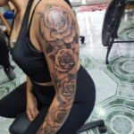
A red rose with gradient shading mimics the way light hits layered petals, and adding green leaves gives the piece balance without making it too bold.
The color here makes the bloom the focus, and the shoulder placement works because it follows the curve of the muscle.
Realistic roses need space for the detail to read, so avoid scaling this down below 3 inches across. You’ll need touch-ups every few years to keep the red saturated.
21. Realistic Yellow Rose
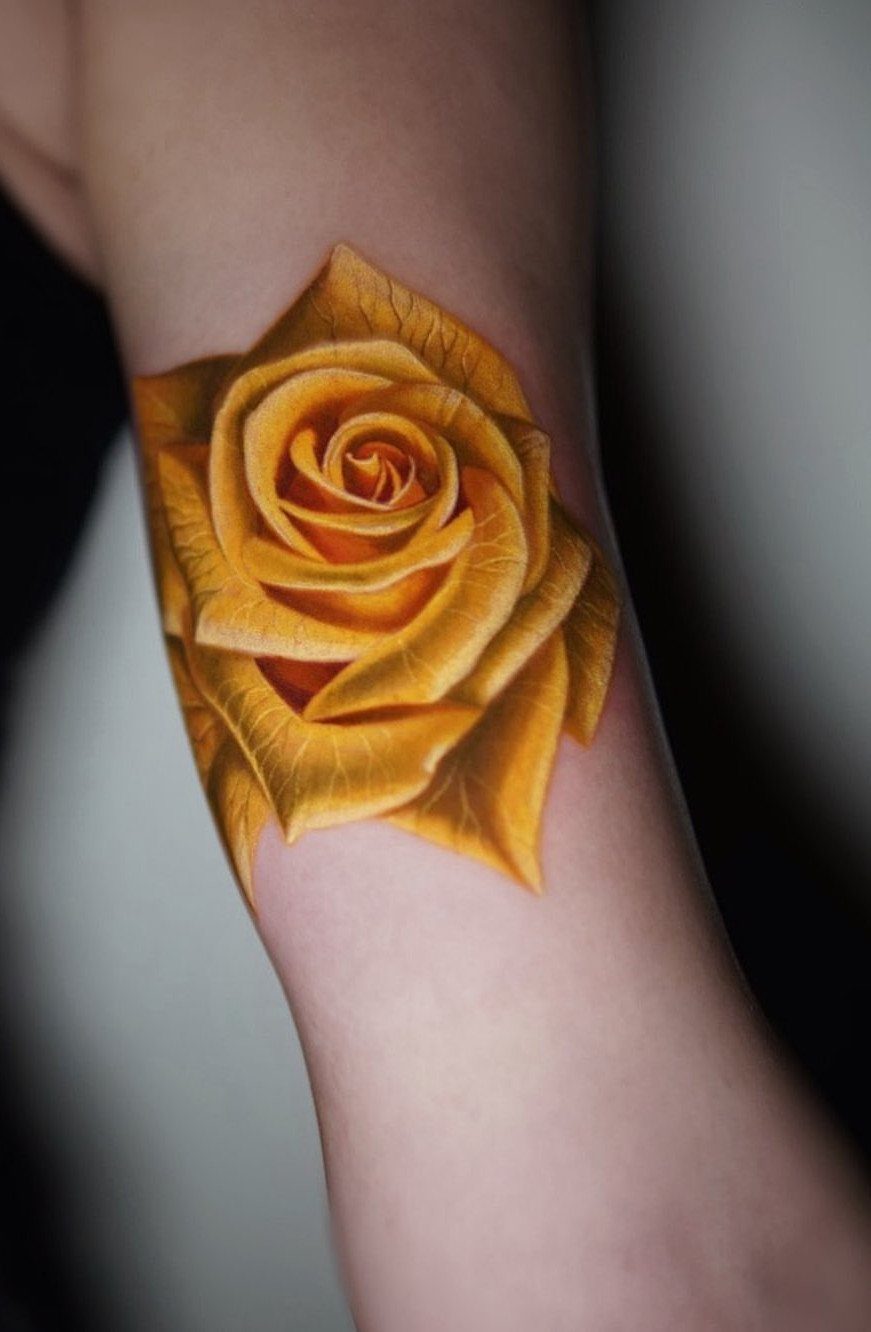
Yellow roses warm up fast with orange tones in the shading, which gives the petals dimension and keeps them from looking flat. The full bloom here shows all the layers without needing stems or leaves to fill space.
Forearm placement keeps it visible, and the size gives you enough room for the shading to read clearly. Yellow fades faster than red and needs a touch-up to stay bright.
If you want something that ages with less maintenance, go with peach tones instead of pure yellow.
Choosing the Right Flower
Researching flowers and their meanings can help you find inspiration for your tattoo’s design, size, and color.
If you have no idea where to start, looking at what different blooms represent often narrows the options faster than scrolling through hundreds of images.
Some people search for a flower that commemorates something specific in their life, while others pick one simply because it looks good. Both reasons work.
Your tattoo artist might ask about favorite flowers, birth months, or what feelings you want the design to invoke.
From there, they can suggest flowers that match those emotions or values. If they specialize in floral work, they’ve likely helped dozens of people through this same decision.
You don’t need a deep reason to get a flower tattooed, but knowing what each one represents gives you more to choose from.
Your tattoo artist might also be able to help and provide suggestions, particularly if they specialize in floral designs. Rodriguez will try to assist their undecided clients with picking a flower design by asking a few questions.
— Allure
Finding a Tattoo Artist
Scroll through portfolios to see whether an artist’s line weight, shading and composition match what you picture. If you want color, check that their portfolio shows saturated work that ages well, not just bright photos straight off the table.
Watercolor technique is specific: soft edges, gradient washes, and splatter need practice, so look for artists who already have clean examples of it.
Portfolios show you not just whether an artist can draw flowers, but how they handle shading, linework, and the specific style you’re after. A realistic rose and a fine line rose need different skills, and most artists lean one direction.
Look for consistent quality in their older work, not just the pieces they posted last week.
Tattoo Symbolism
Many flowers carry deep meanings, symbolizing growth, love, and transformation, which can resonate with personal journeys. Roses, lilies, and peonies are the most popular requests, often chosen in memory of a loved one who has passed.
In Buddhist symbolism, the lotus grows through mud and murky water before it blooms, which is why it often represents growth through difficulty.
Many people read flowers as a shorthand for growth, change or something beautiful that came from a harder season.
You don’t need to tie a tattoo to a specific memory, but knowing what a flower represents can make the design feel more intentional.
Frequently Asked Questions
What does a flower tattoo symbolize?
A flower can stand for growth, change, beauty or love, often tied to something you lived through or someone who mattered.
What flowers are good for tattoos?
Roses, peonies and lilies get asked for more than anything else, and the shapes stay readable after years. Sunflowers, cosmos, and camellias also translate cleanly, and each carries its own symbolism if that matters to you.
Pick a flower that fits the size and placement you’re planning, since detailed blooms like chrysanthemums need more room than a single wildflower.
What’s the most common flower tattoo?
Roses are the most common flower tattoo, often chosen in memory of someone or for their symbolism of love and honor.
Lilies and peonies follow close behind, and all three work in black and grey or color depending on what you want.